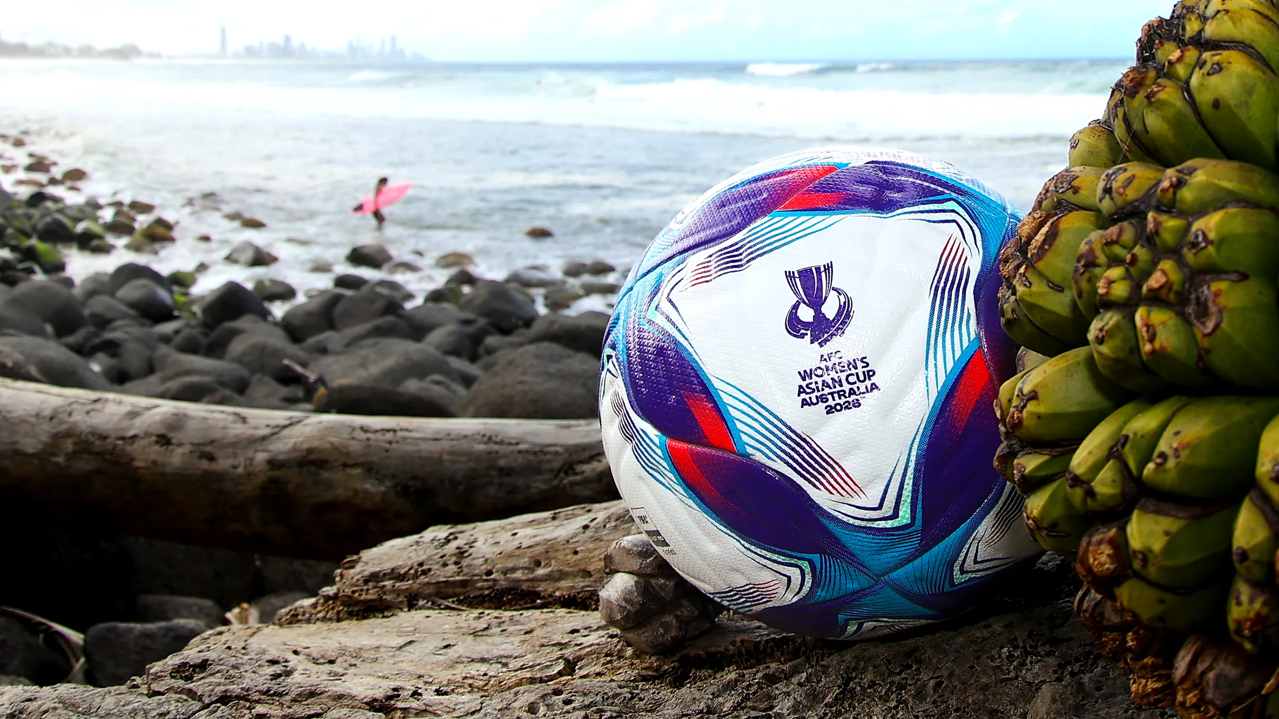
AFC Women’s Asian Cup Australia 2026™
Year: 2025
Client: Asian Football Confederation (AFC)
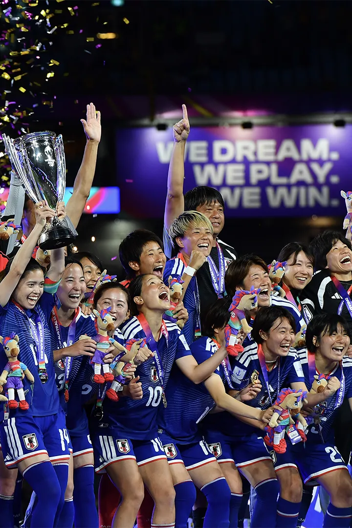
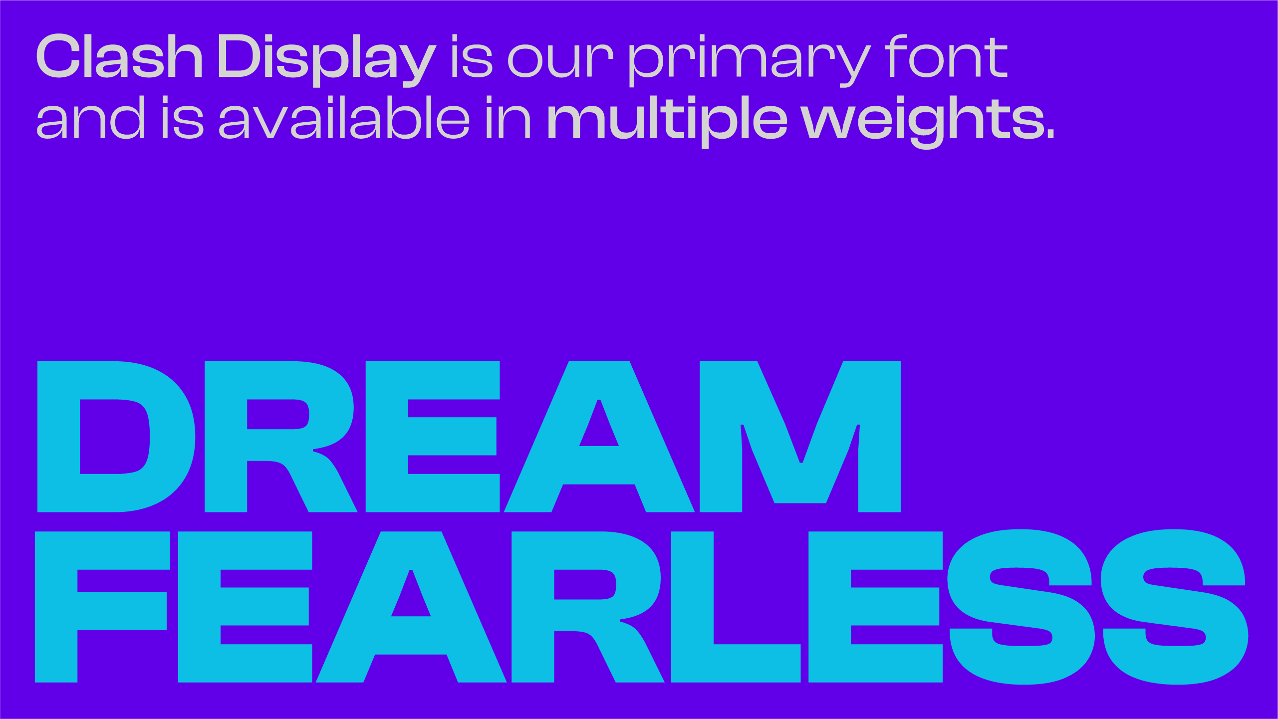
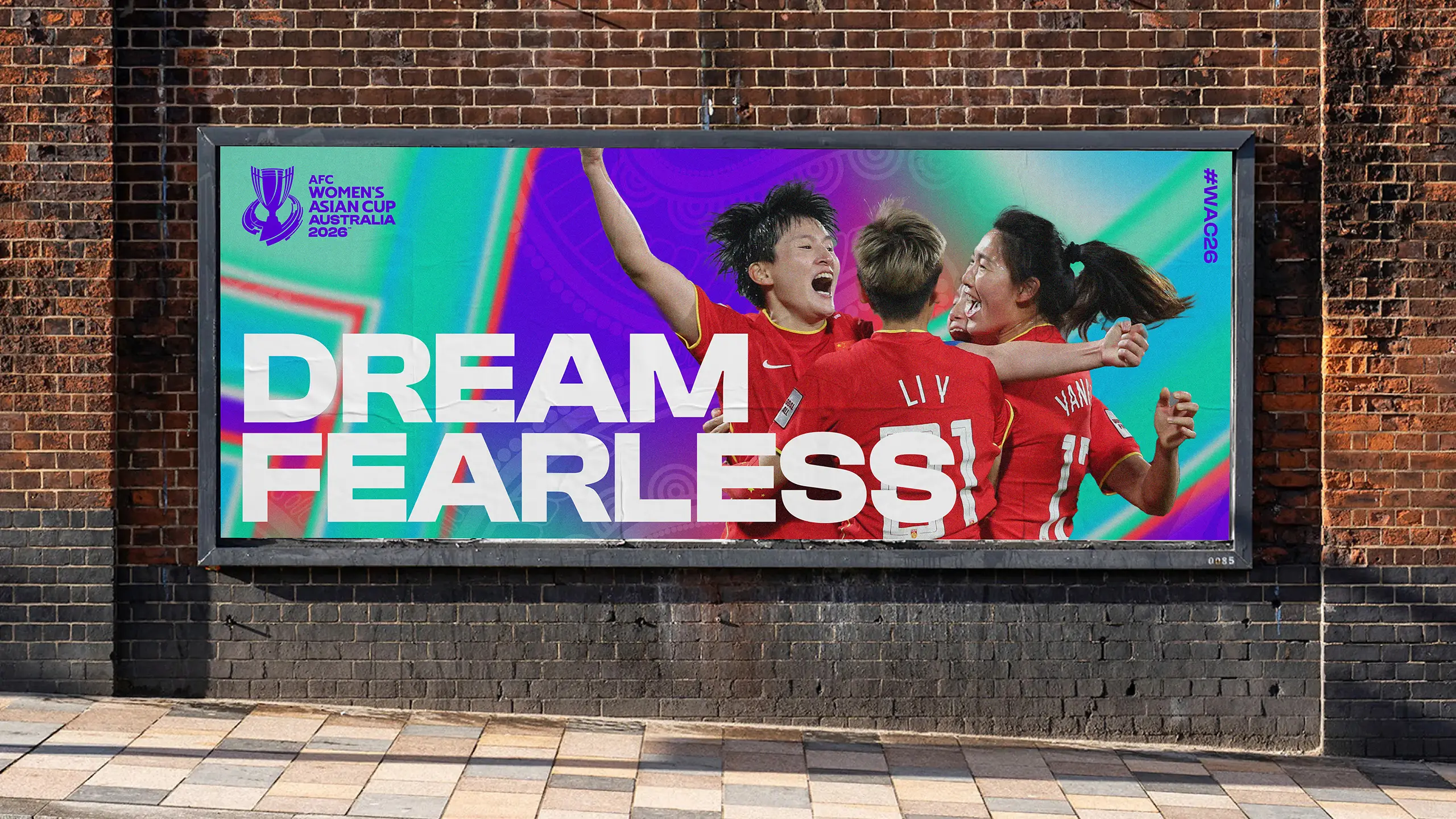
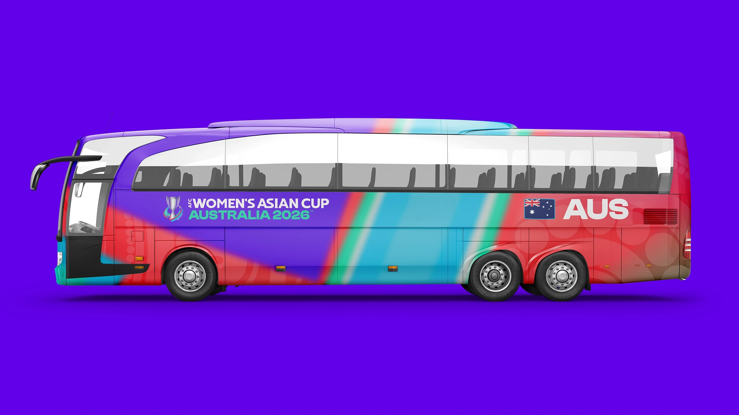
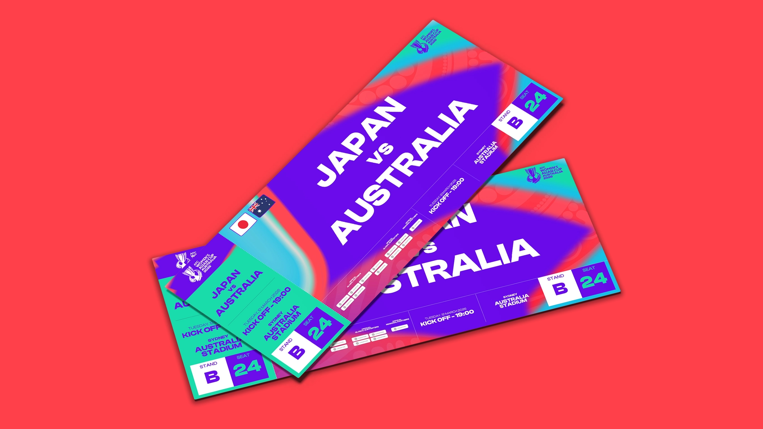
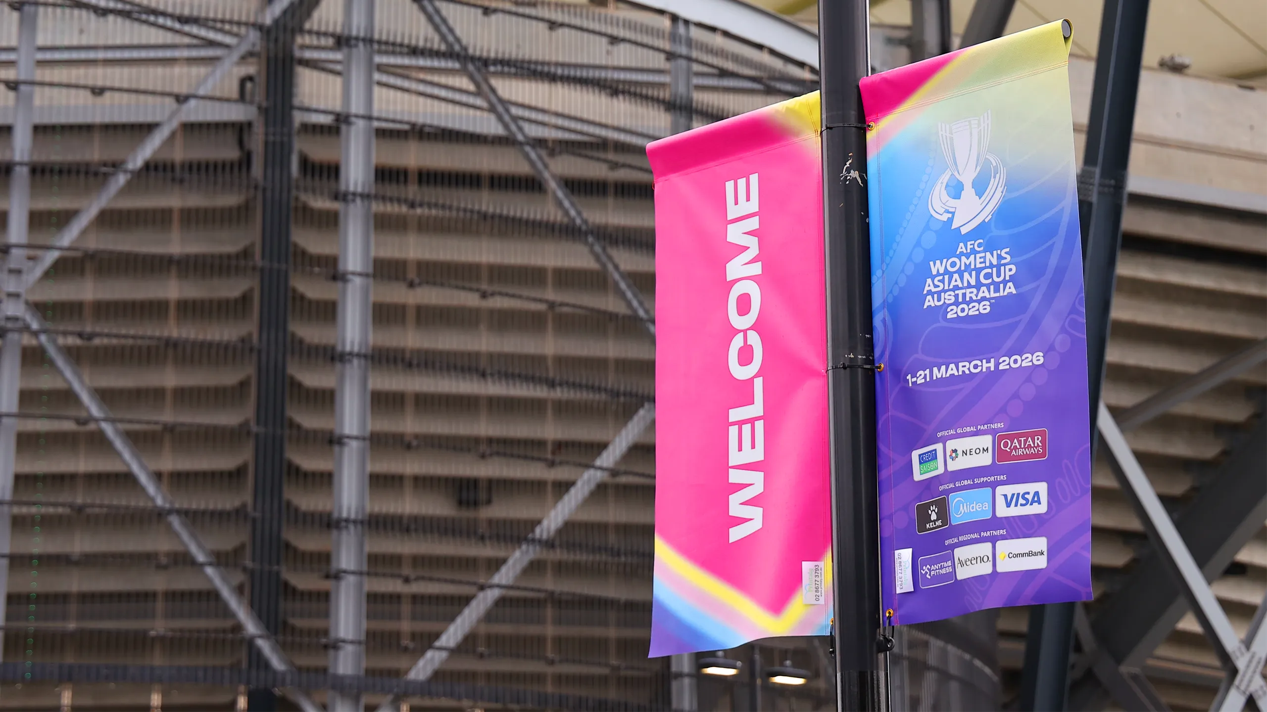
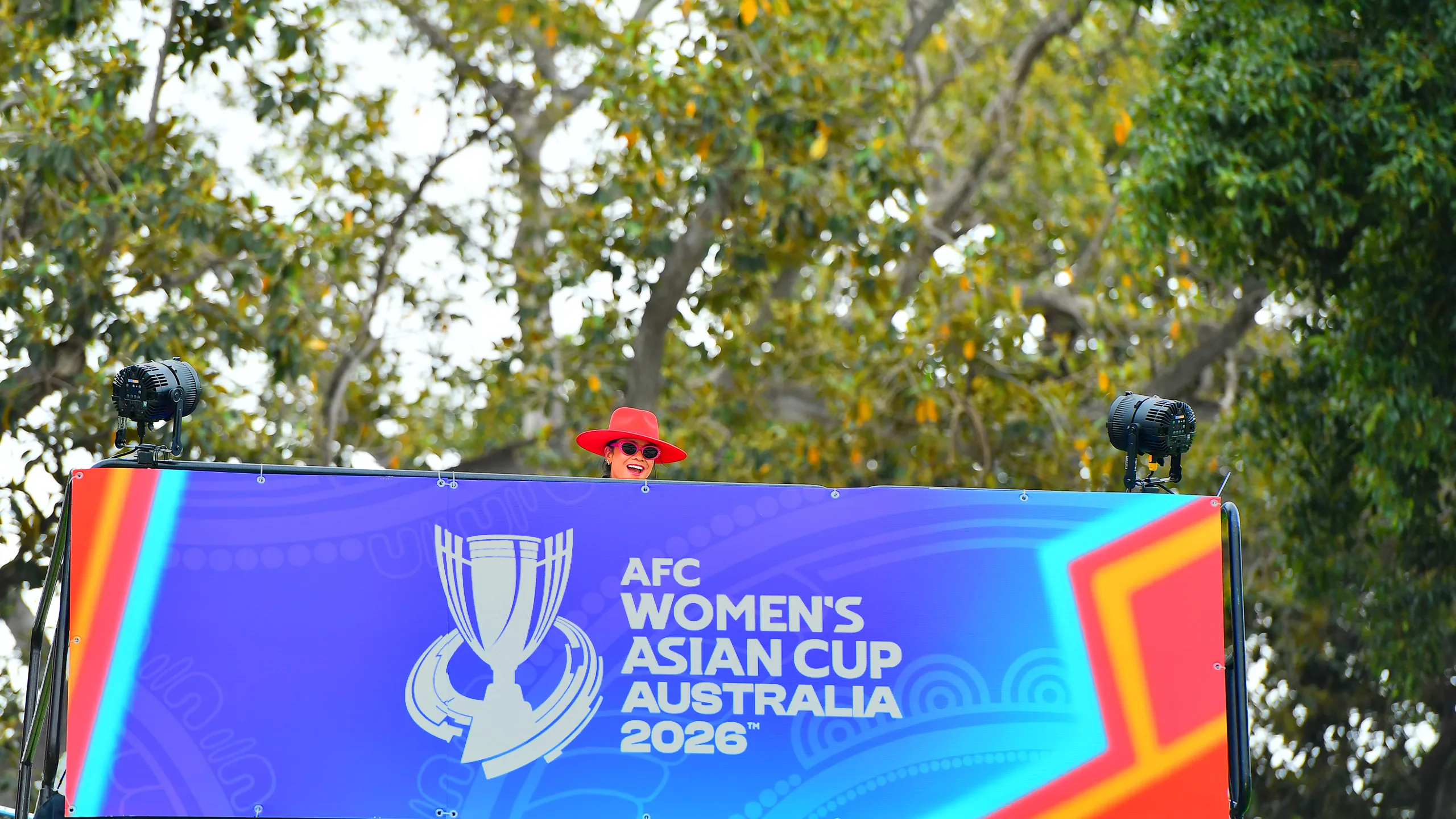
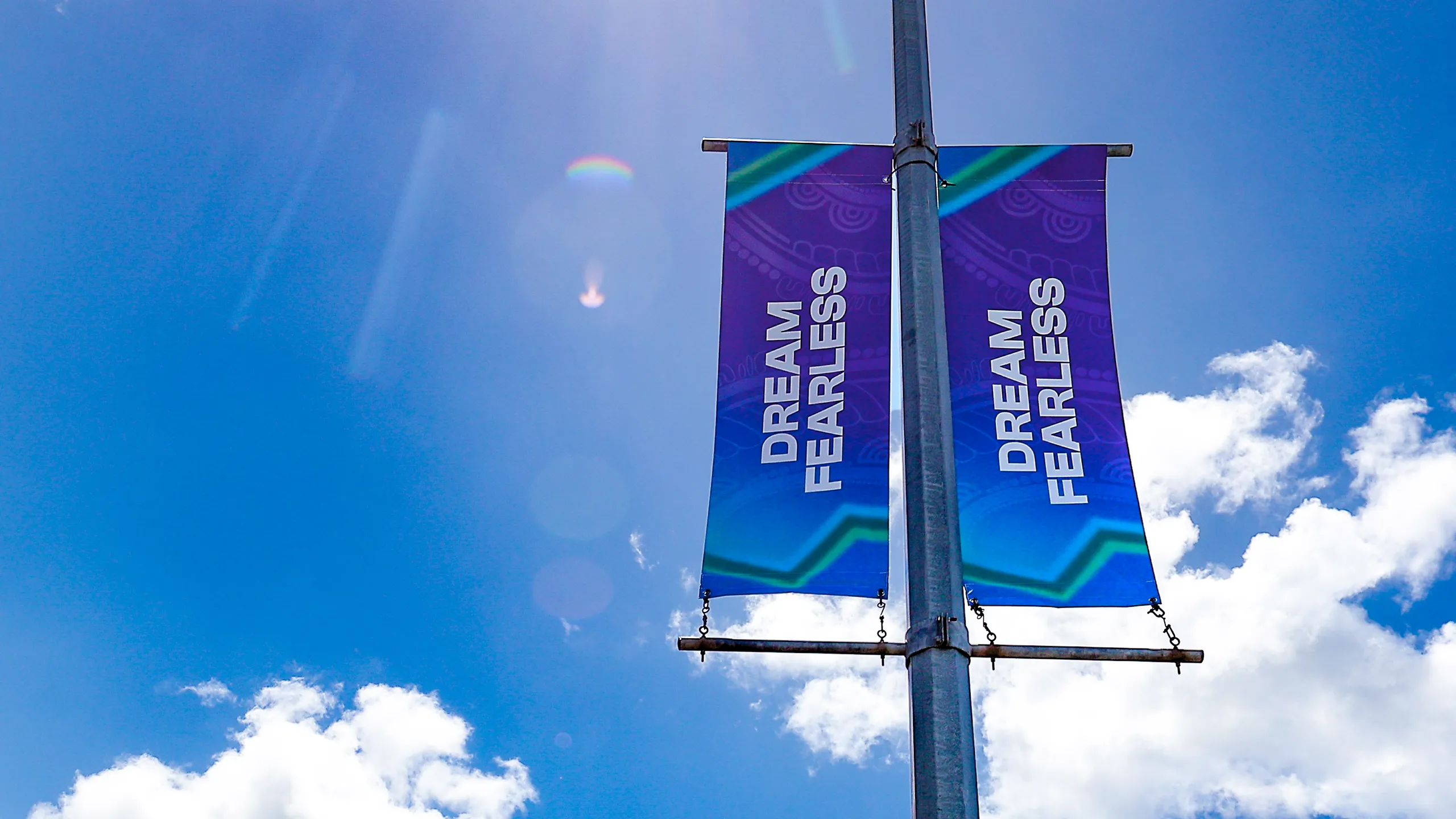
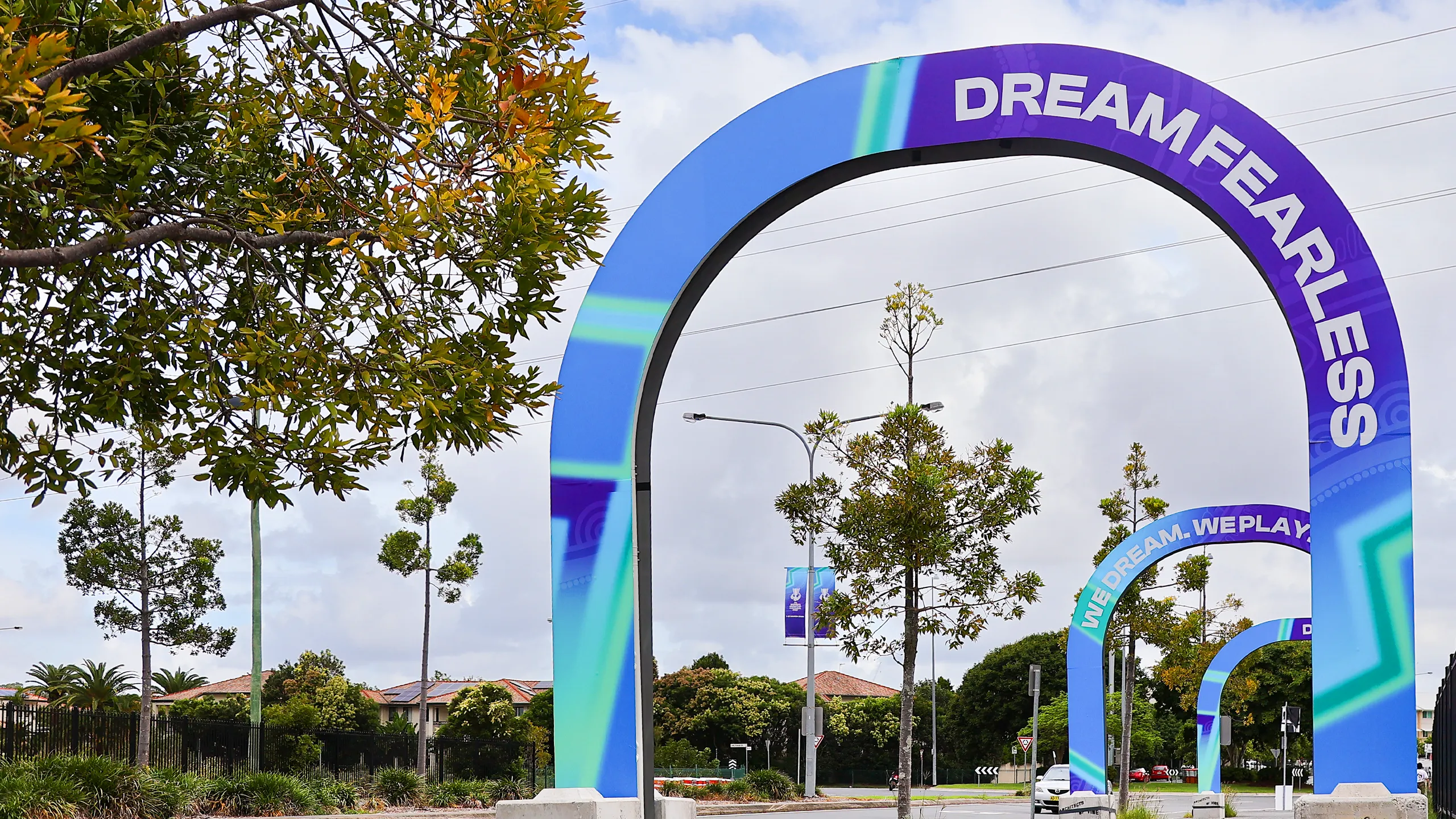
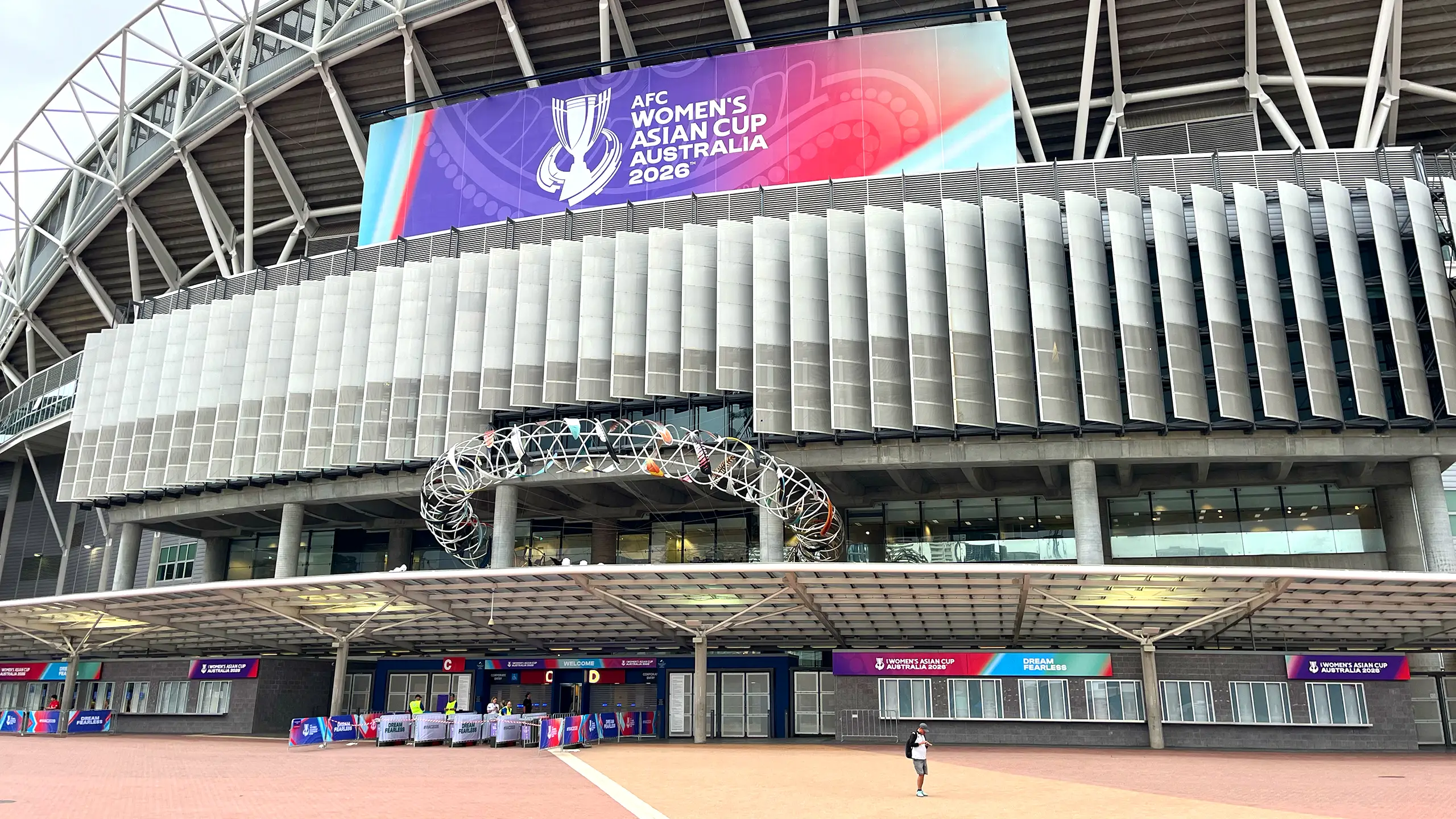
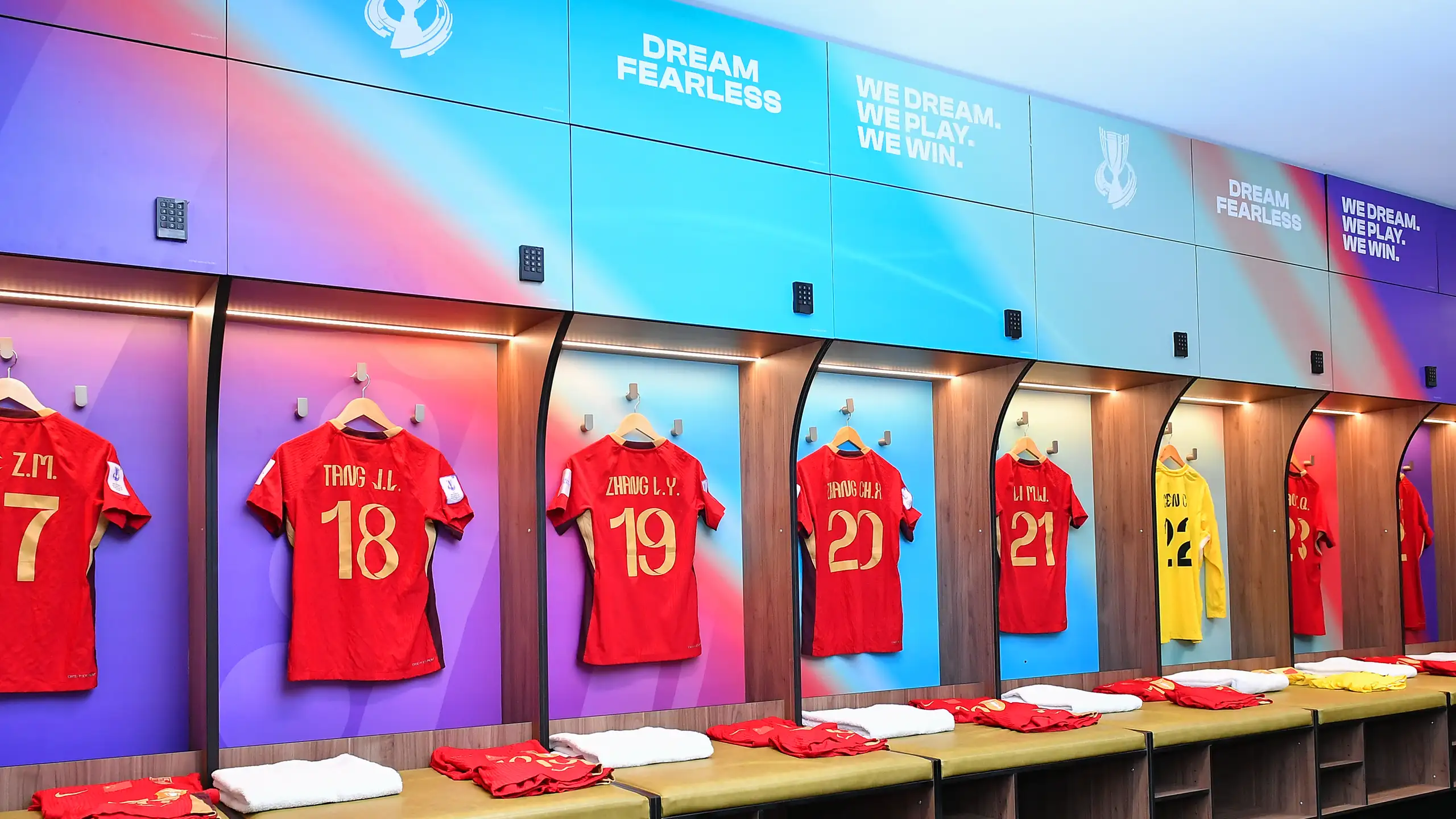
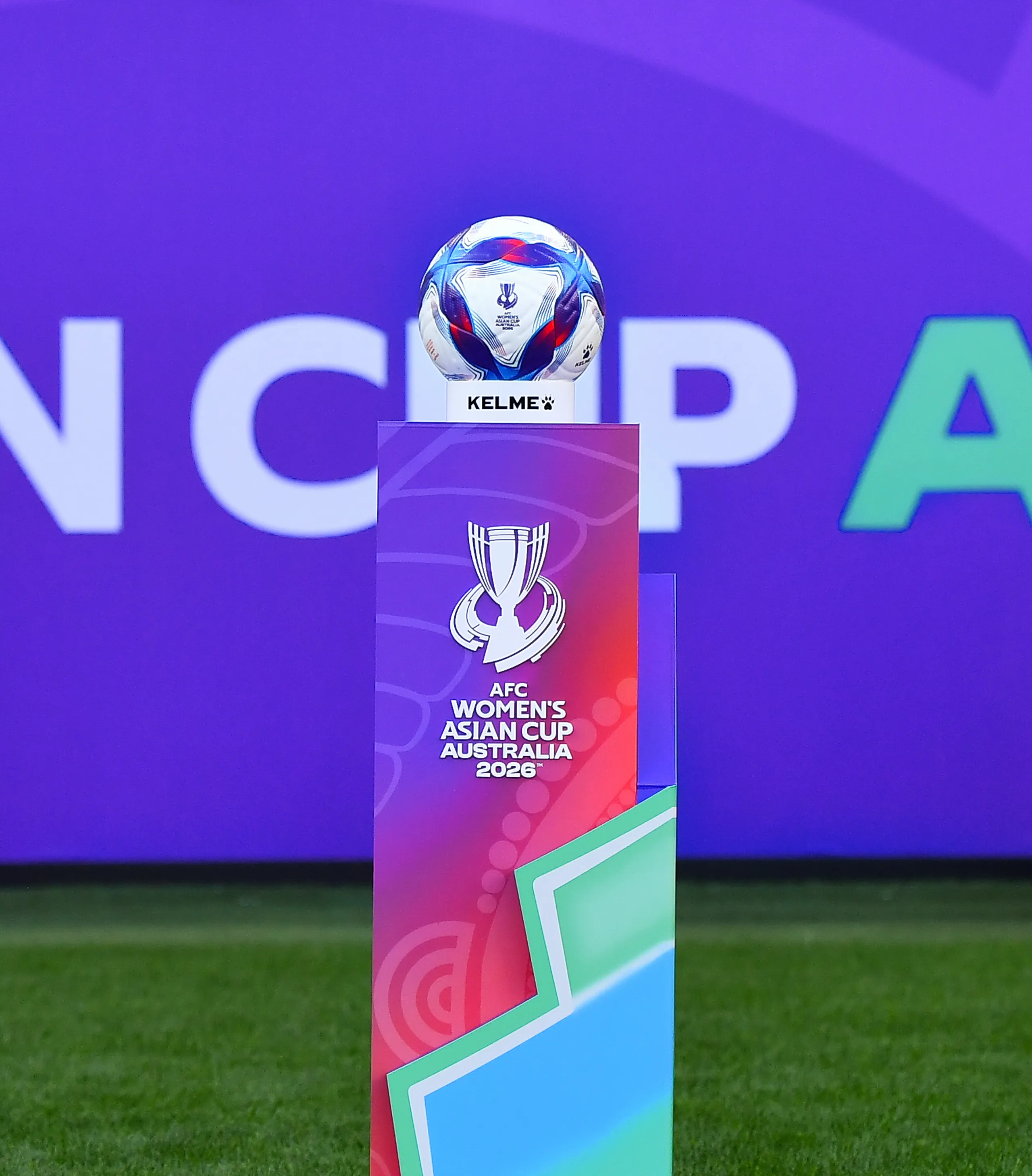
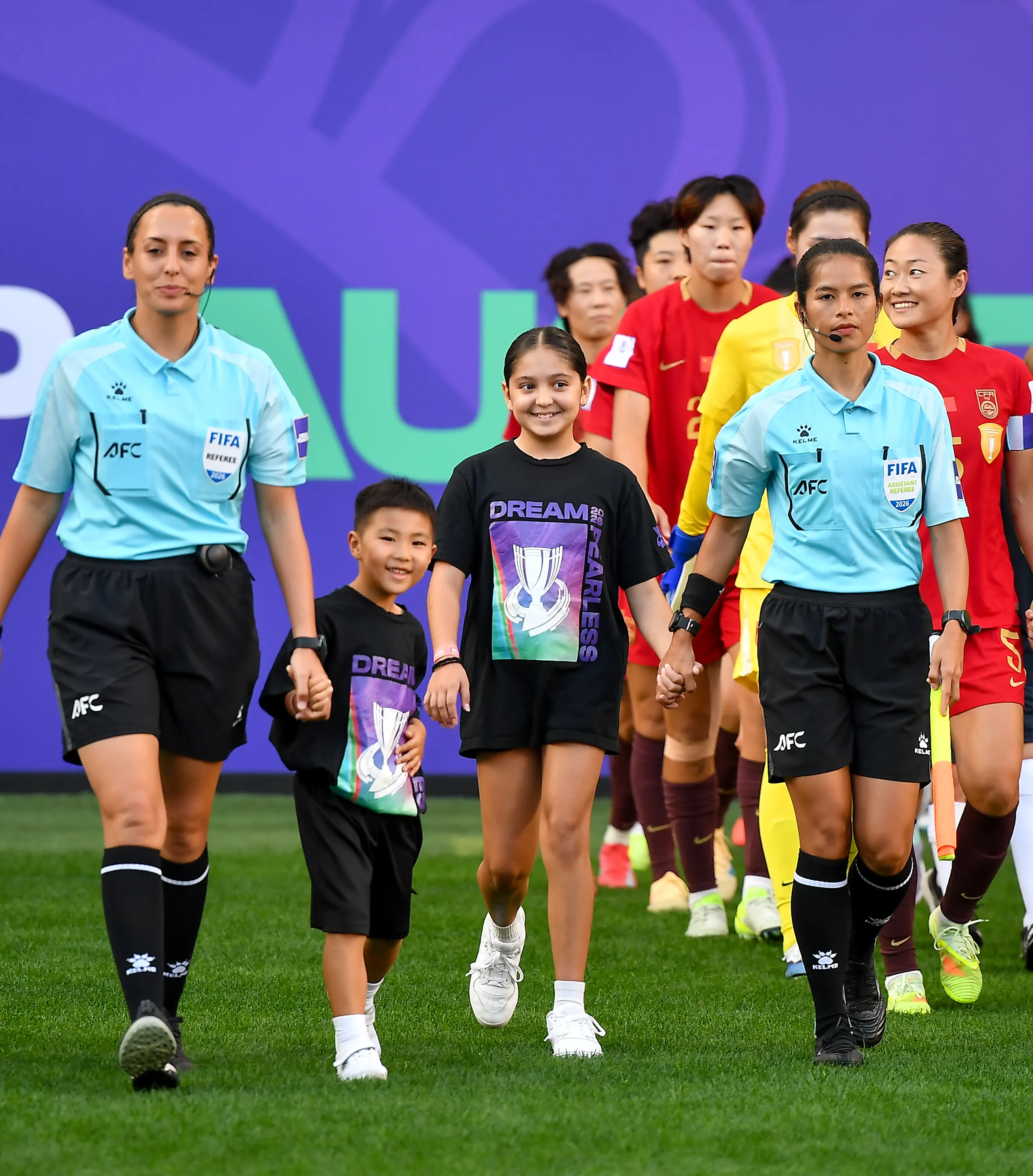
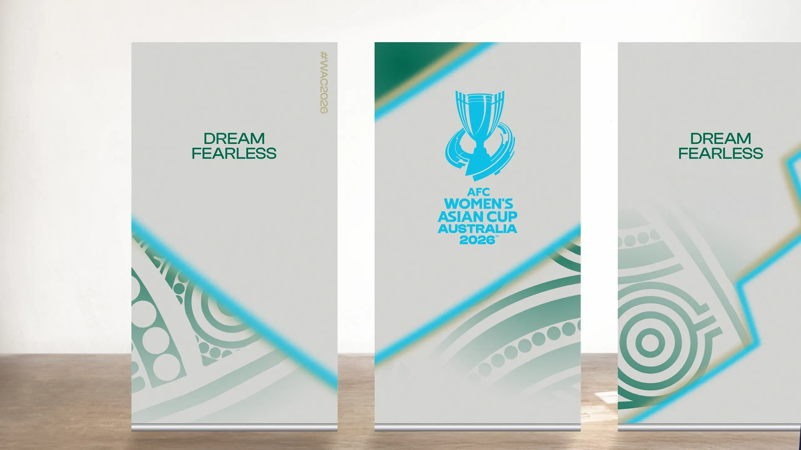
Polymath partnered with the Asian Football Confederation, Asia Football Group and the Local Organising Committee to create the complete brand for the AFC Women's Asian Cup Australia 2026™, the premier women's international football tournament in Asia and the most successful edition in the competition's history. At the heart of the project was the creation of "Dream Fearless", a bespoke brand idea and competition tagline developed by Polymath to capture the spirit of the tournament.
More than a slogan, Dream Fearless became a strategic foundation for the identity, expressing the ambition of players, the passion of fans and a bold new era for women's football on the global stage. From this idea, Polymath developed the complete identity system, from logo and visual language to broadcast, wayfinding, custom host city dressing for three cities, stadium environments, premium experiences and digital and social media, delivering a bold and cohesive brand across a competition that broke records and set a new benchmark for women's football in Asia.
Sector
Sports
CATEGORY
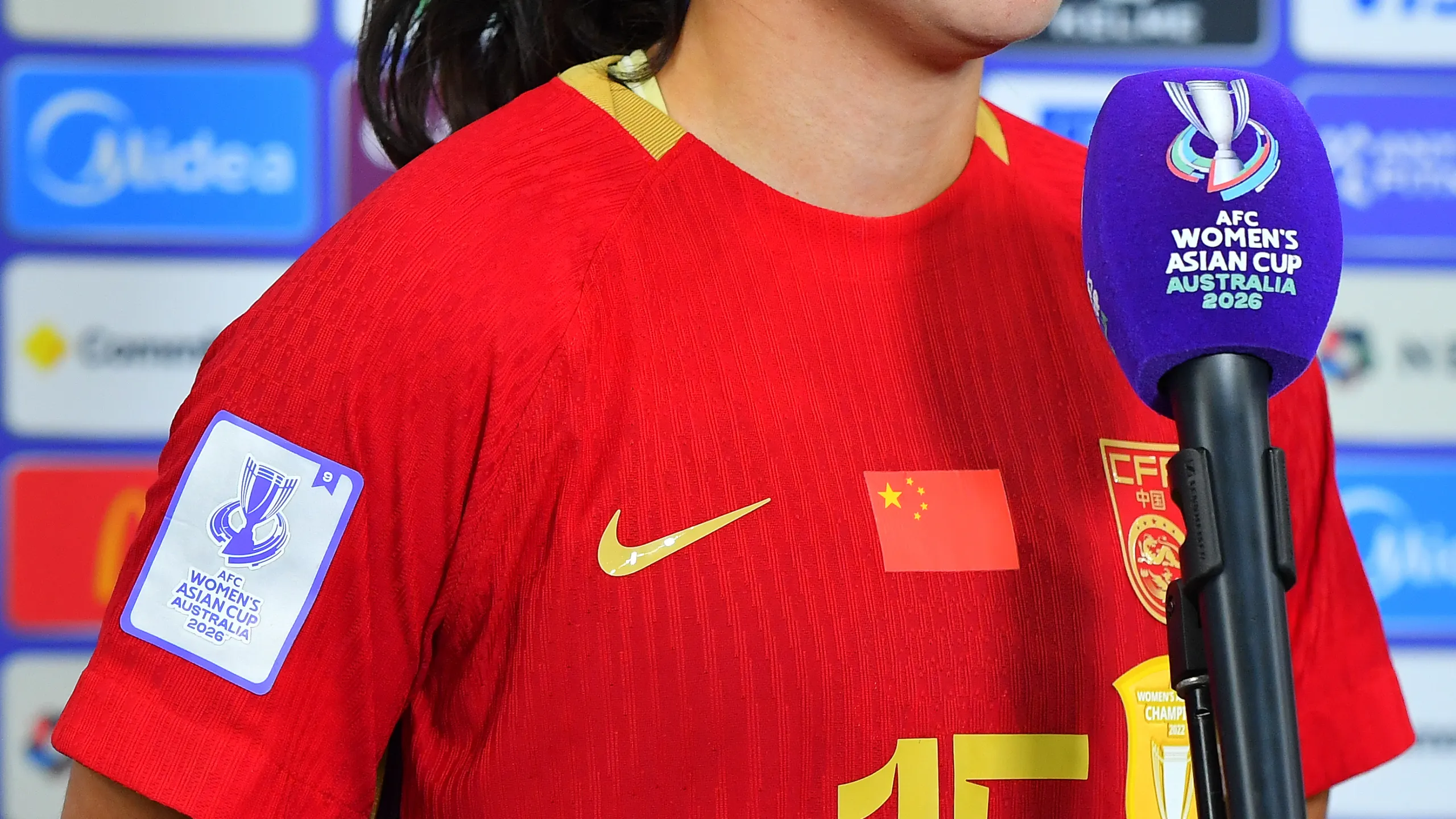
Brand Identity | Signage & Wayfinding | Merchandise | Type Design


Host City
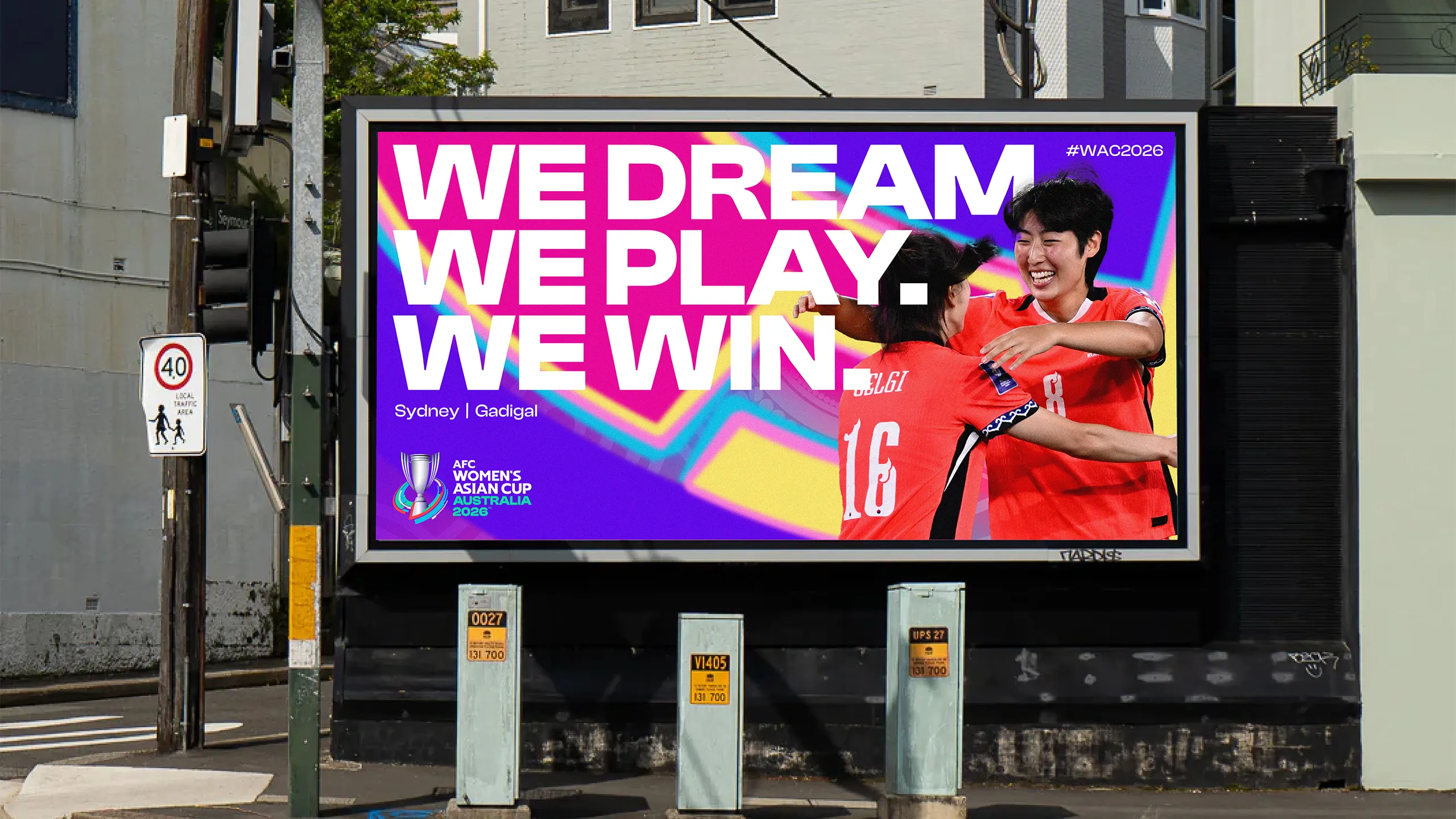
Sydney | Gadigal
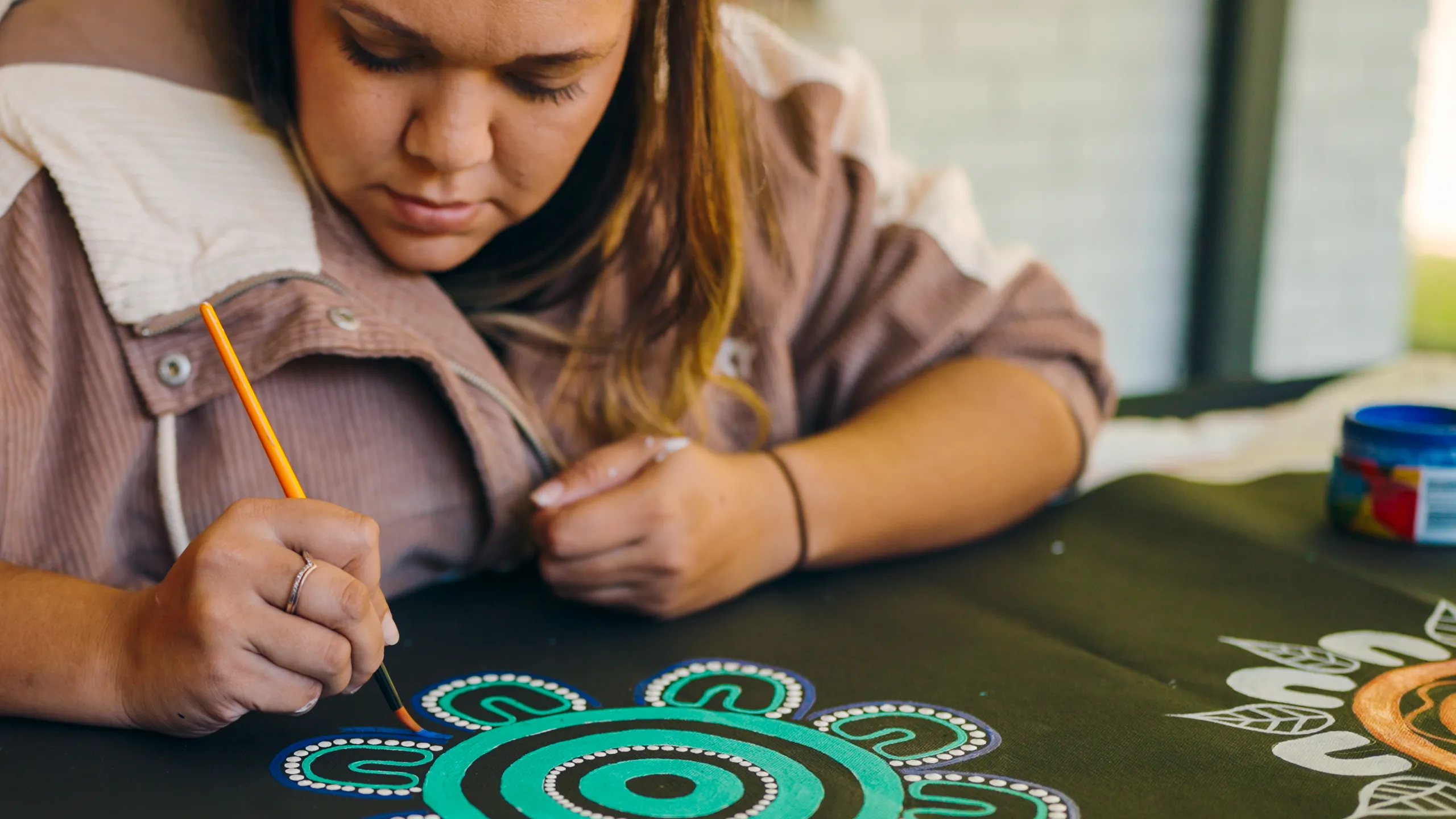
The AFC Women's Asian Cup Australia 2026™ presented a unique creative challenge, with the brand requiring a distinct localised identity for each of its three host cities, ensuring the tournament felt rooted in each location while remaining cohesive as a whole. A key part of this was honouring the First Nations names of each city, with Perth, Sydney and the Gold Coast recognised alongside their Aboriginal names of Boorloo, Gadigal and Kombumerri Country respectively, embedded throughout the brand system as an expression of respect and cultural acknowledgement.
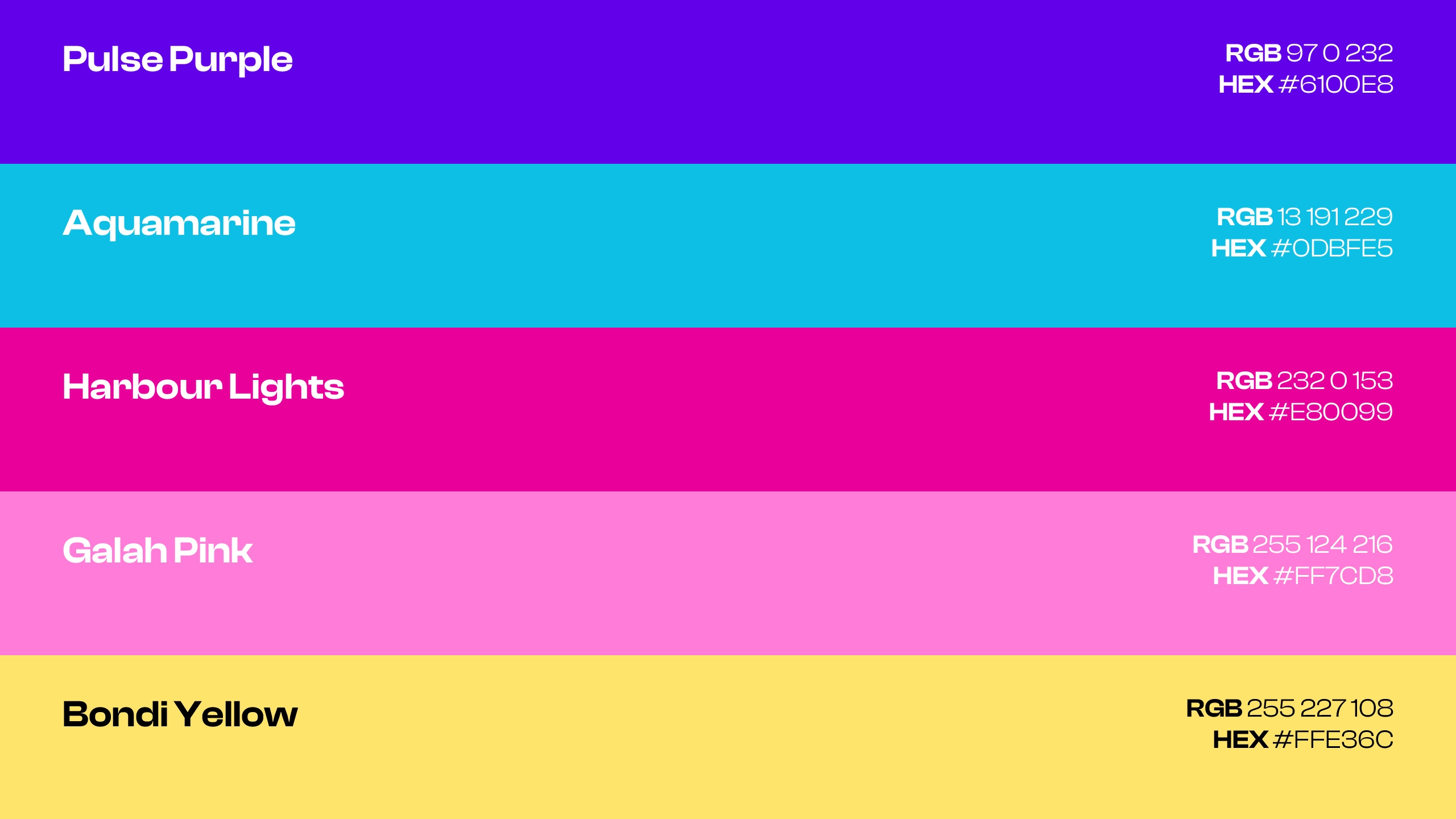
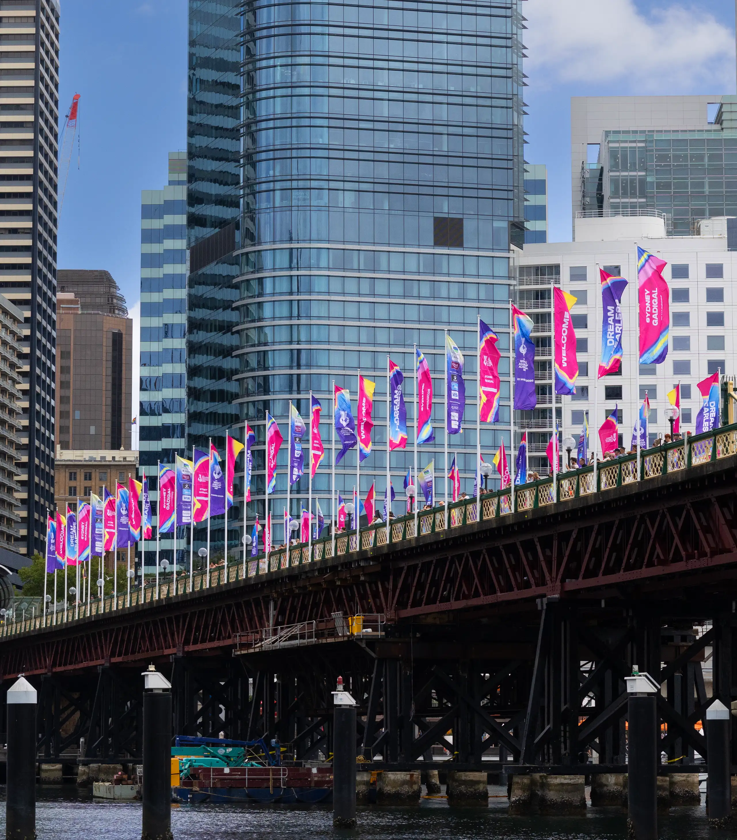
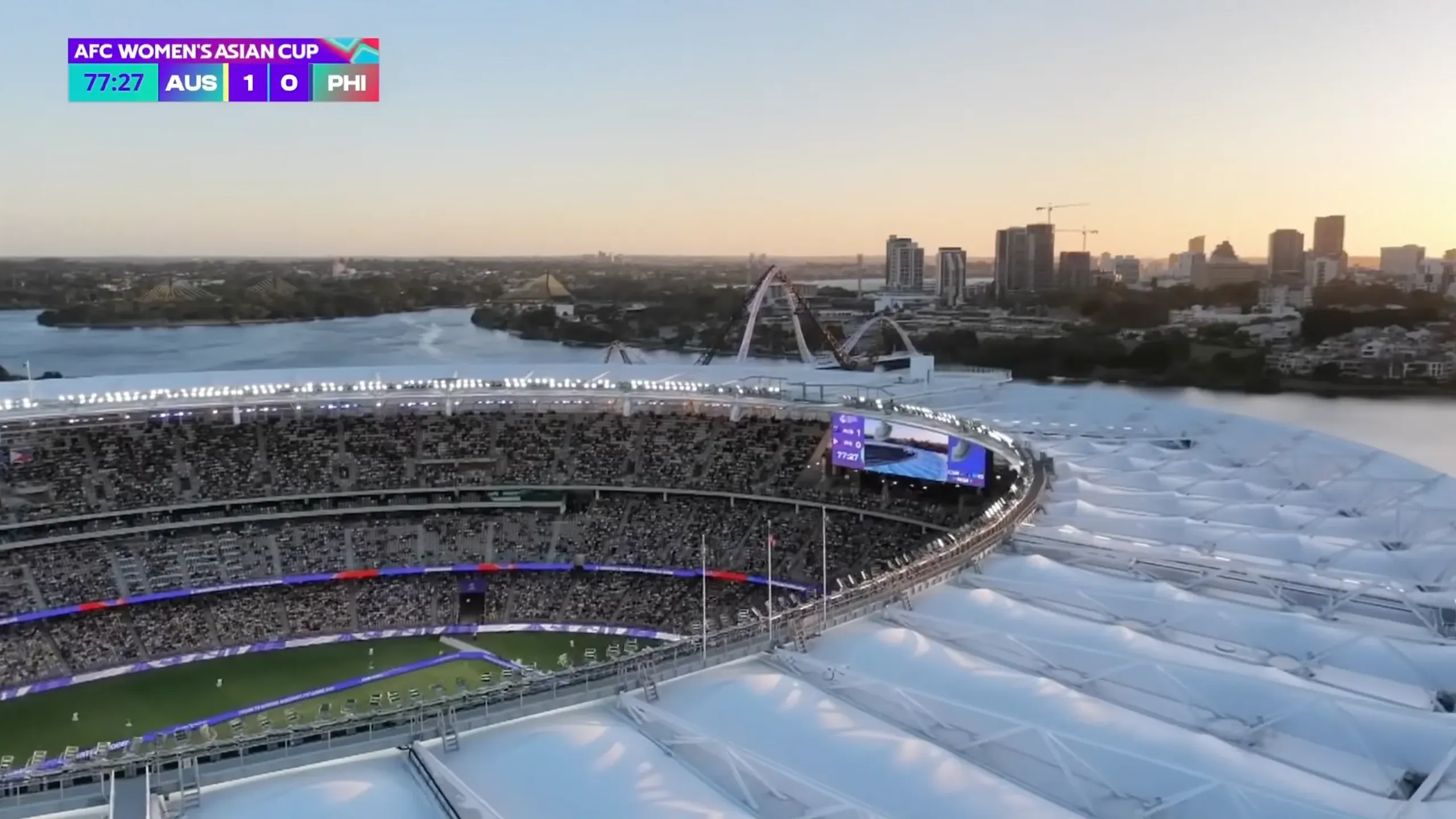
For Sydney | Gadigal, the host city palette paired the tournament's connecting colours with three dedicated supporting colours in Harbour Lights, Galah Pink and Bondi Yellow, capturing the energy and vibrancy of one of the world's most iconic cities. Applied across the entire city from billboards and street banners to bridge dressing and fan zones, the scale of the rollout transformed Sydney into a vivid expression of the tournament, bringing the brand to life across a city that was home to the closing ceremony and final.
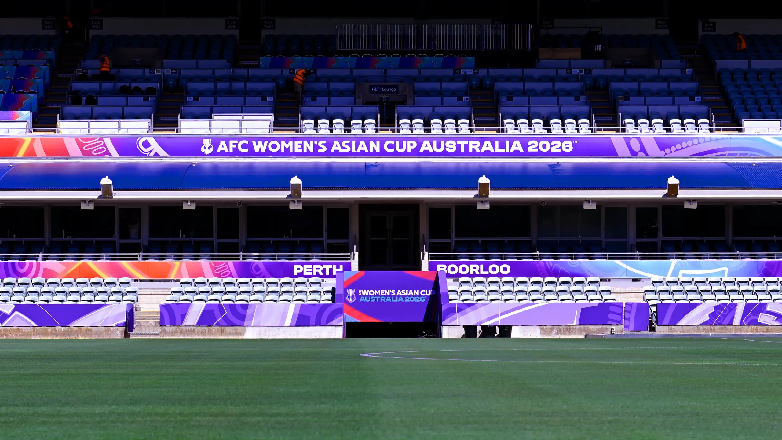
Host City
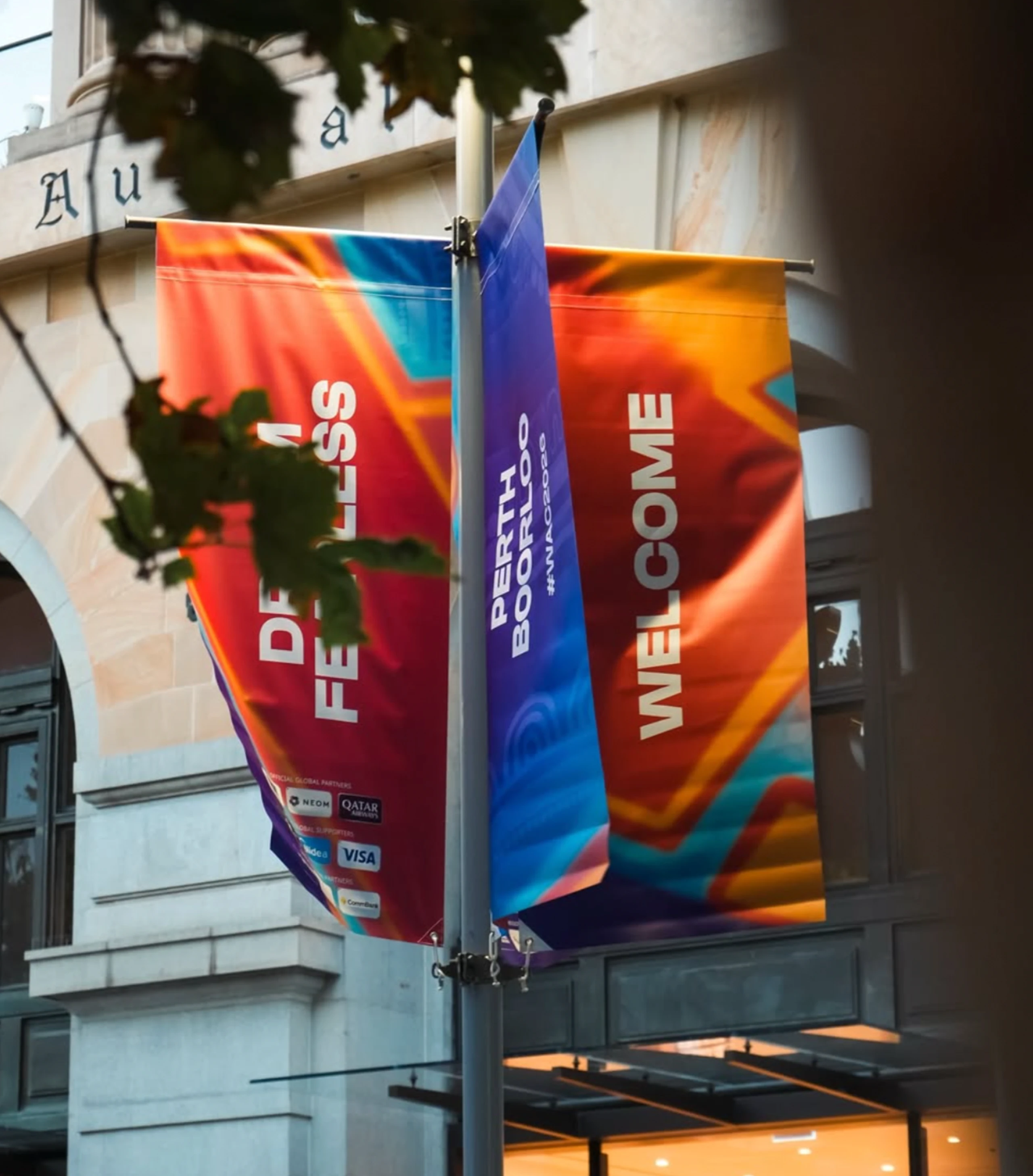
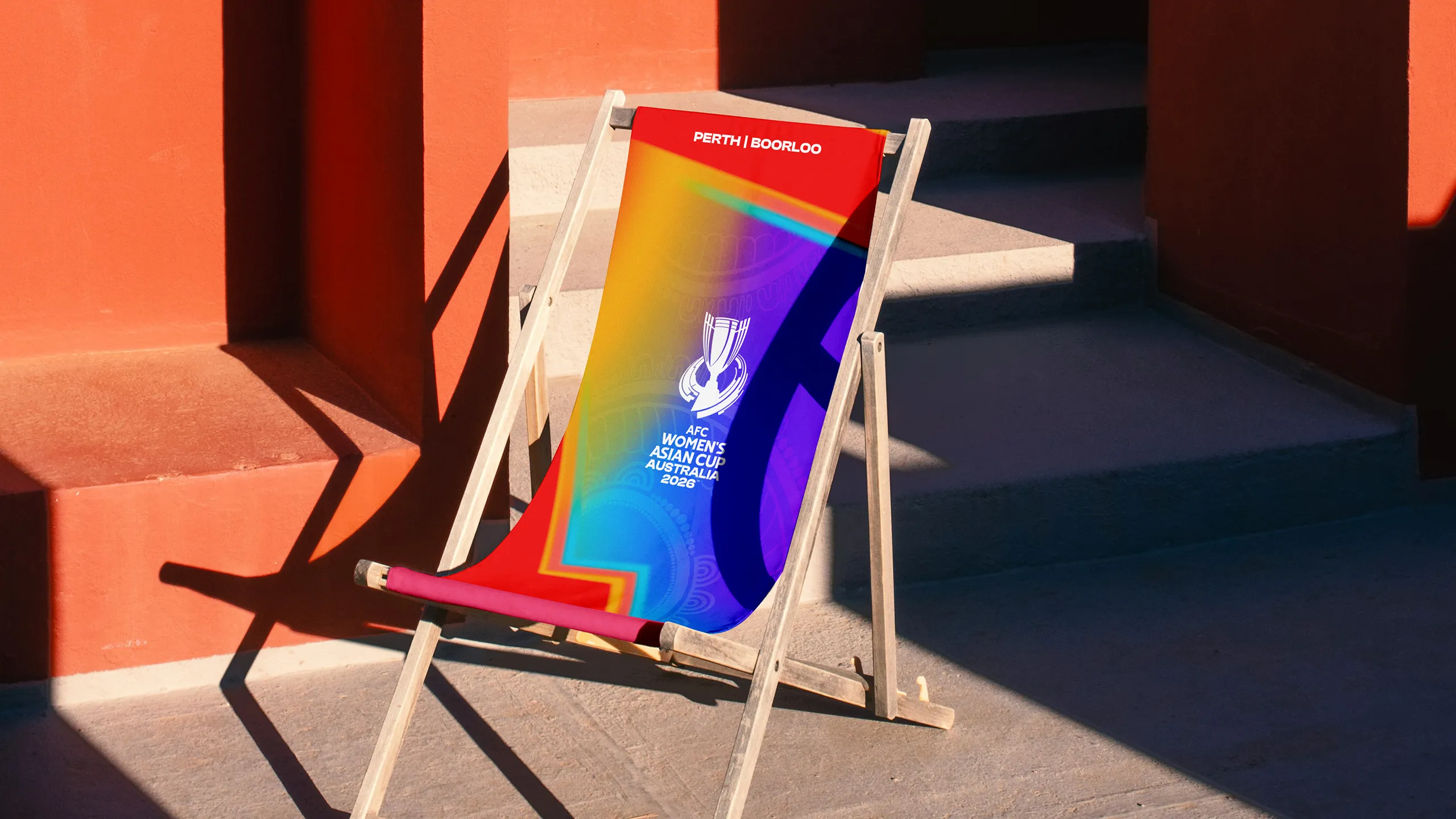
Perth | Borloo
For Perth | Boorloo, the host city palette paired the tournament's connecting colours with three dedicated supporting colours in Ocean Sunset, Golden Hour and Warm Sand, reflecting the city's iconic skies, coastline and sun-drenched character. Applied across street banners, fan zones and city dressing, the palette brought an unmistakable sense of place to the tournament's opening host city.

Host City
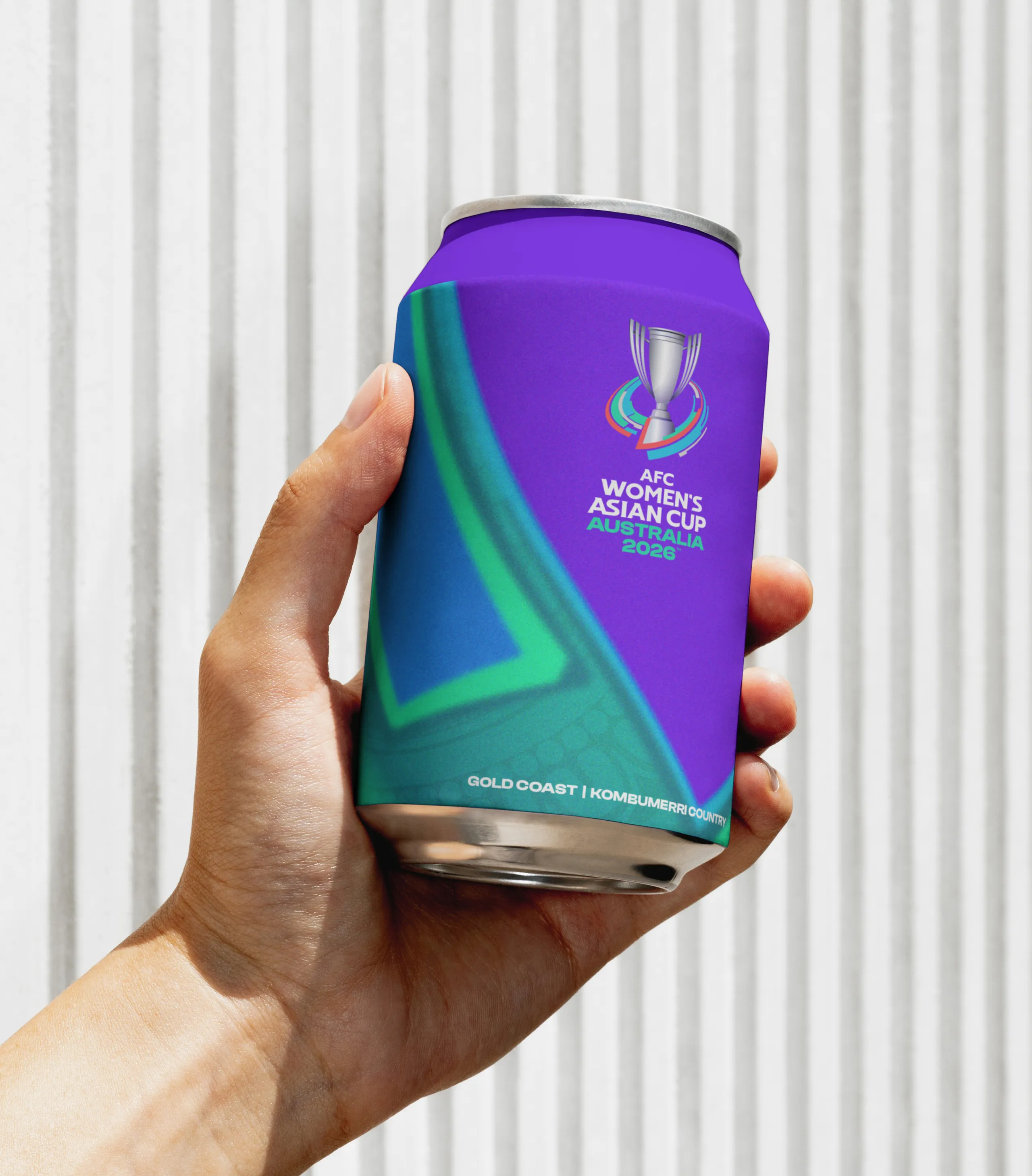
Gold Coast | Kombumerri Country
For Gold Coast | Kombumerri Country, Pacific Waves, Ancient Forest and Eucalyptus captured the city's natural contrasts of ocean, rainforest and native landscape, bringing a genuine sense of place to every application across city dressing and fan zones.

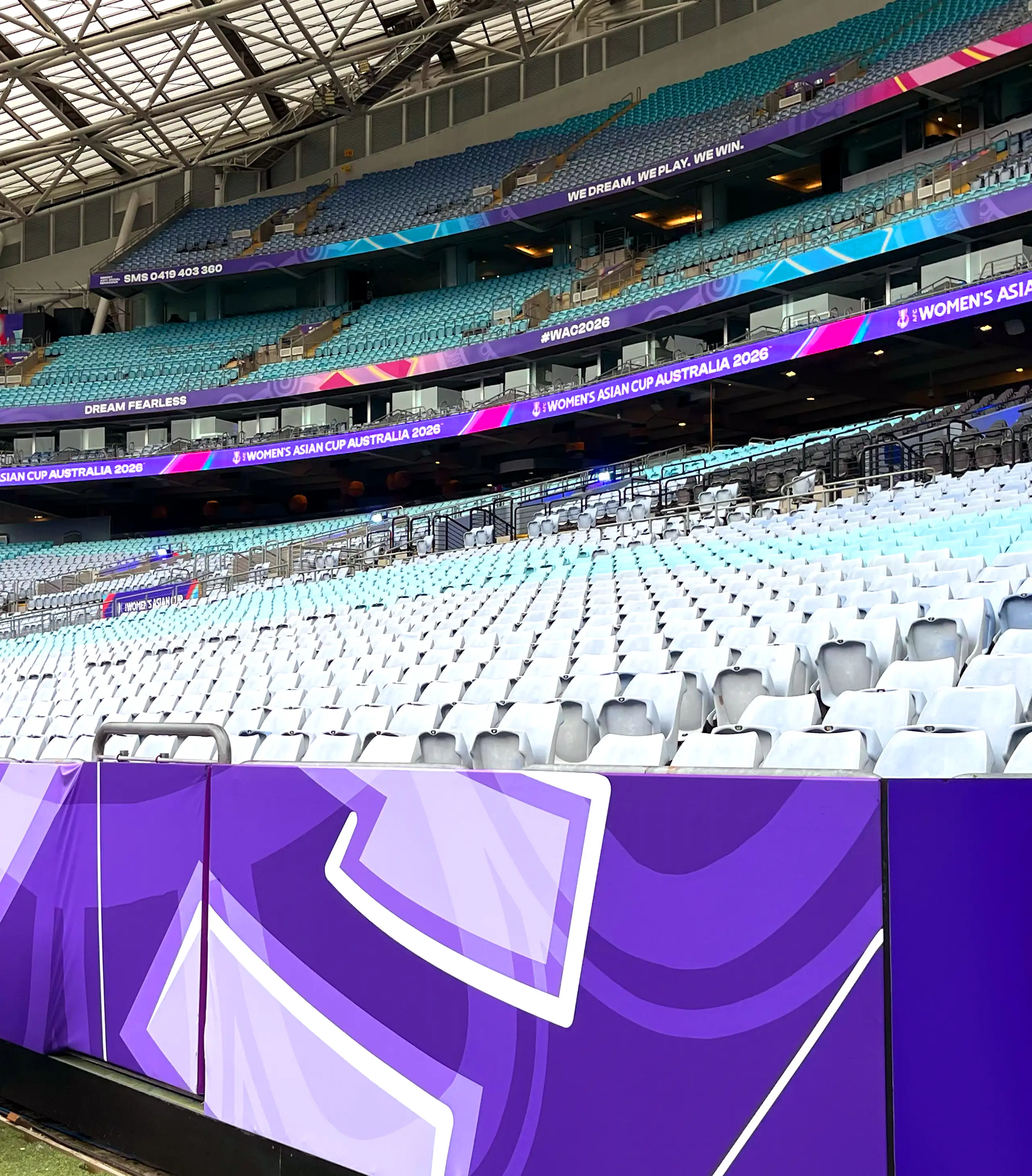
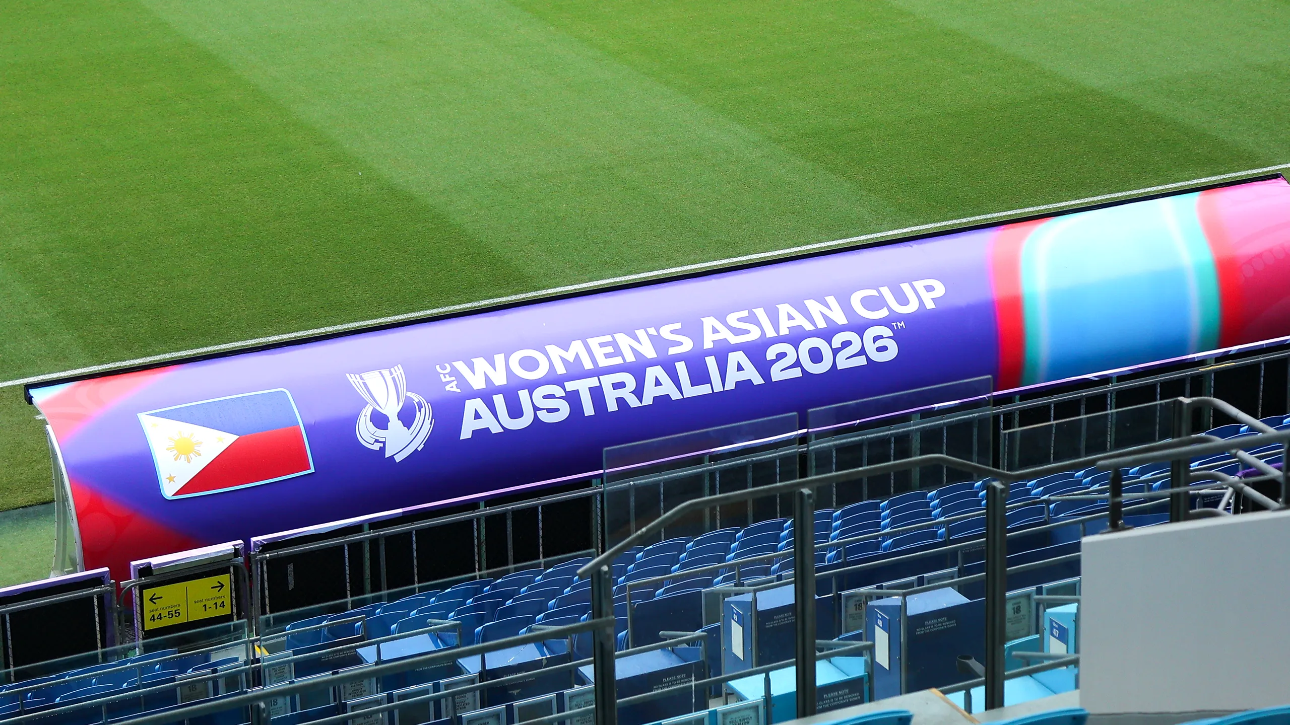
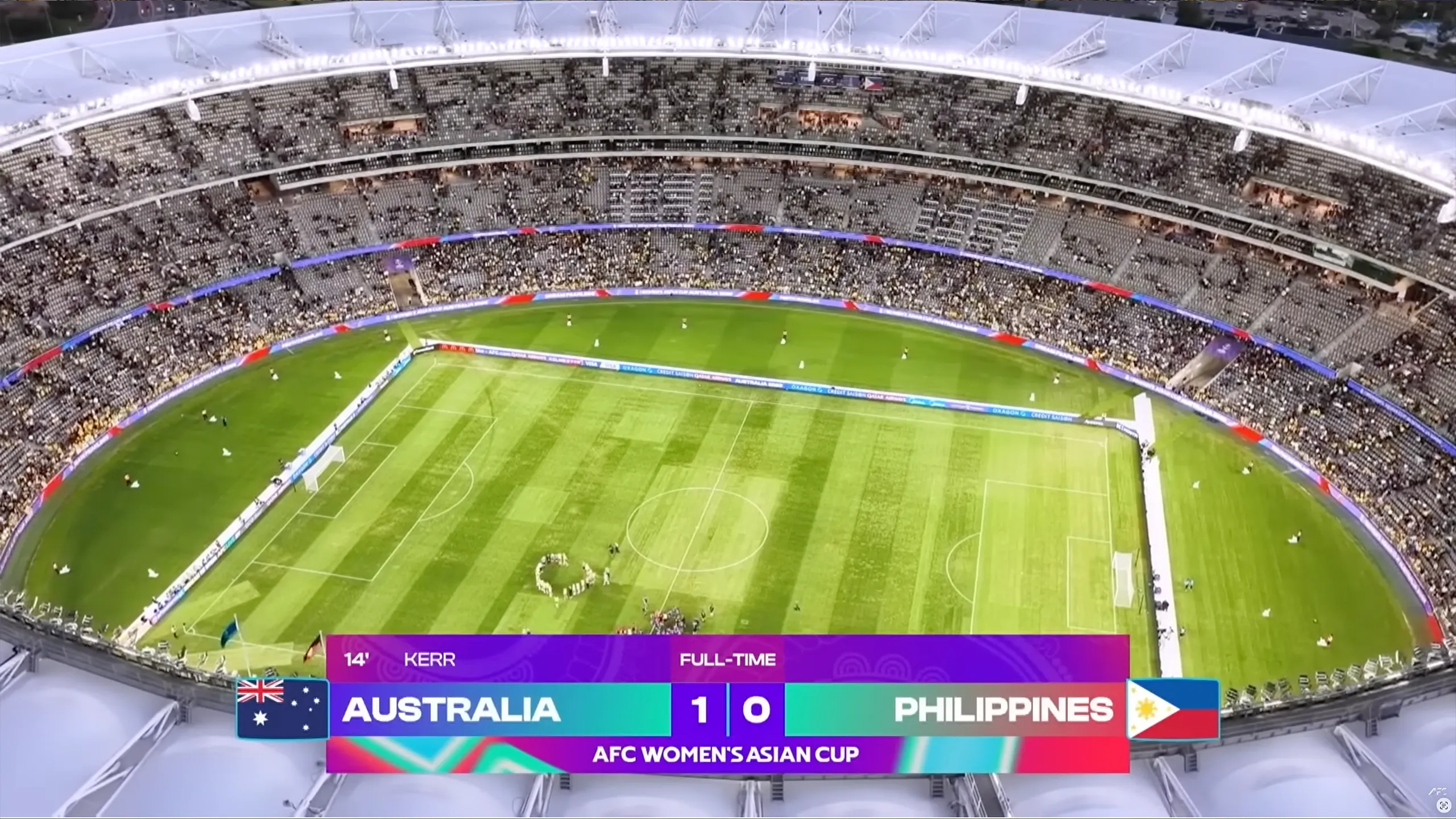
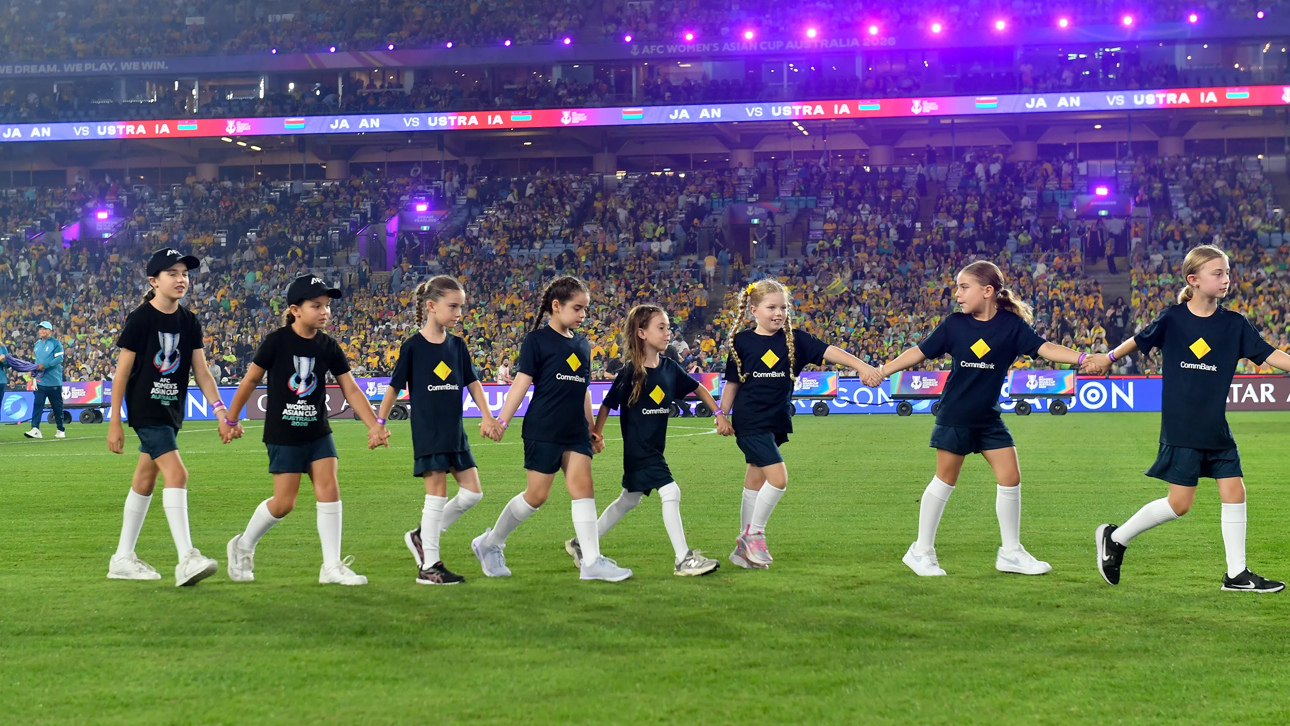
Stadiums
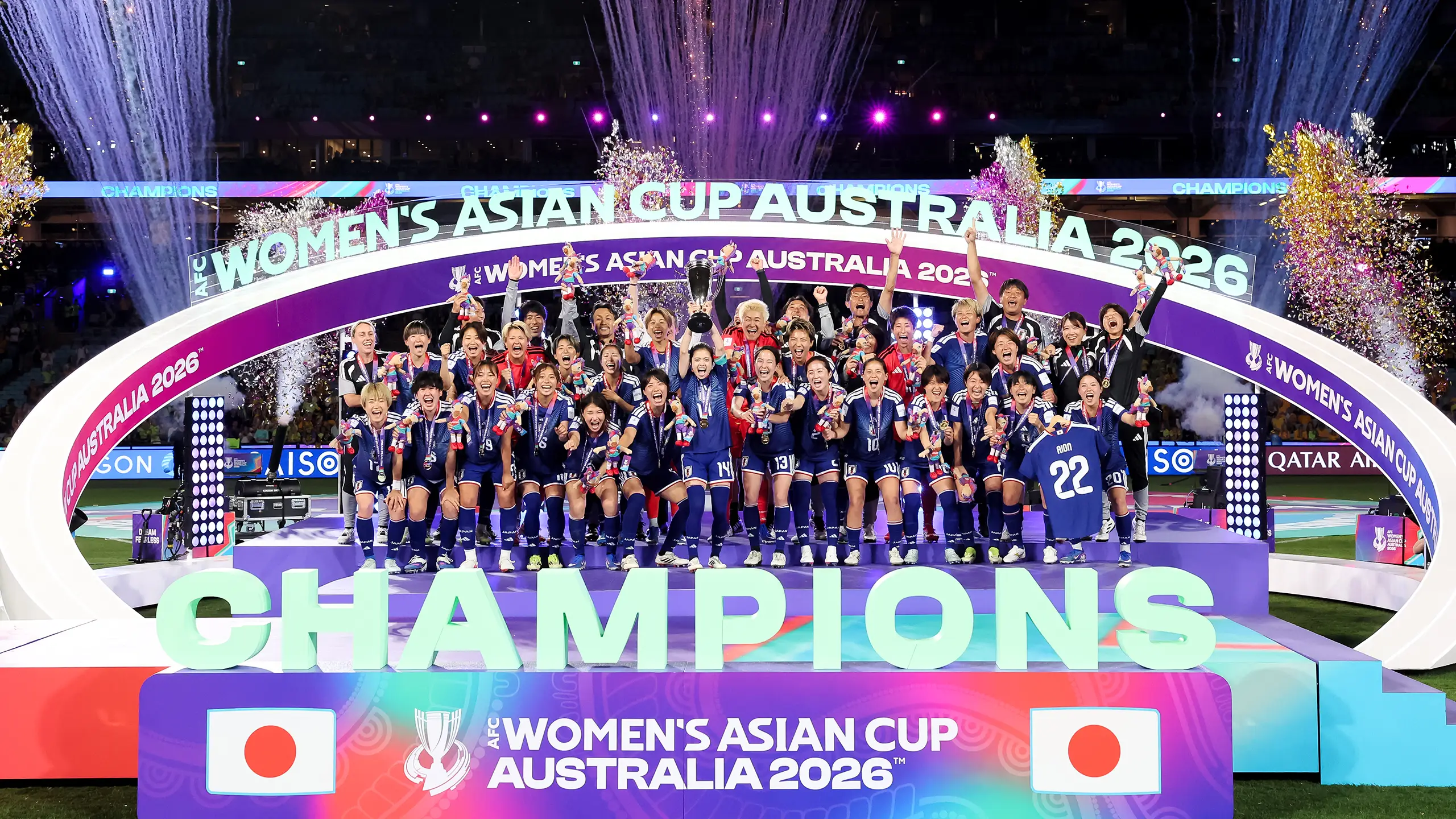
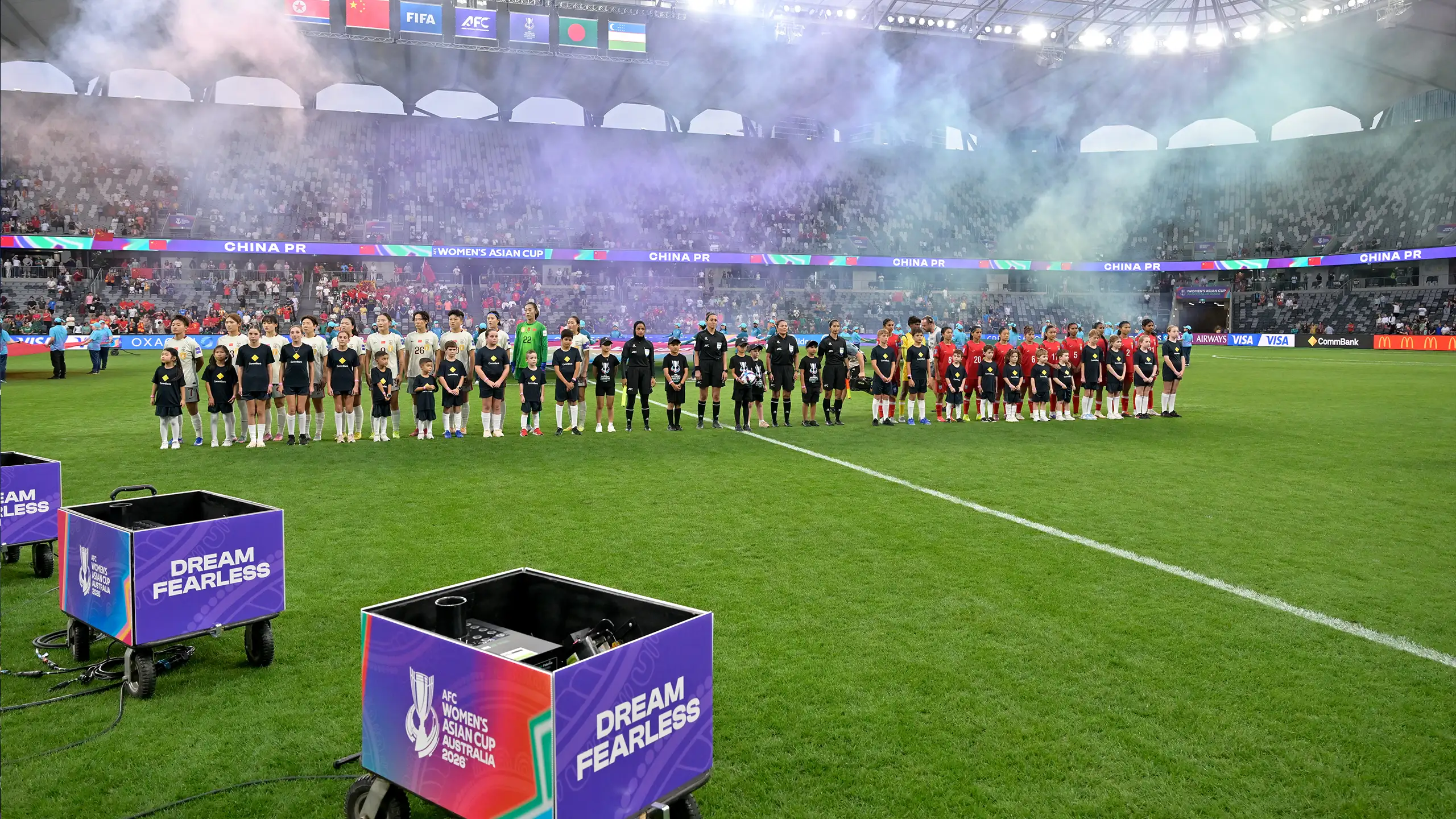
The AFC Women's Asian Cup Australia 2026™ brand came to life across five venues in Perth | Boorloo, Gold Coast | Kombumerri Country and Sydney | Gadigal, with a comprehensive stadium dressing system built on the core brand purple, layered with indigenous patterns and textures to create depth, rhythm and cultural resonance across scrims, perimeter boards and LED applications. Each host city was given its own dedicated tier dressing system, ensuring every venue felt locally engrained while remaining cohesive with the wider tournament identity.
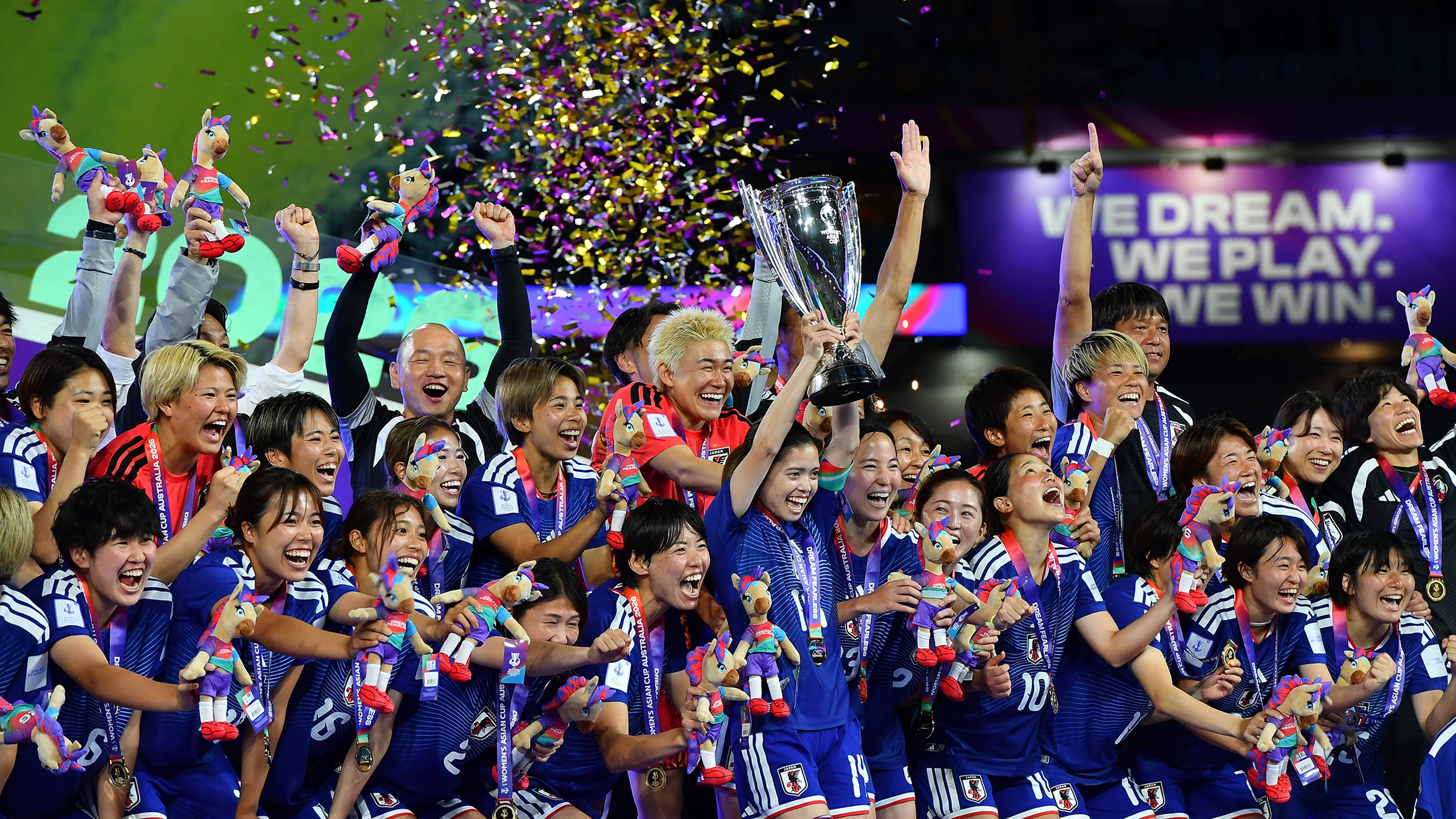
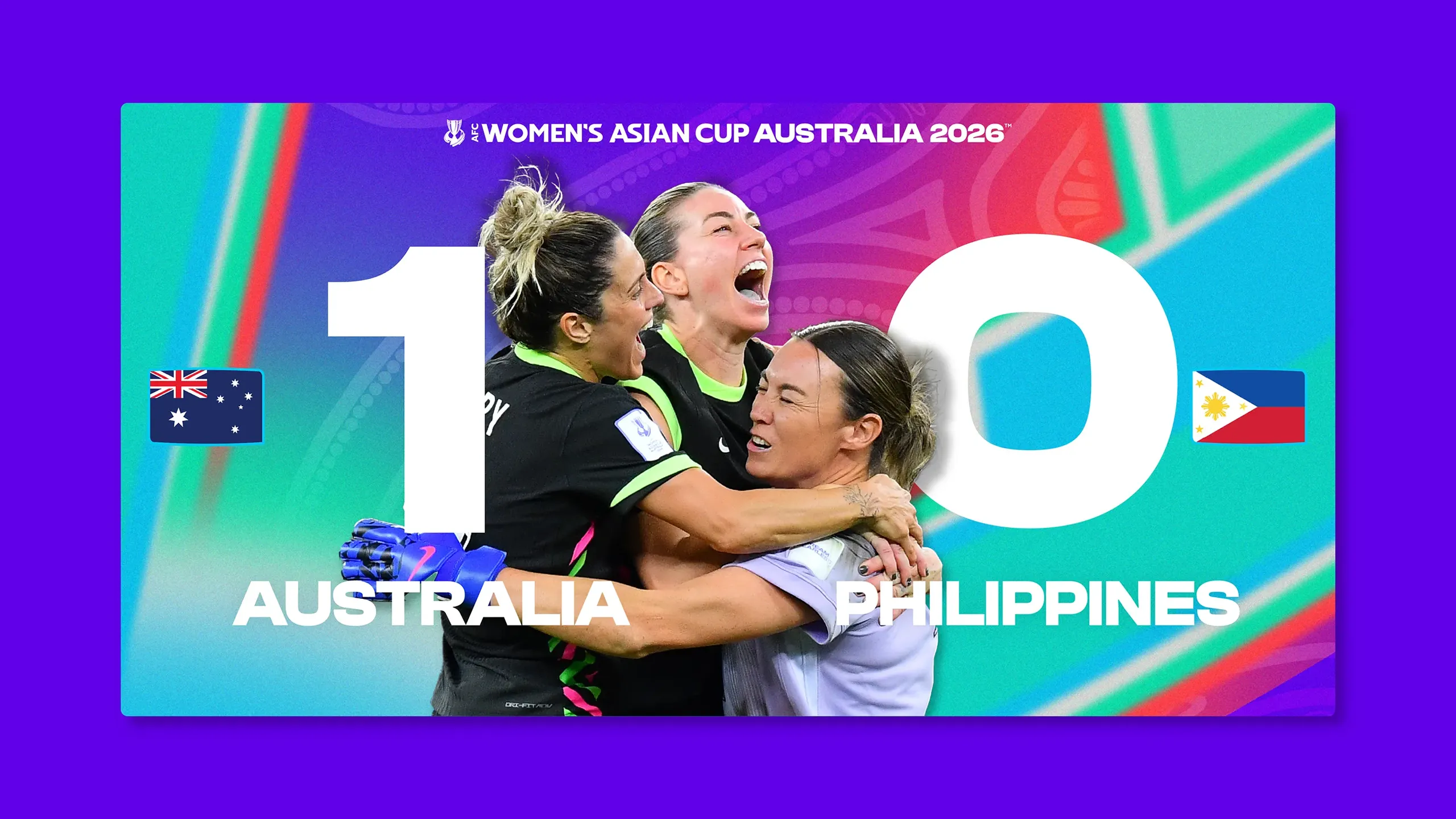
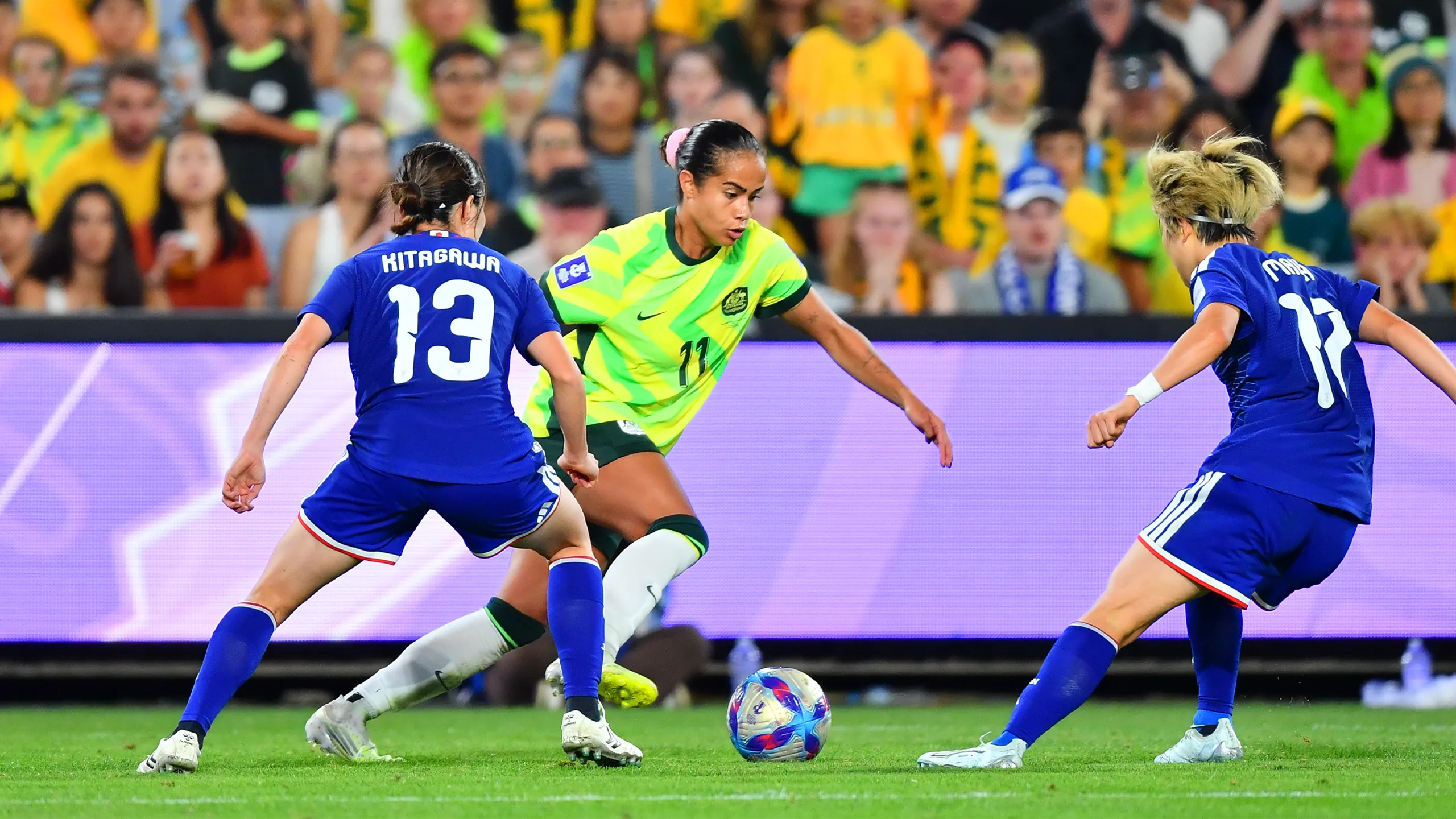
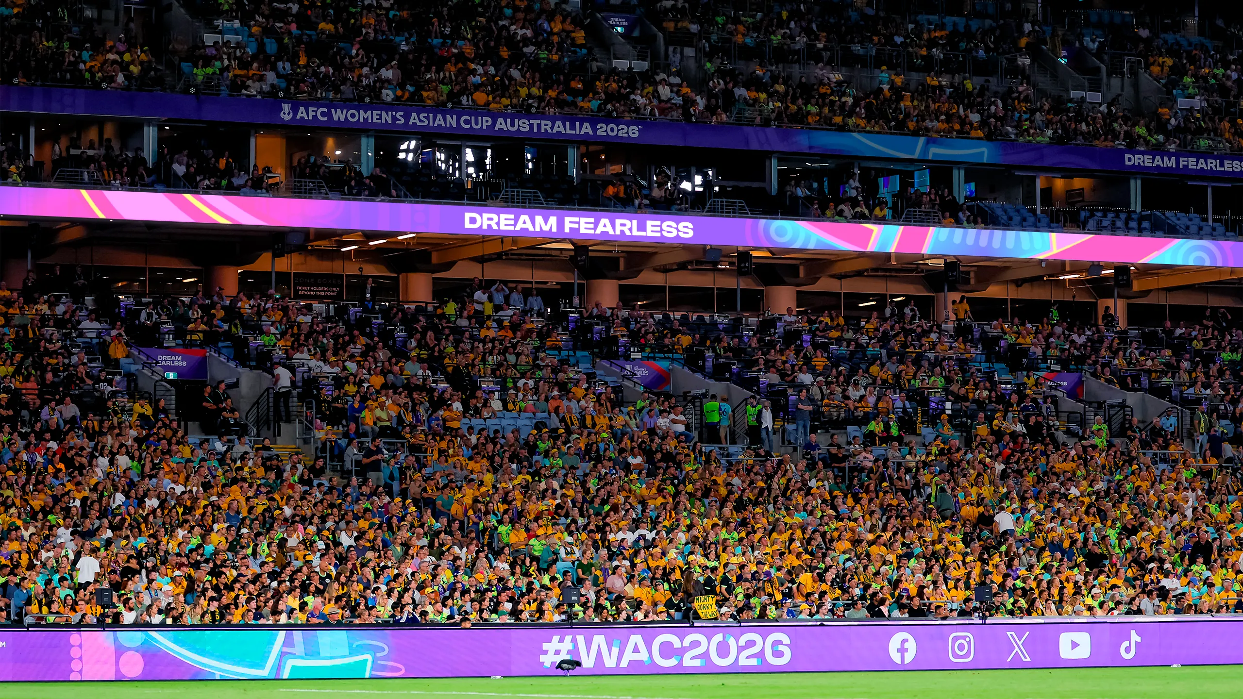
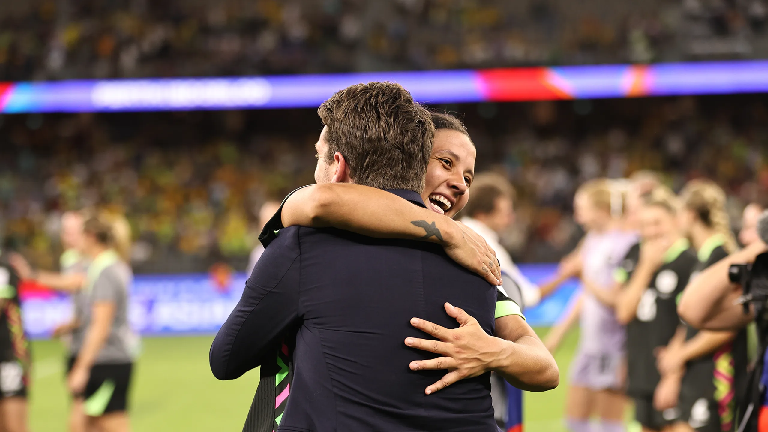
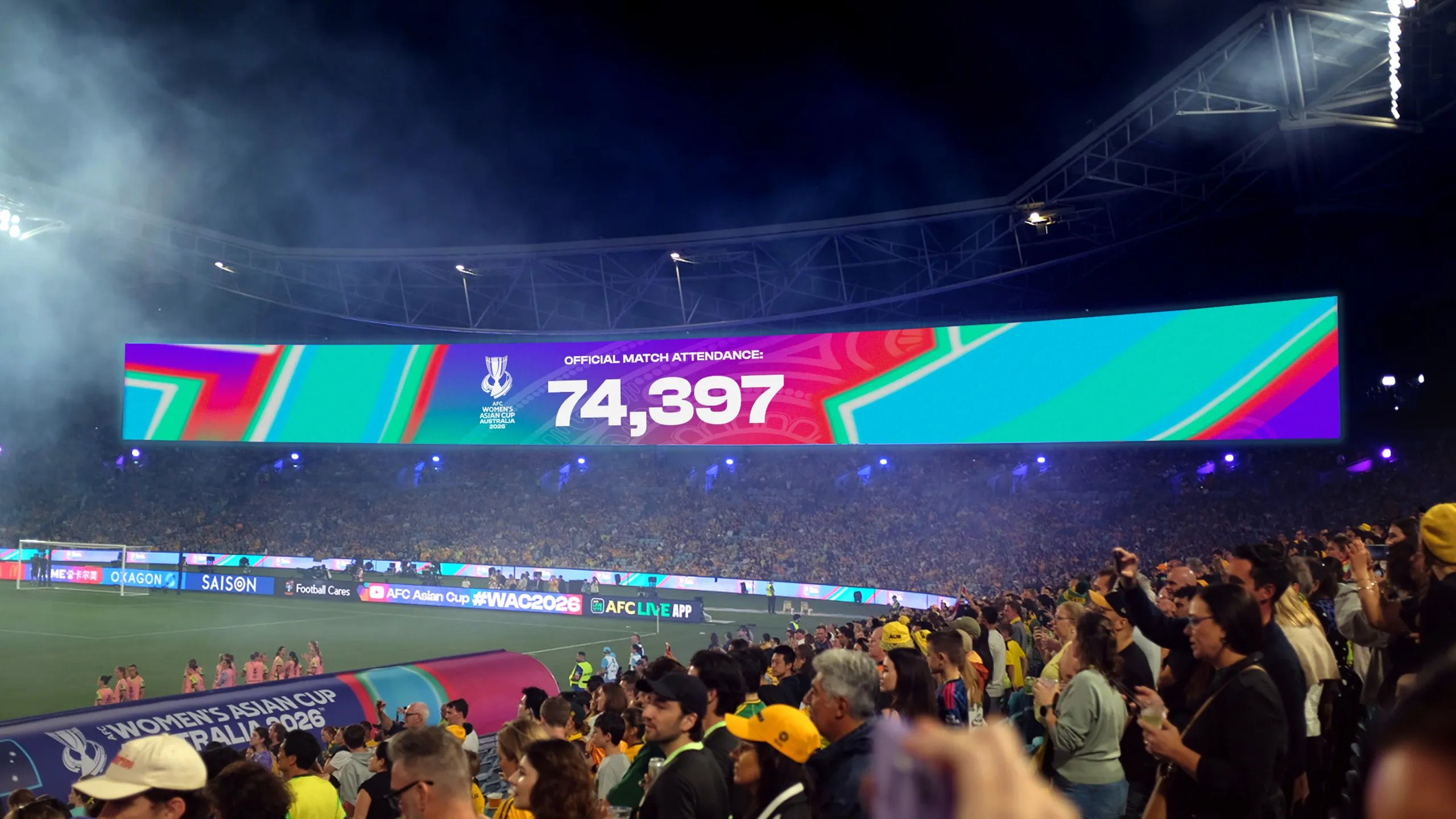
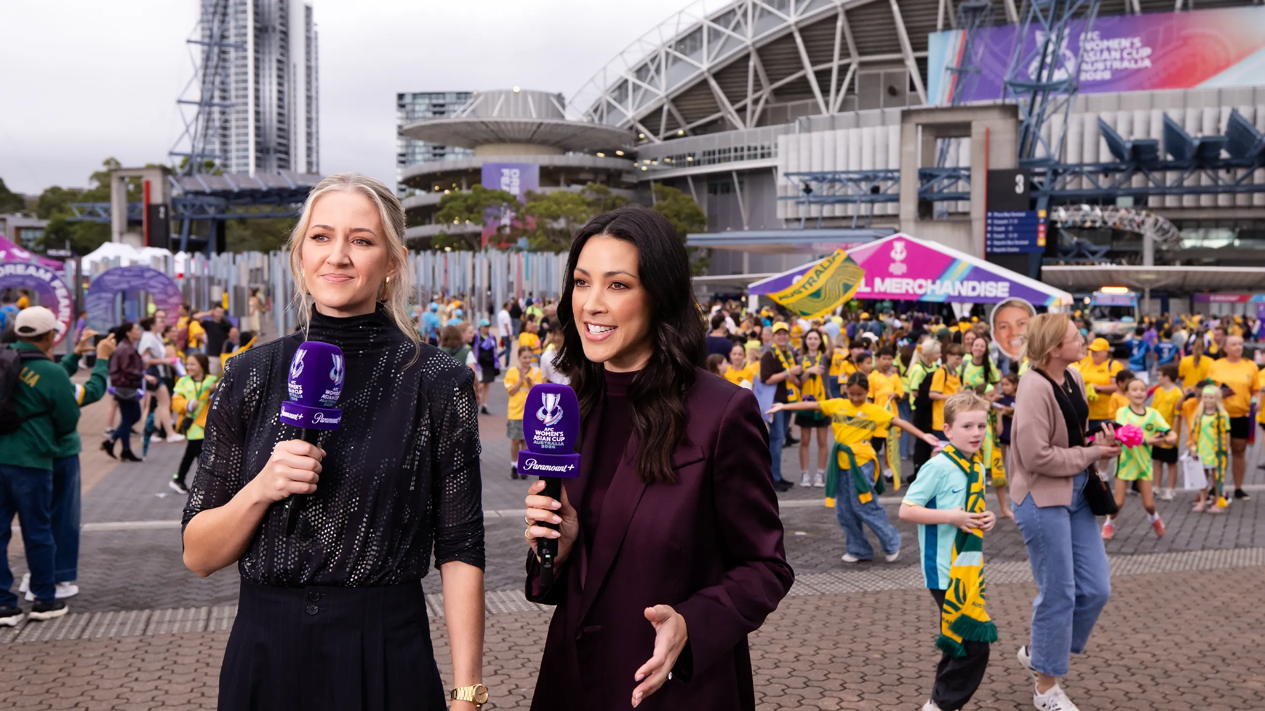
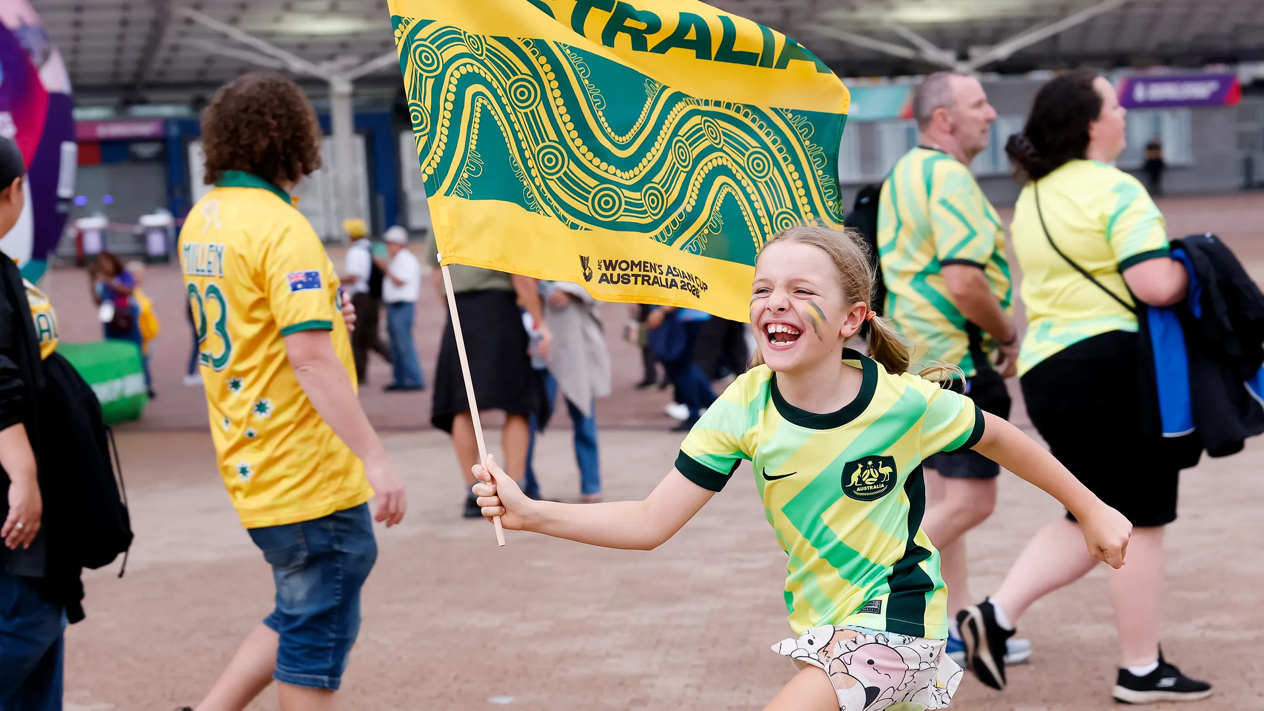
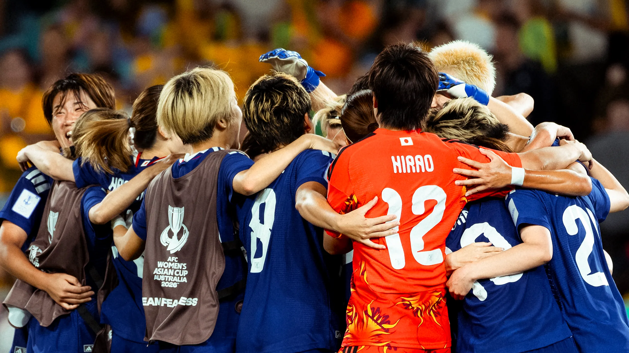
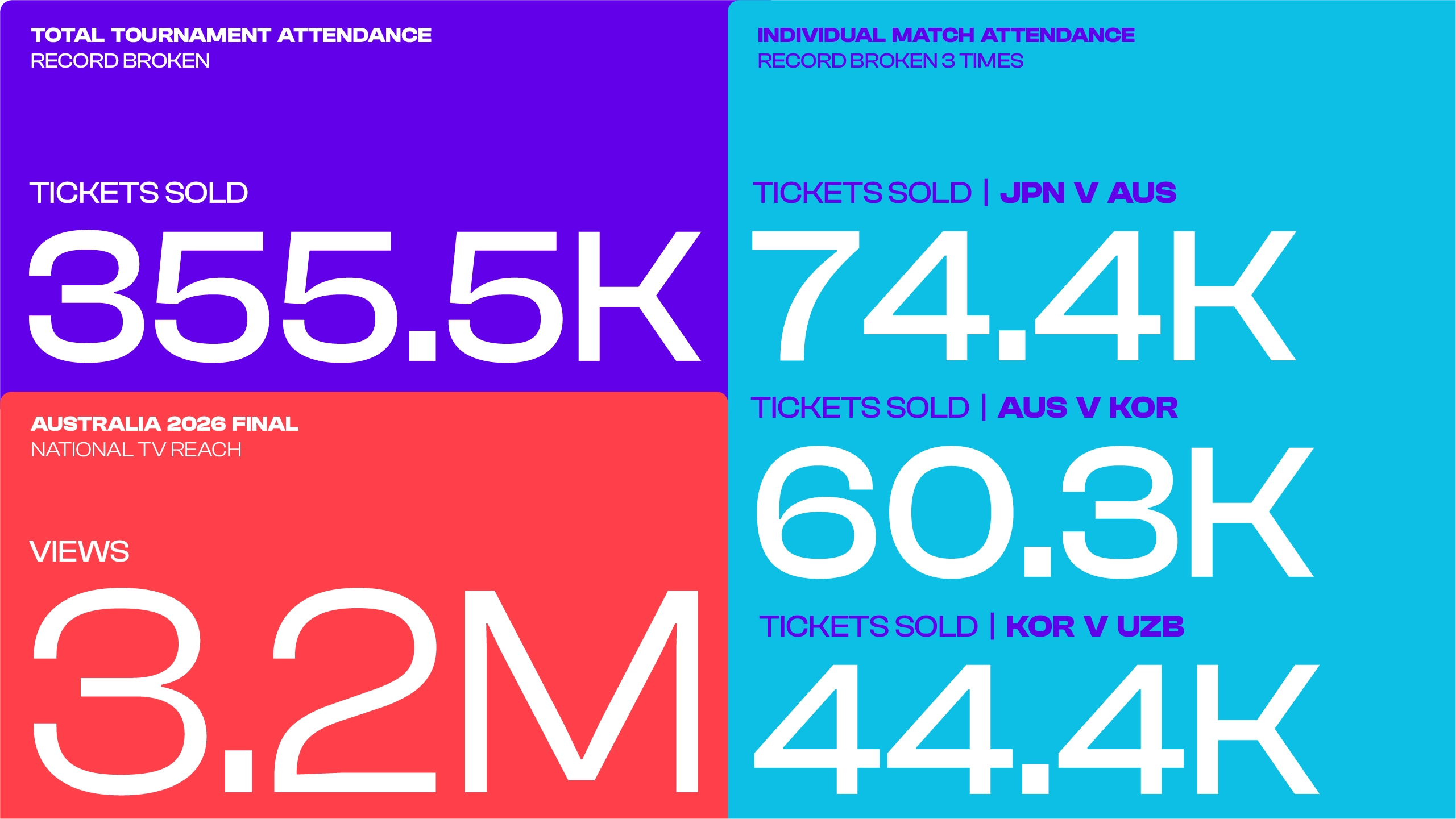
The tournament opened at Perth Stadium with a record-breaking ceremony featuring a performance from singer Audrey Nuna, in front of the highest attendance in AFC Women's Asian Cup history. It closed in equally spectacular fashion at Stadium Australia in Sydney, where Australian artist G Flip headlined the closing ceremony before the final. With 74,397 fans filling the stands, the occasion set yet another attendance record and brought the most successful edition of the AFC Women's Asian Cup™ ever staged to a fitting close.
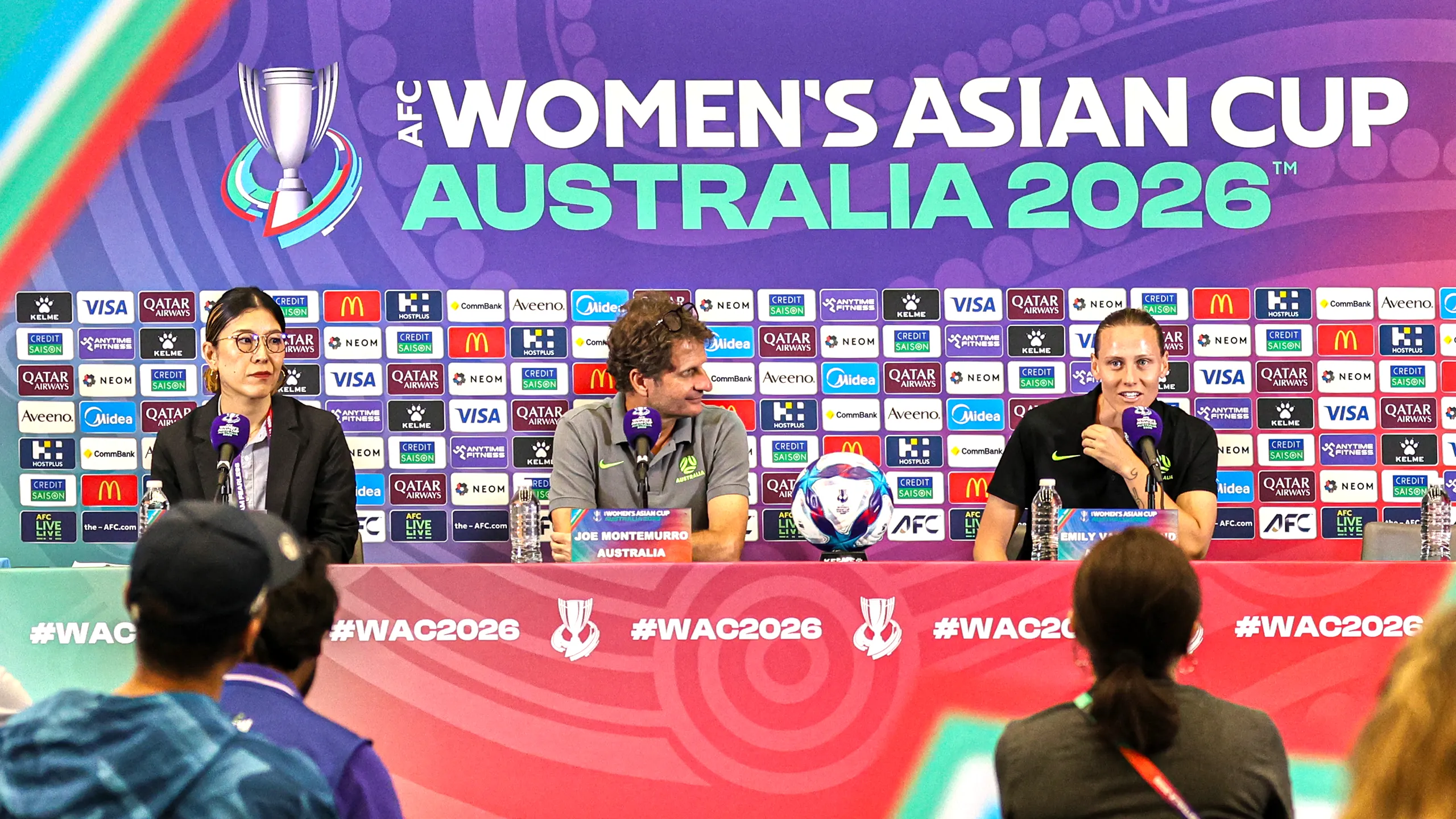
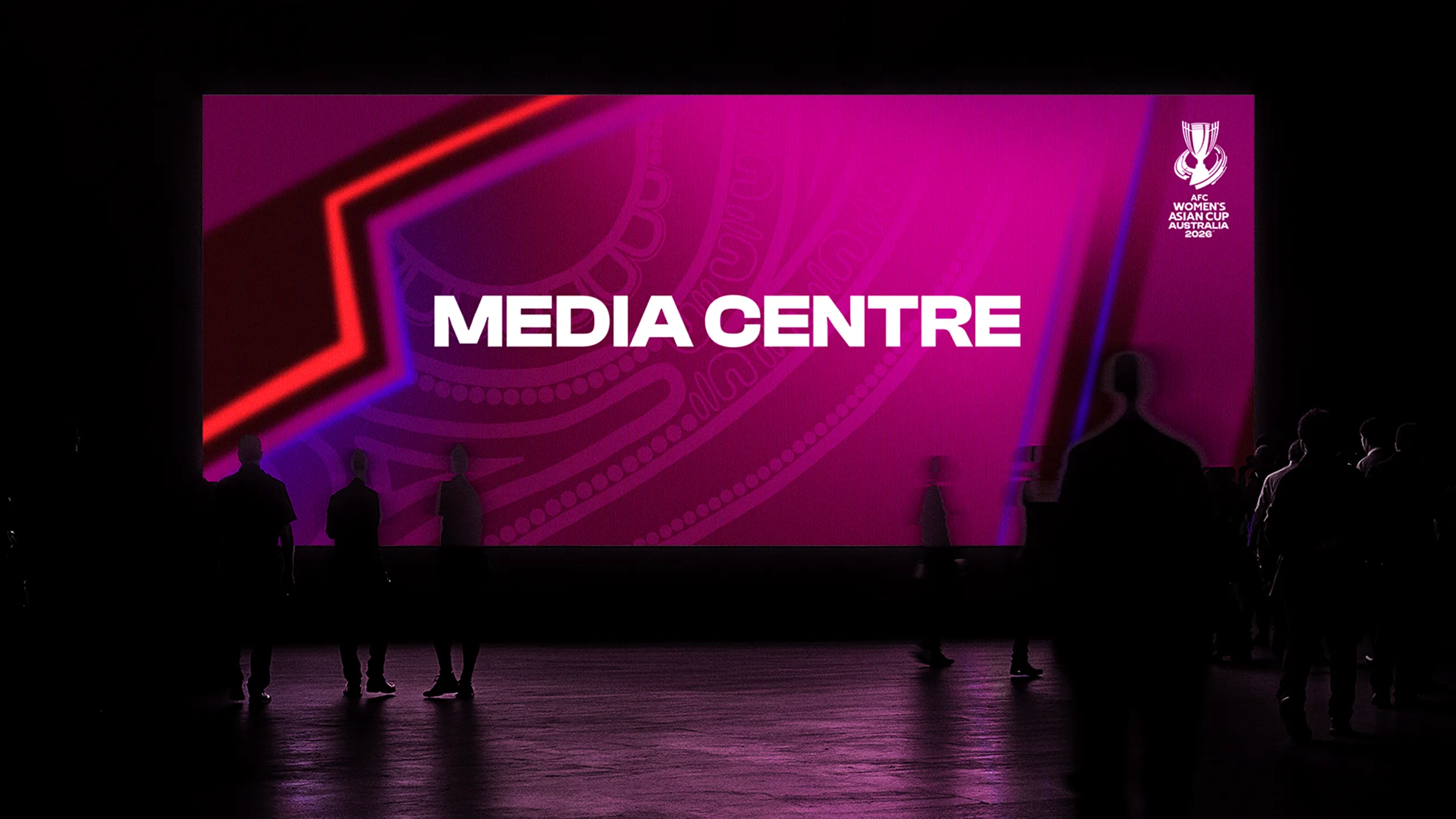
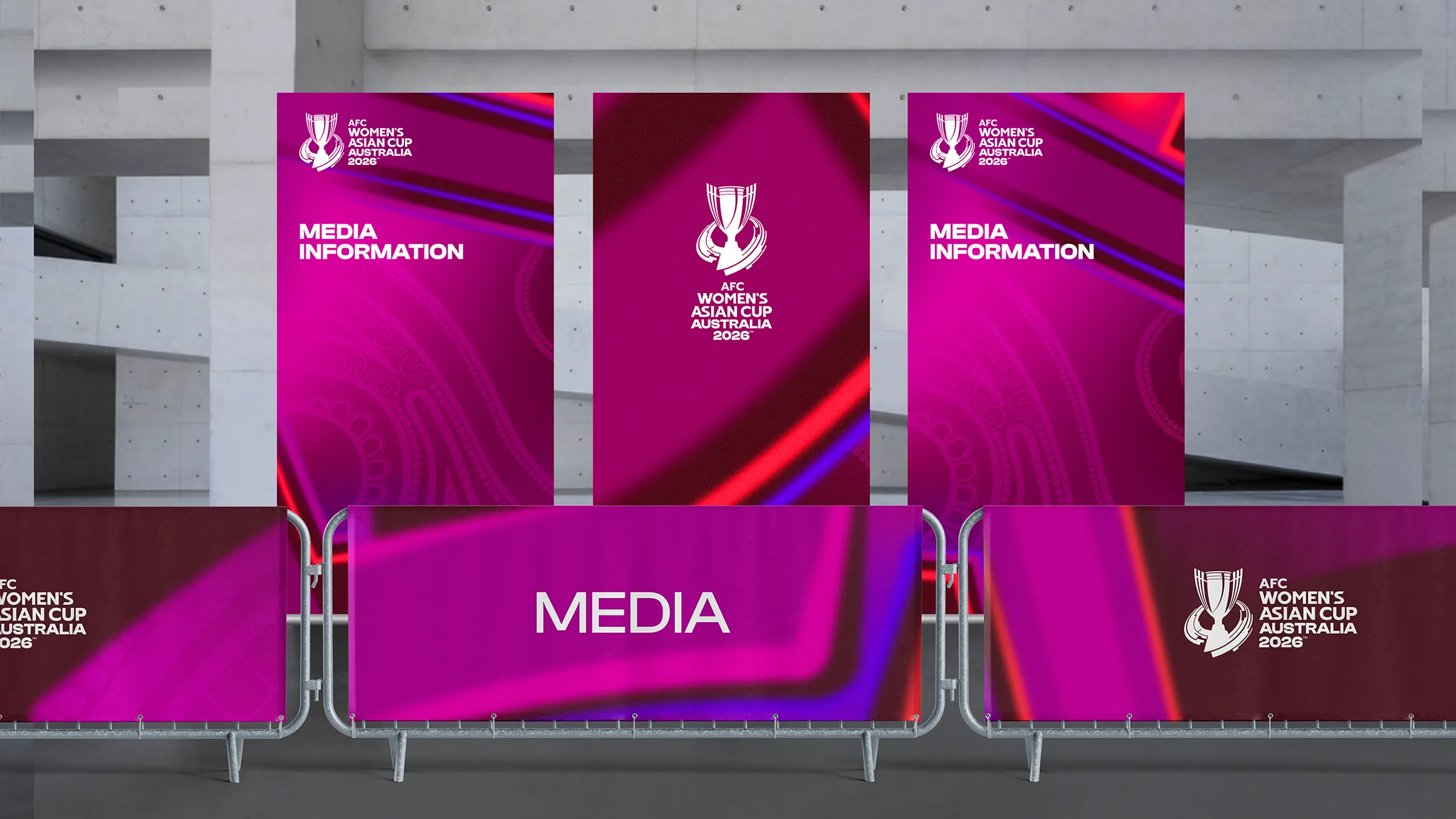
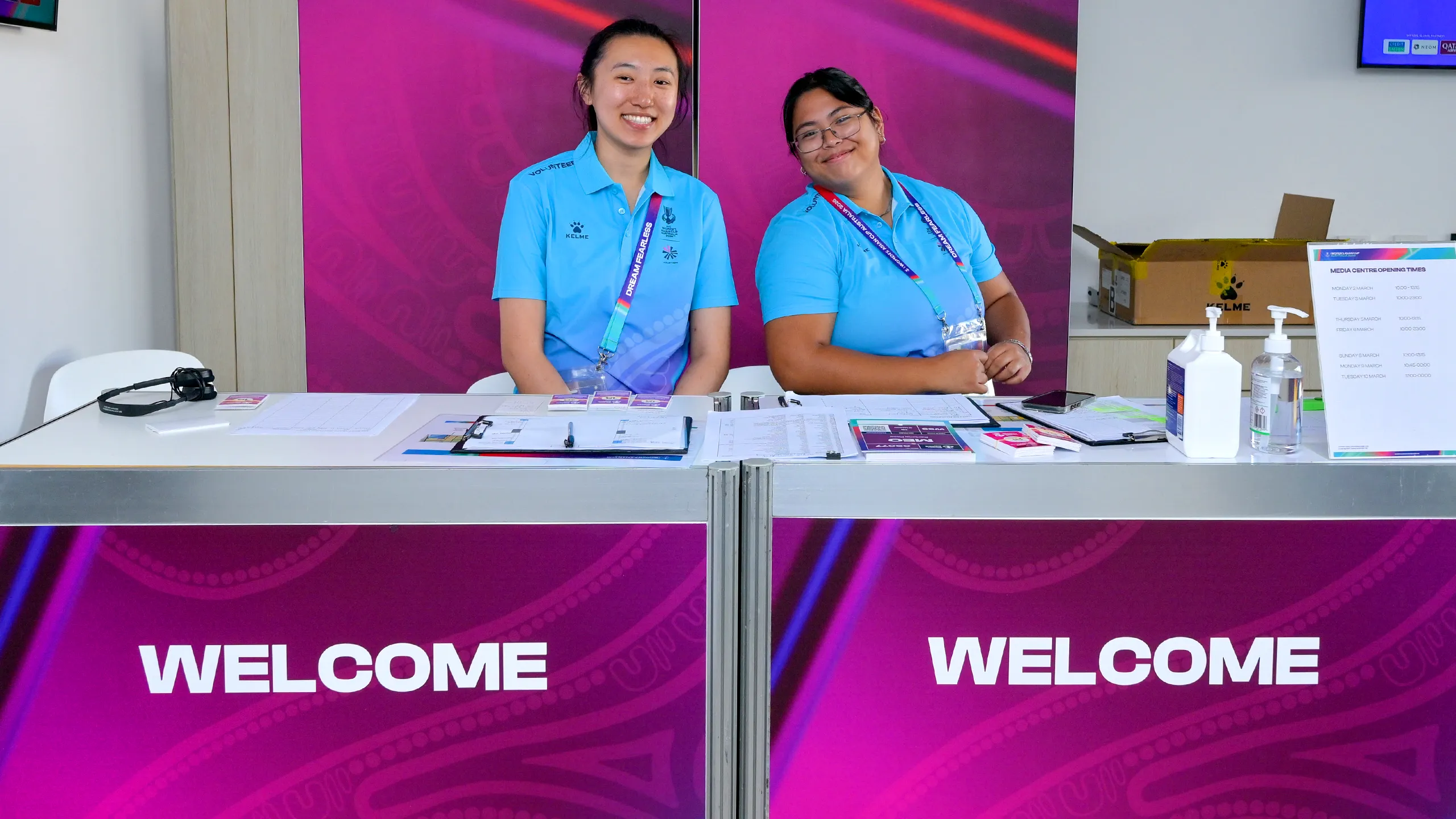
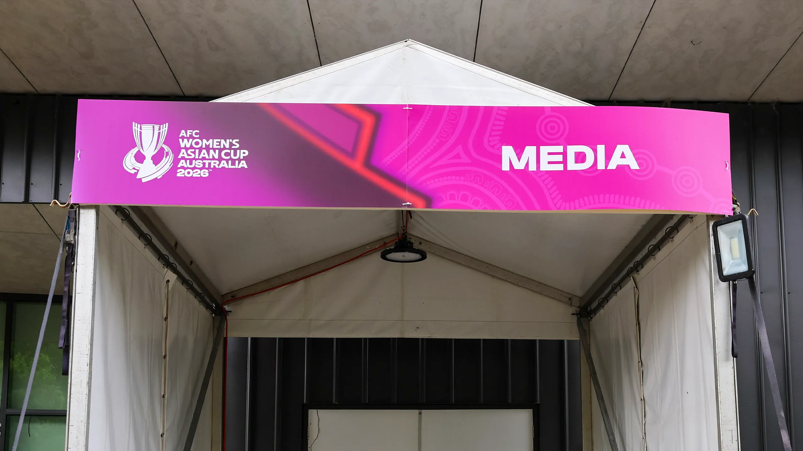
Media Centres
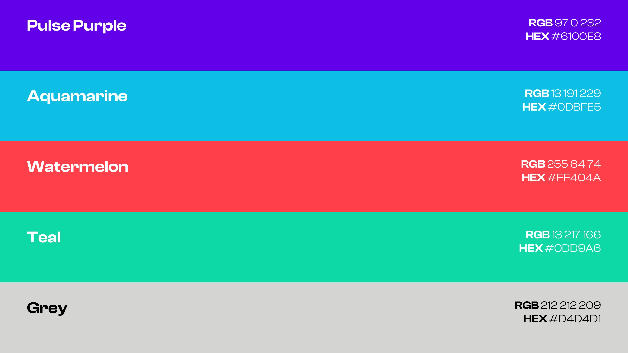
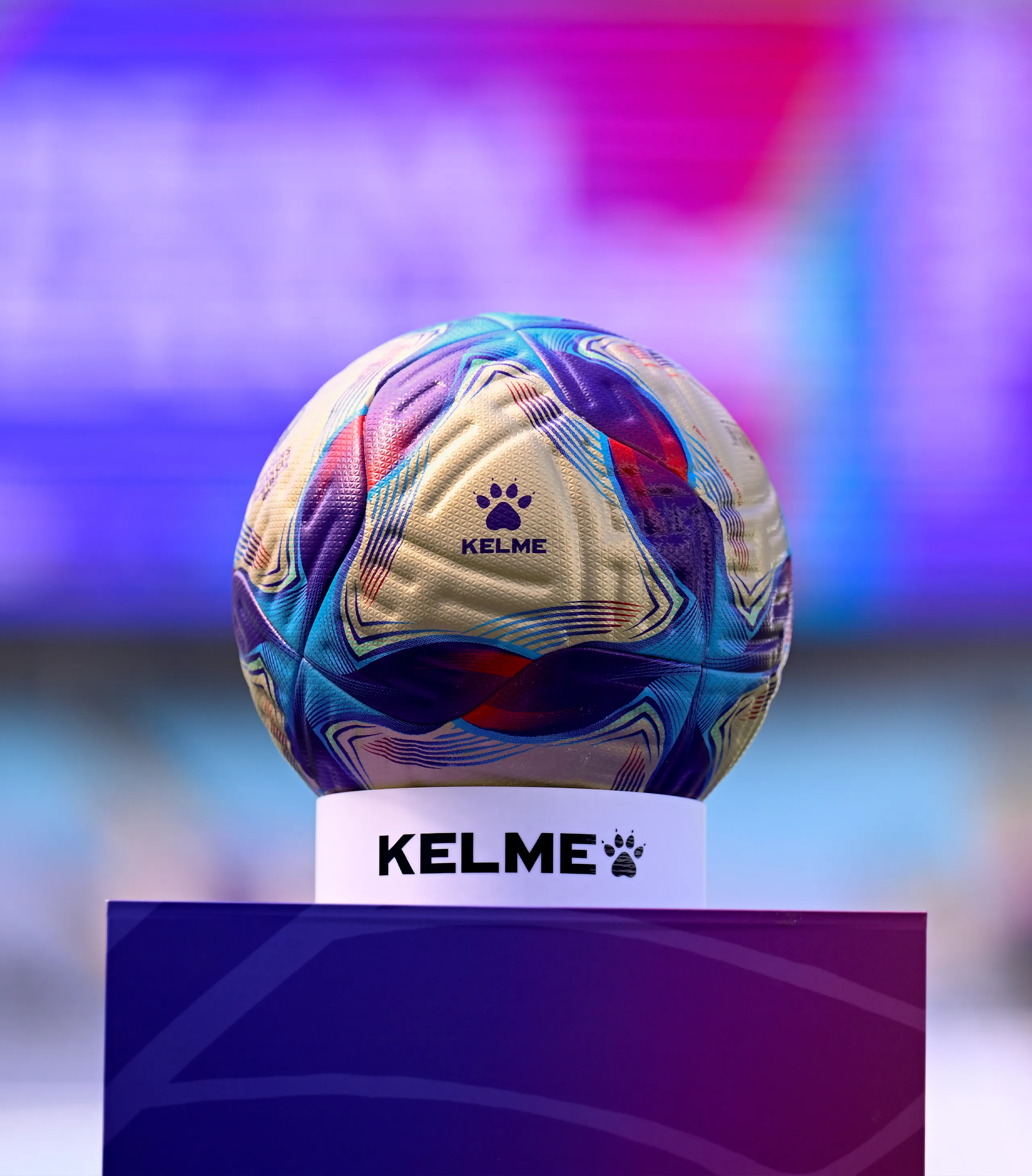
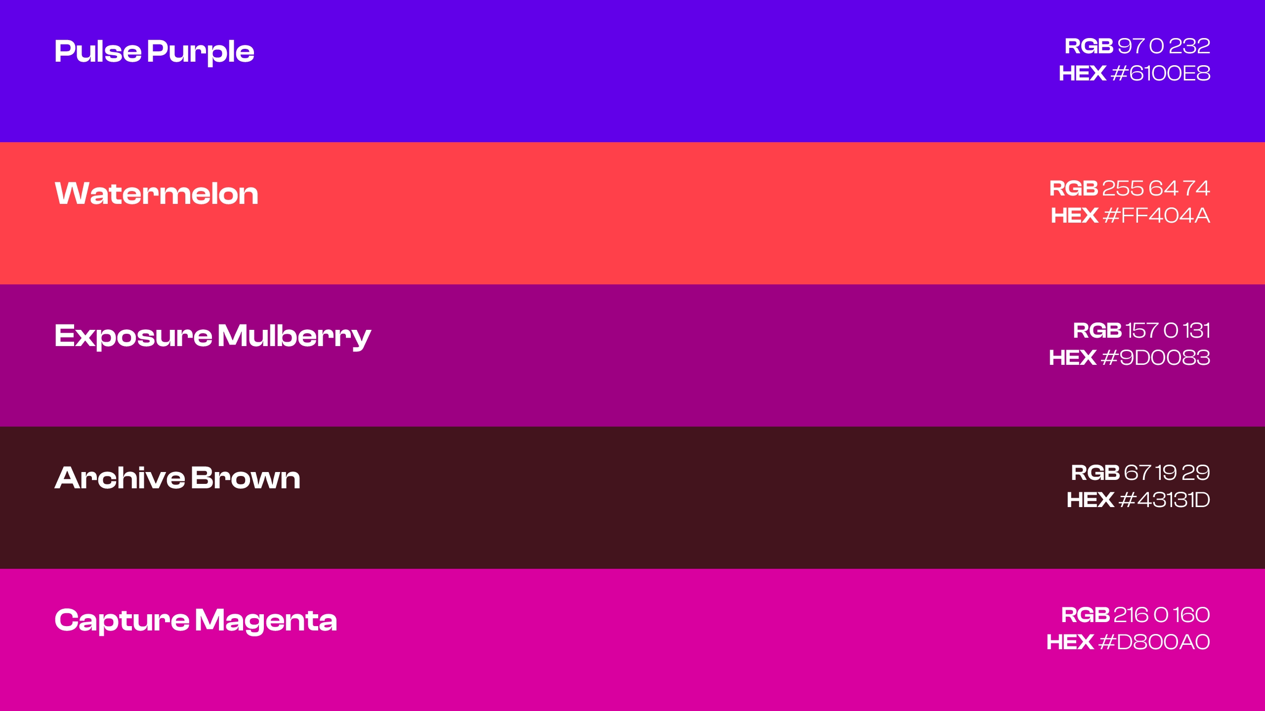
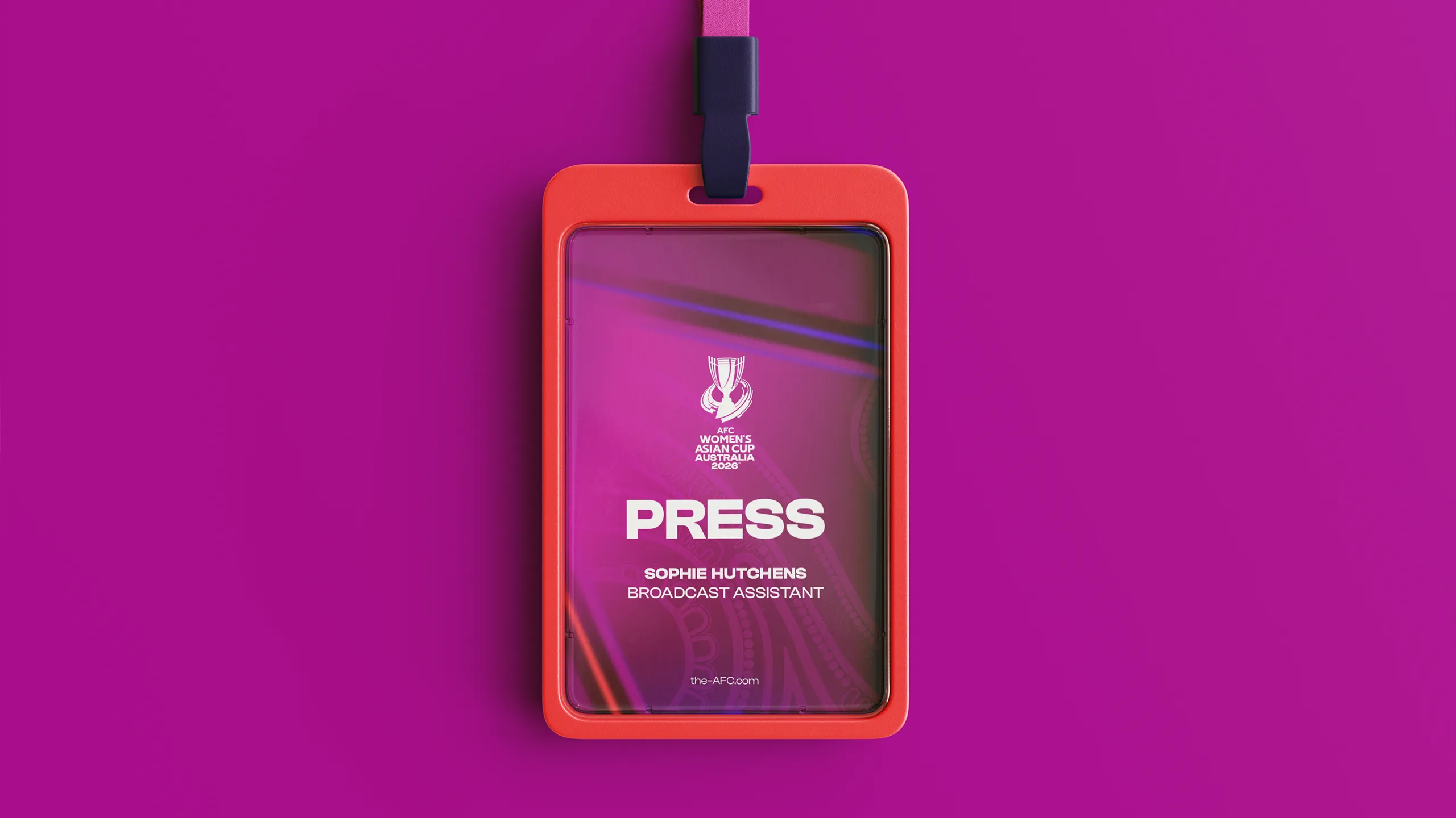
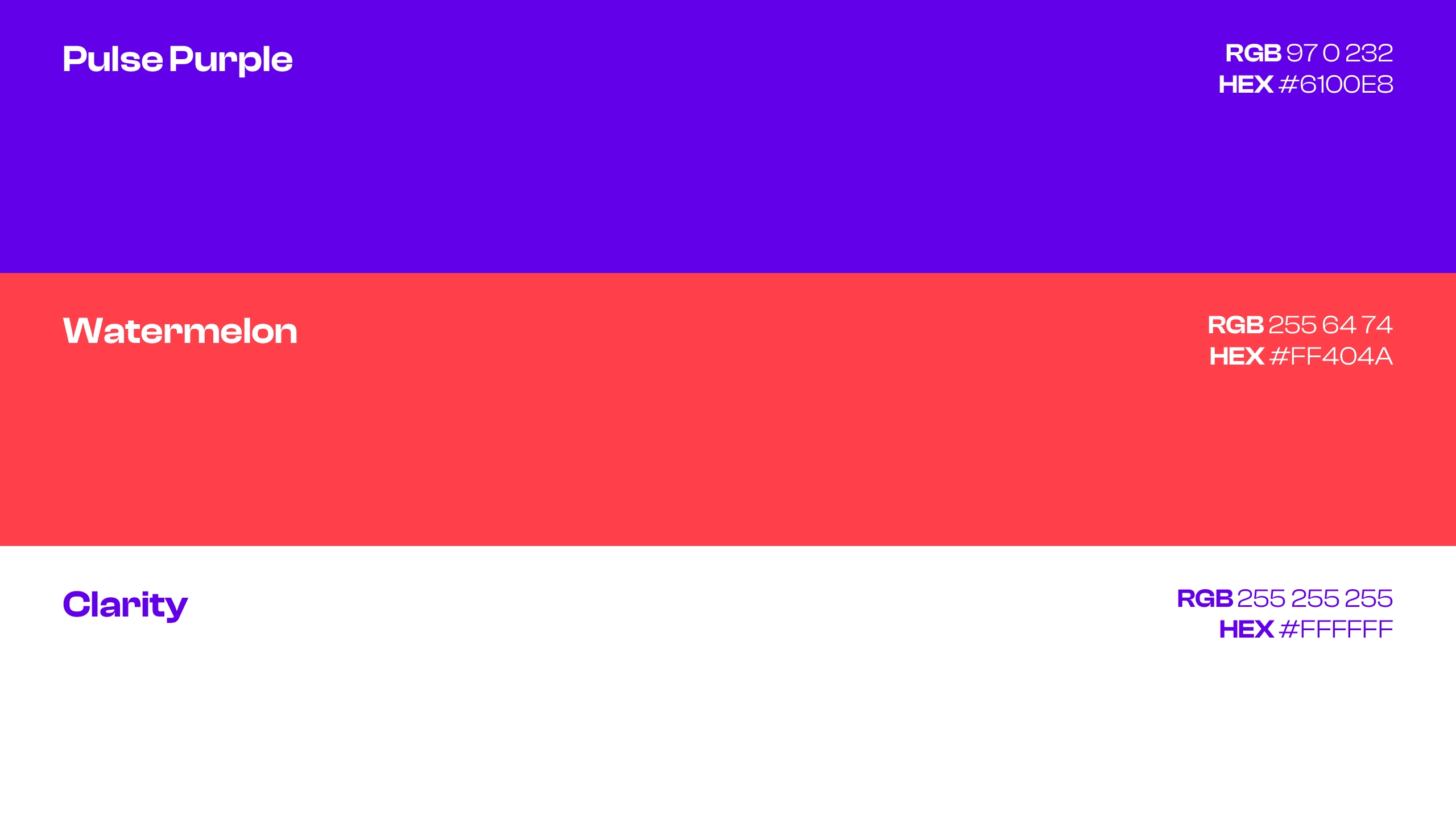
A specific palette was created for the Media Centres of the AFC Women's Asian Cup Australia 2026™, designed to establish a professional and cohesive environment for media teams. Built on a rich spectrum of purples and magentas, with Pulse Purple as a connecting colour and Watermelon as the primary system, the identity balanced boldness with functionality across all applications. From welcome signage and accreditation to backdrop dressing and directional panels, the result was a distinctive and well-considered space that supported media operations while remaining firmly connected to the wider tournament brand.
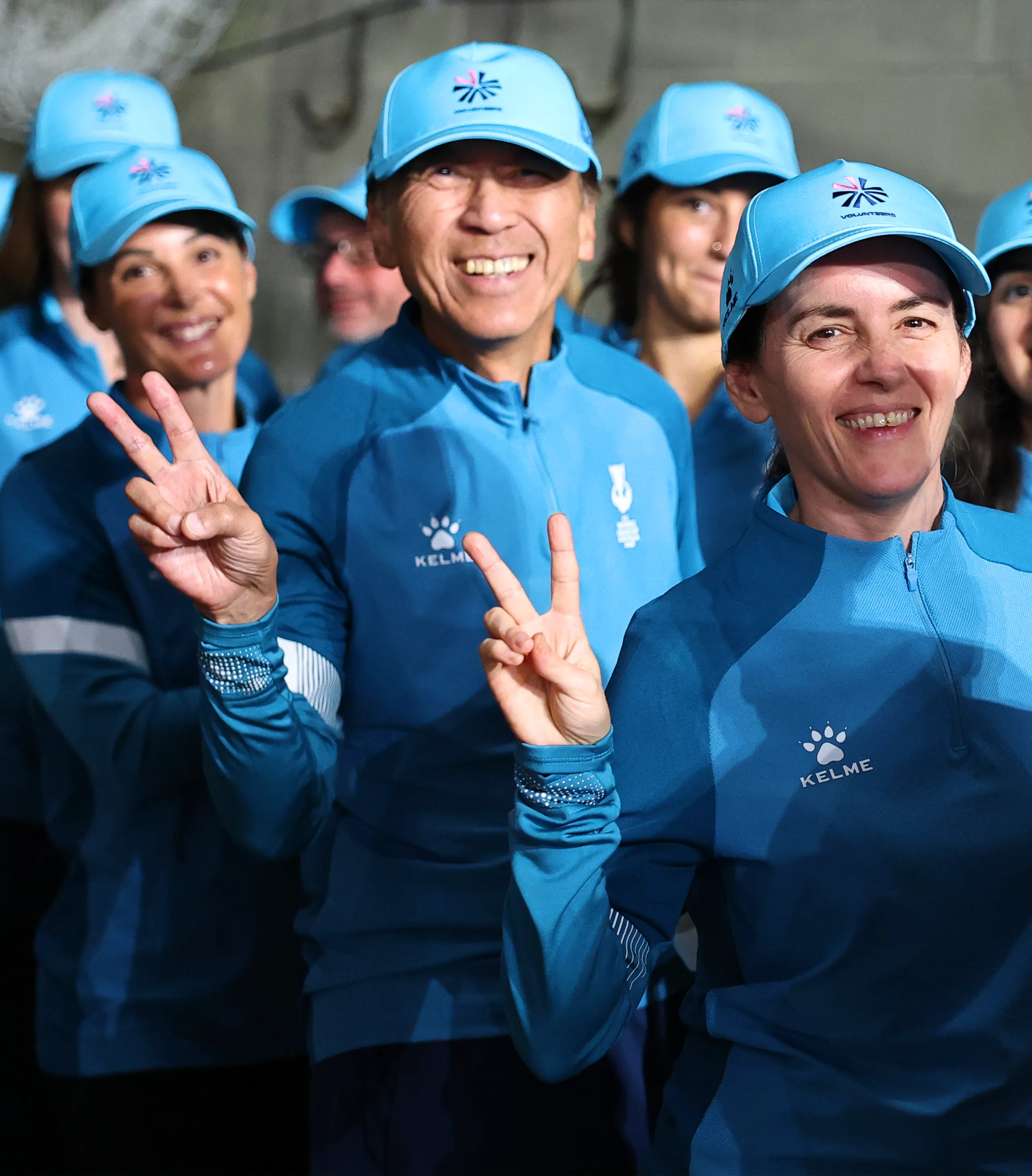
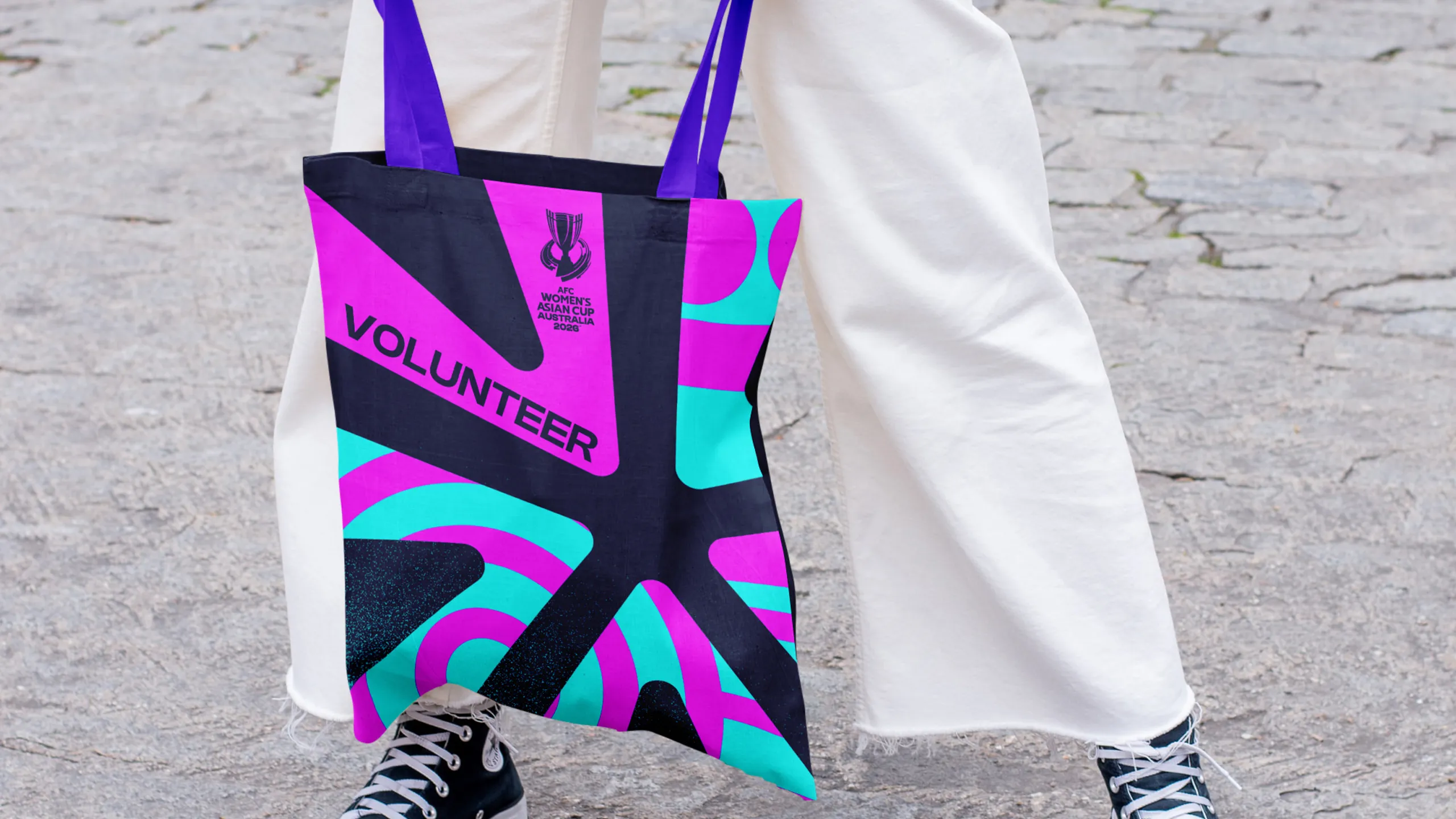
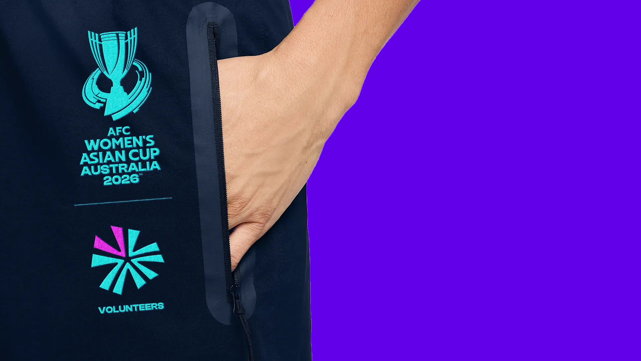
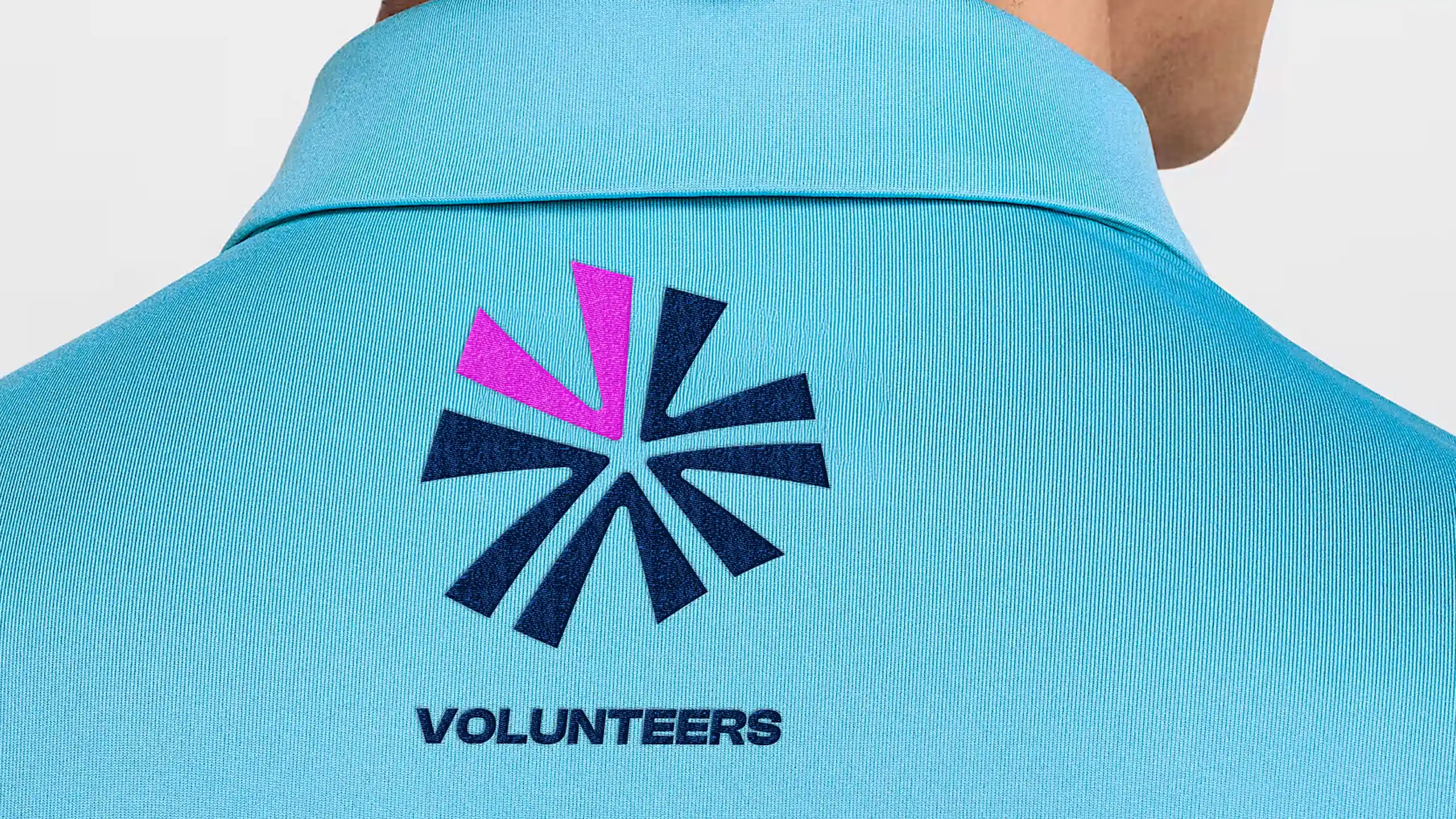
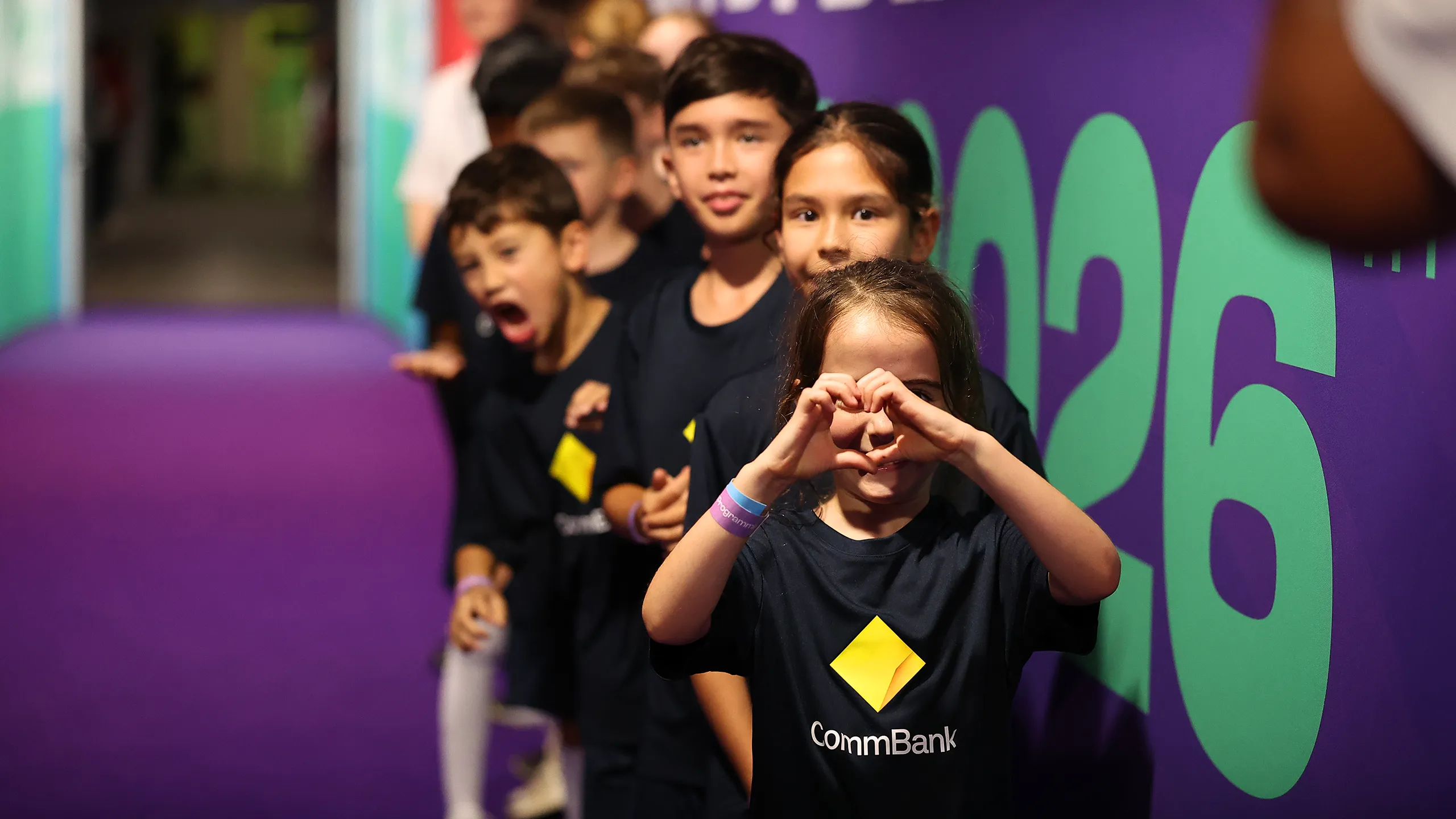
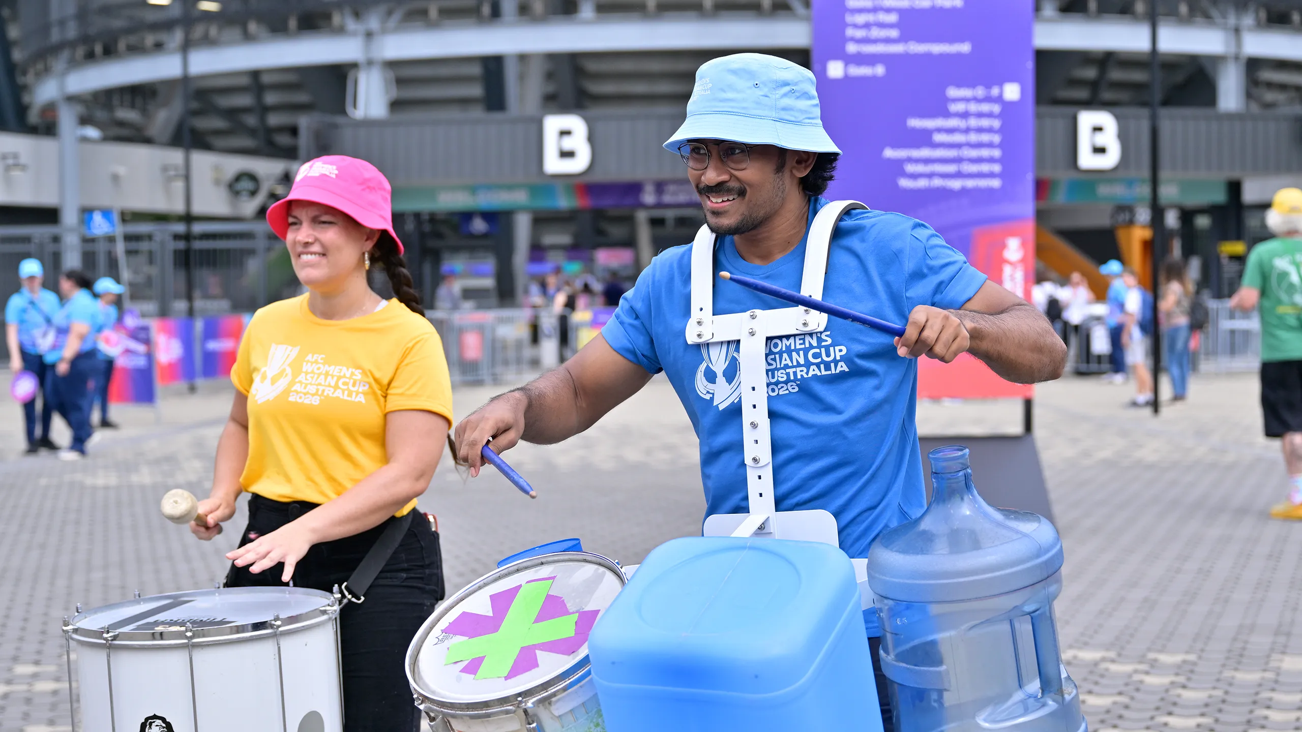
Volunteers
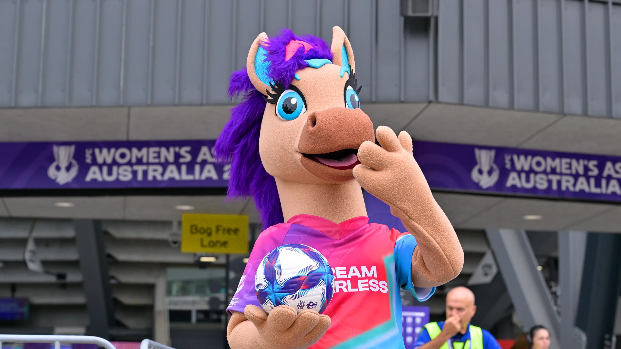
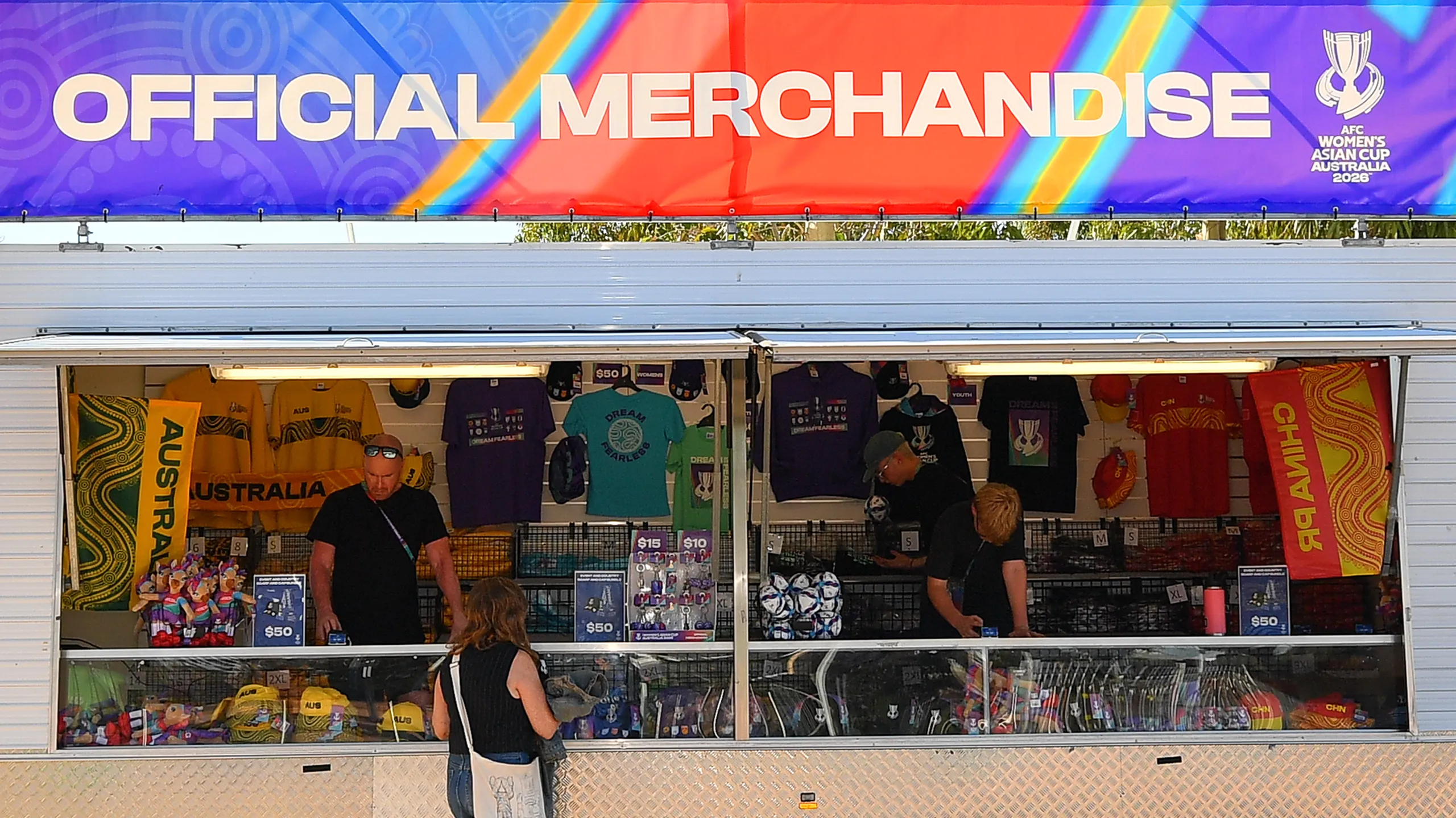
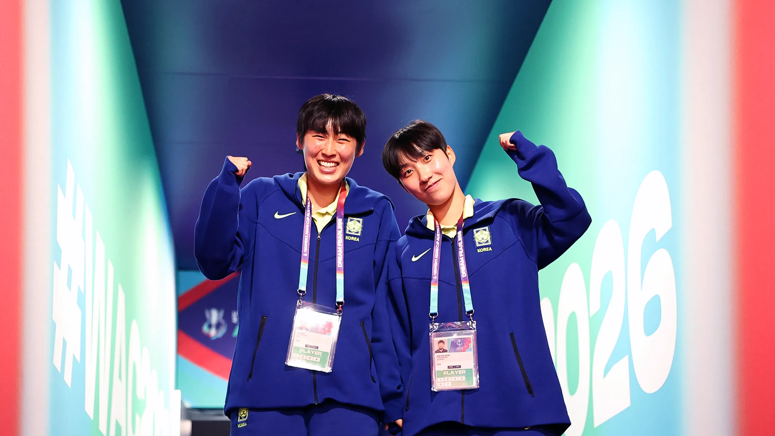
Volunteers are the heartbeat of any major tournament and the AFC Women's Asian Cup Australia 2026™ identity ensured they were recognised as such. A dedicated sub-brand gave the volunteer programme its own distinct visual presence, built around a vibrant palette of Surfer’s Lagoon, Fearless Pink, Great Ocean Blue and Pulse Purple, applied across uniforms, merchandise and accreditation materials. A bespoke Volunteers mark sat at the heart of the system, ensuring those at the frontline of the tournament were as visually connected to the brand as any other touchpoint.


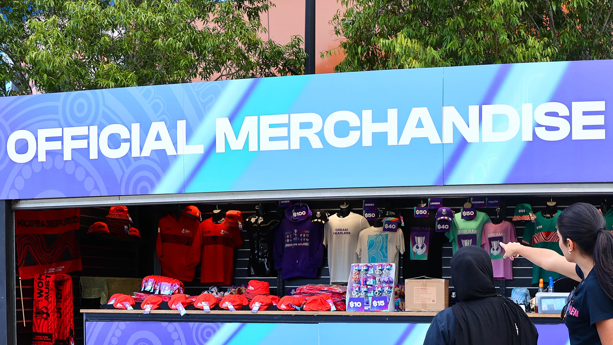
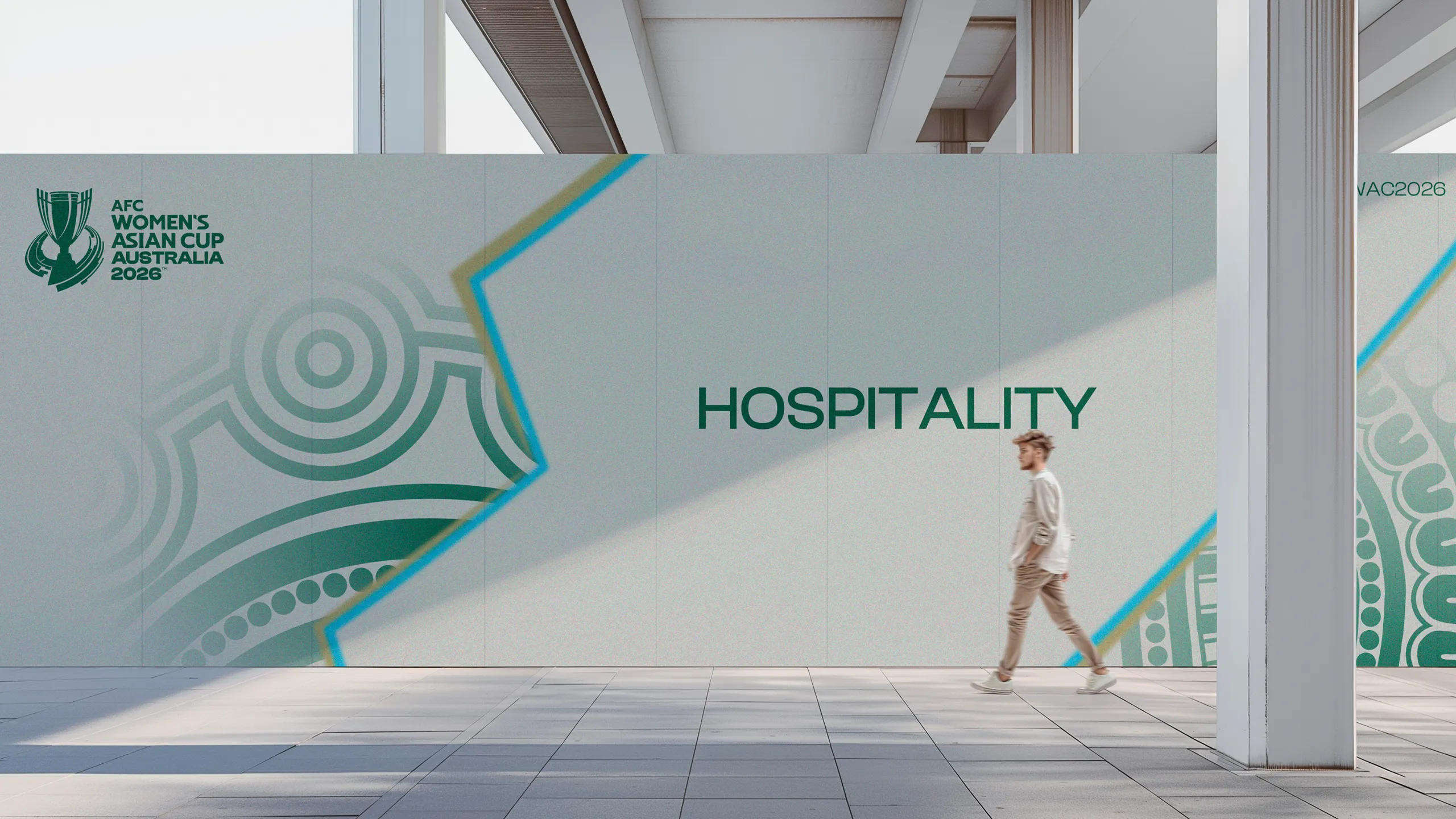
Premium Experiences
Sub-Brands
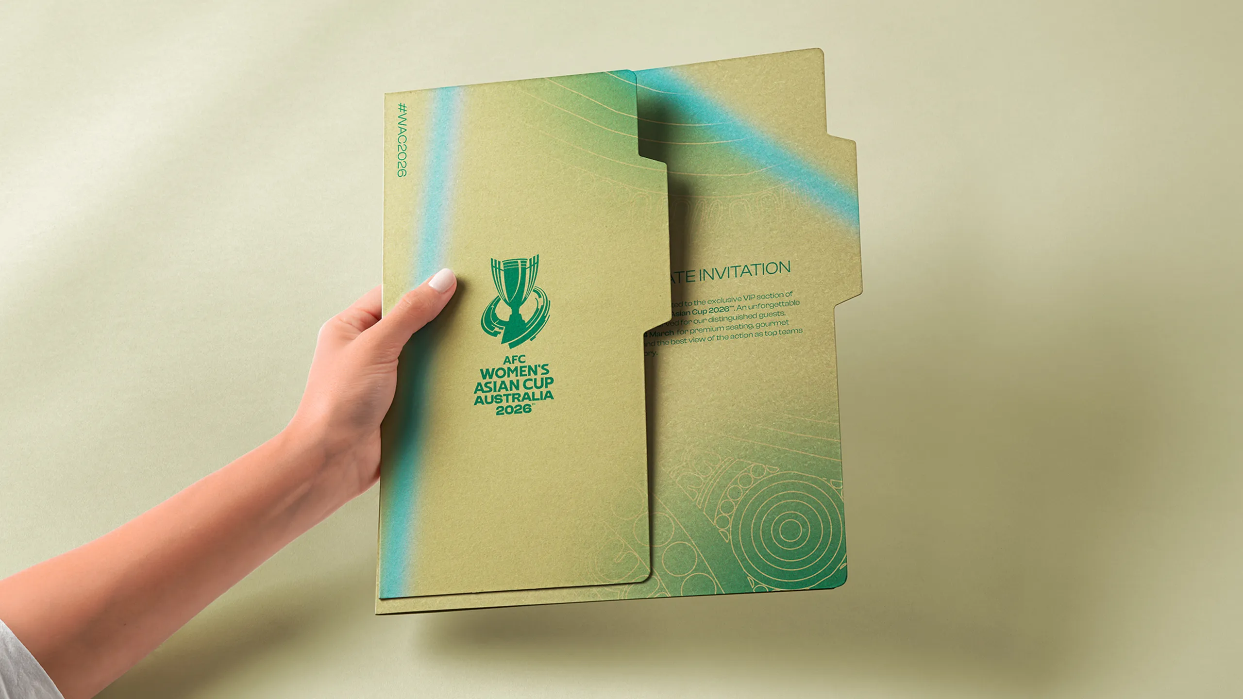
A dedicated sub-brand system was created for the premium tiers of the AFC Women's Asian Cup Australia 2026™, giving Hospitality and VIP environments their own distinct visual identities while remaining connected to the wider tournament brand. The Hospitality palette of Grey, Deep Green and Aquamarine was paired with bolder texture treatments and indigenous patterns to create refined, welcoming spaces, while the VIP tier shifted towards Grey and Gold for a more sophisticated feel. Exclusive logo colourways and texture treatments ensured each tier felt elevated and purposeful.


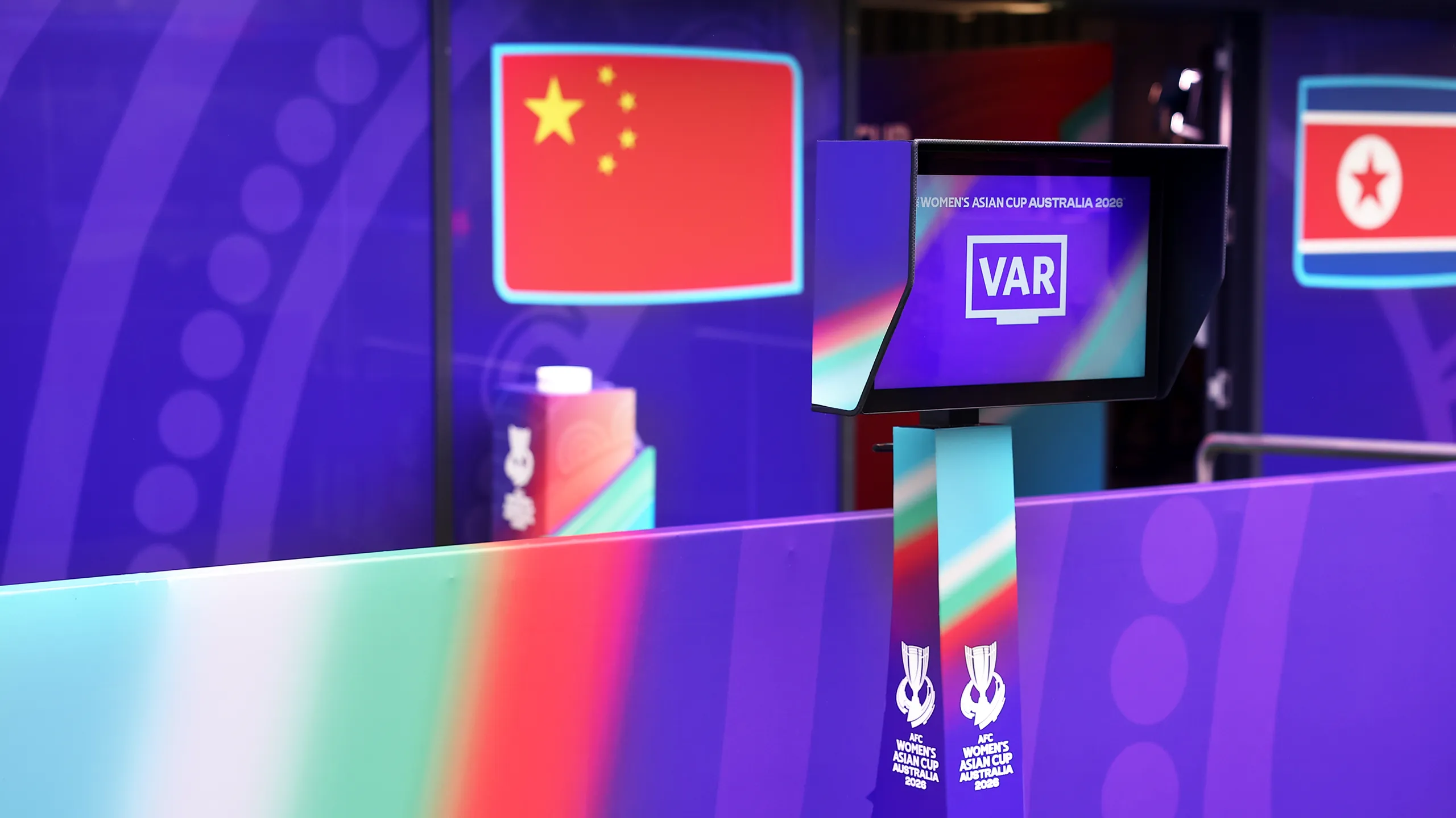
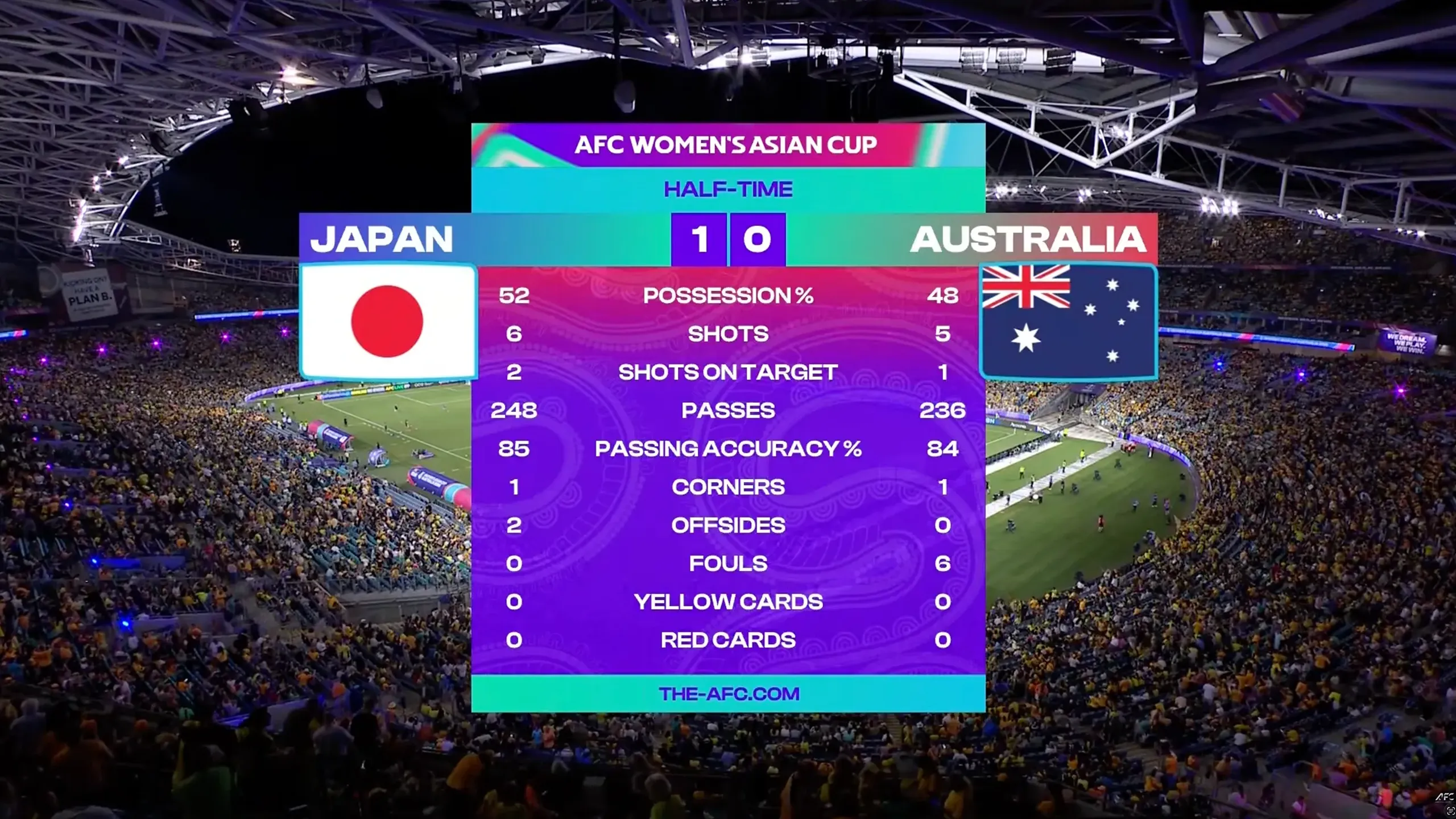
Broadcast
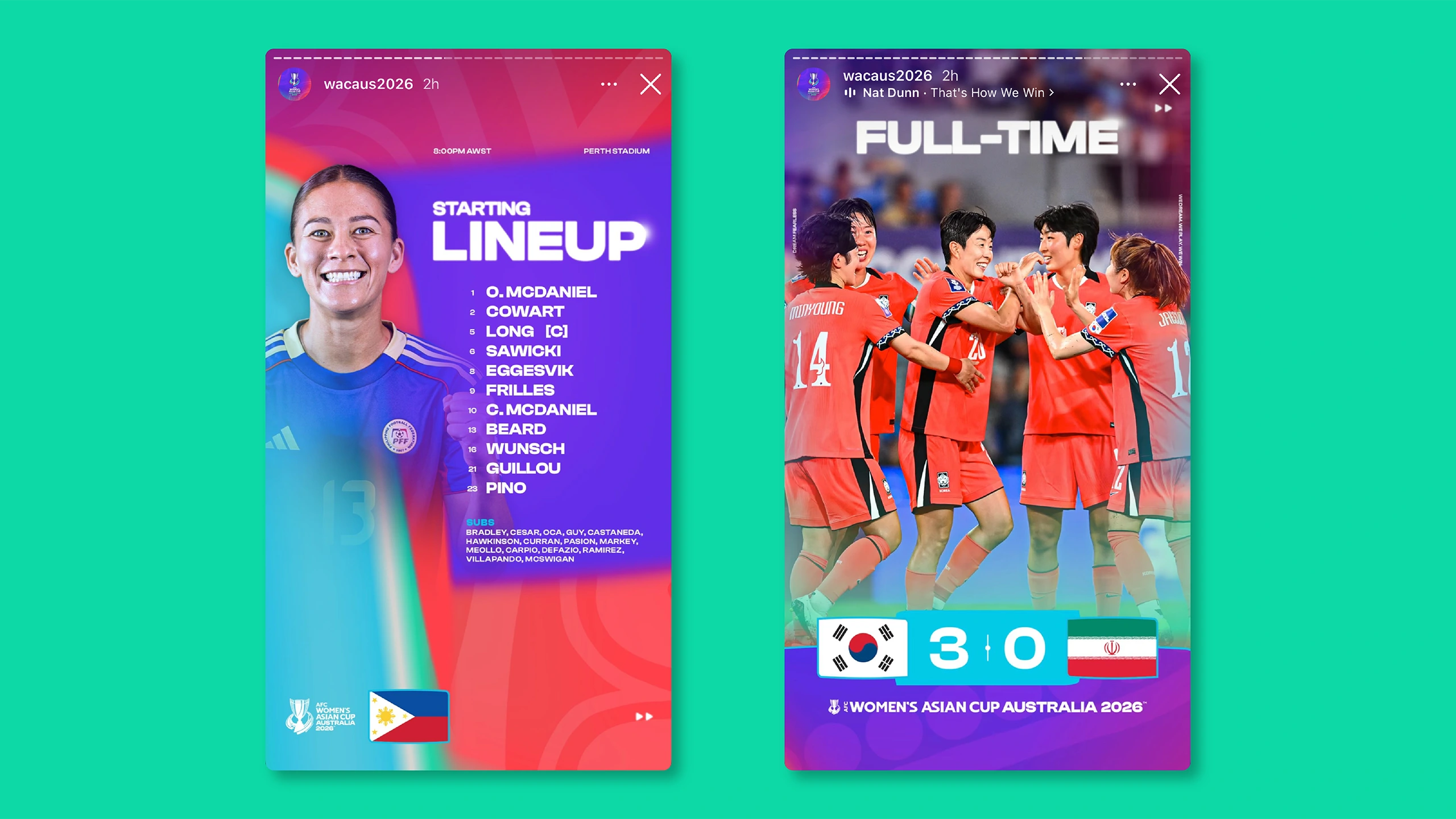
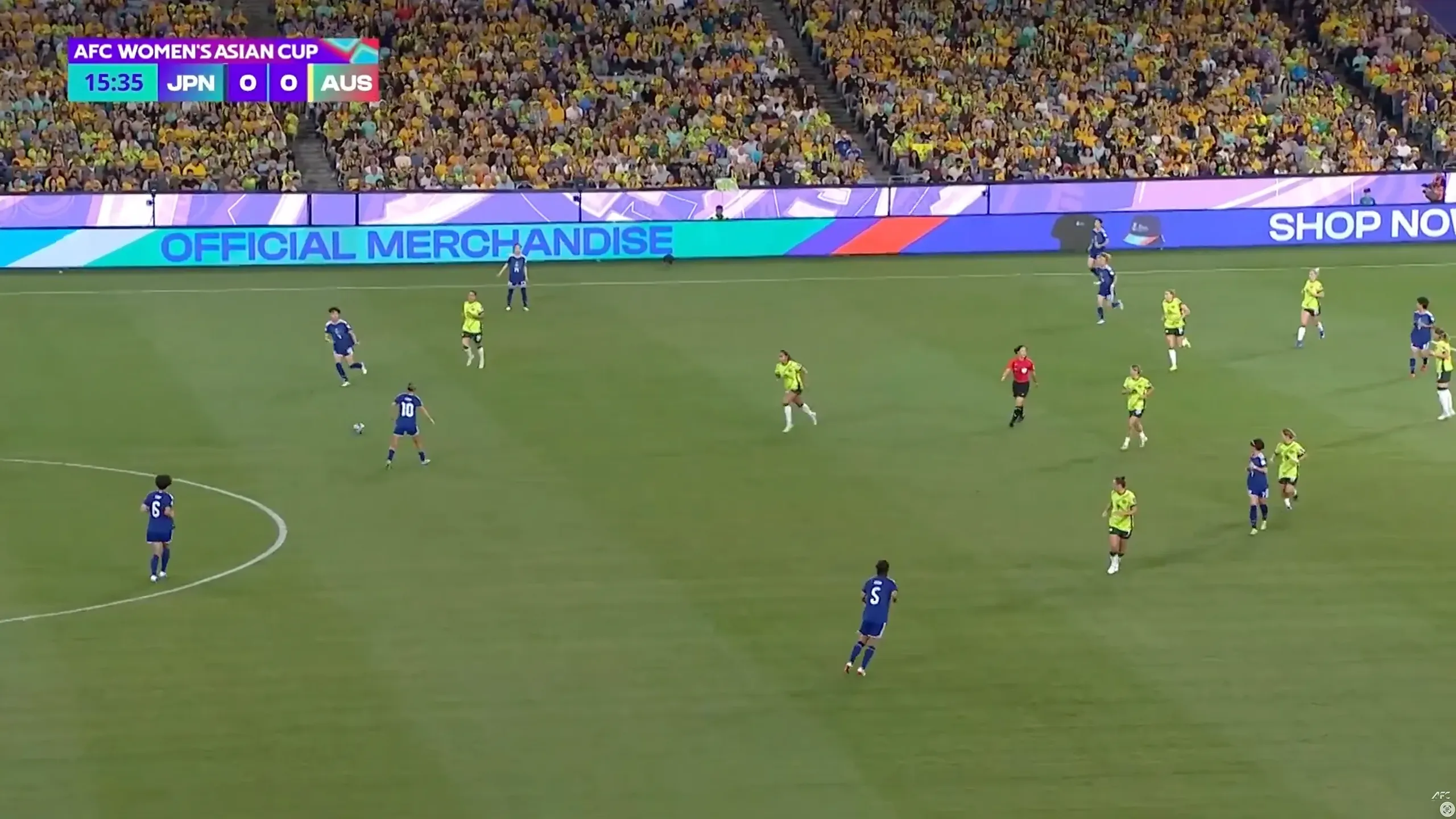
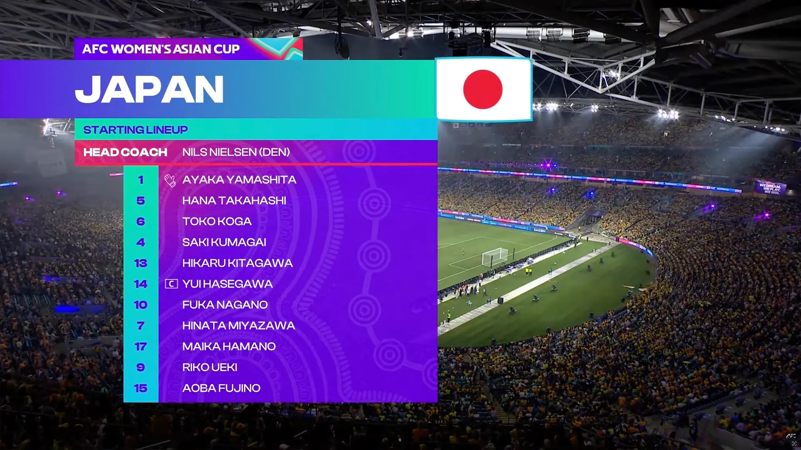
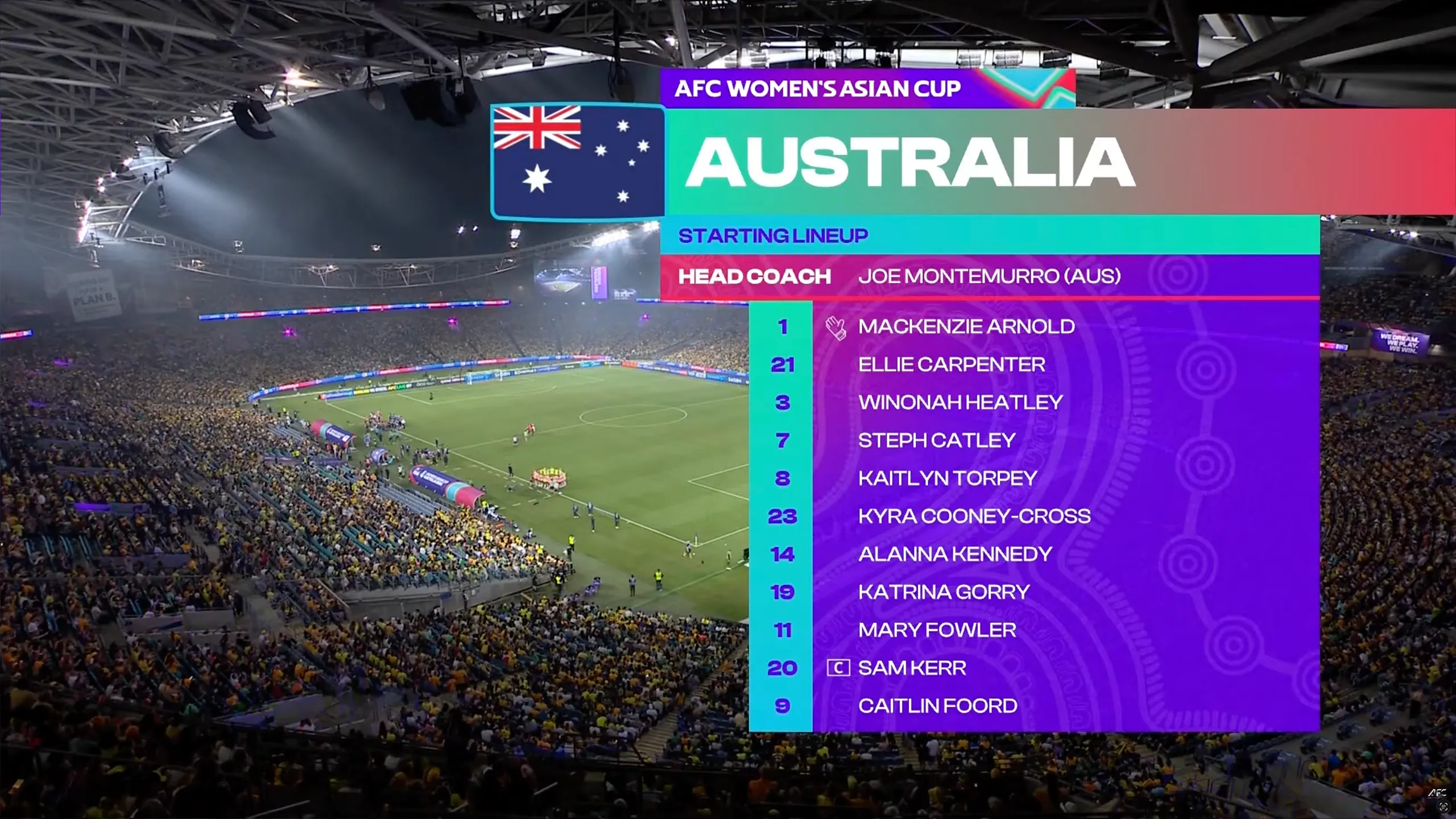
The broadcast system for the AFC Women's Asian Cup Australia 2026™ translated the tournament identity into a harmonious on-screen language for live match coverage. A bespoke shape treatment drew on the indigenous pattern artwork at the heart of the brand, using curved horizontal edges and rounded corners that echo the movement and fluidity of the wider visual identity. Applied across lower thirds, score graphics, starting lineups and transitions in bowl and across television and streaming platforms, brand colours and textures were layered in a considered way to deliver bold, consistent and instantly recognisable messaging throughout every broadcast.
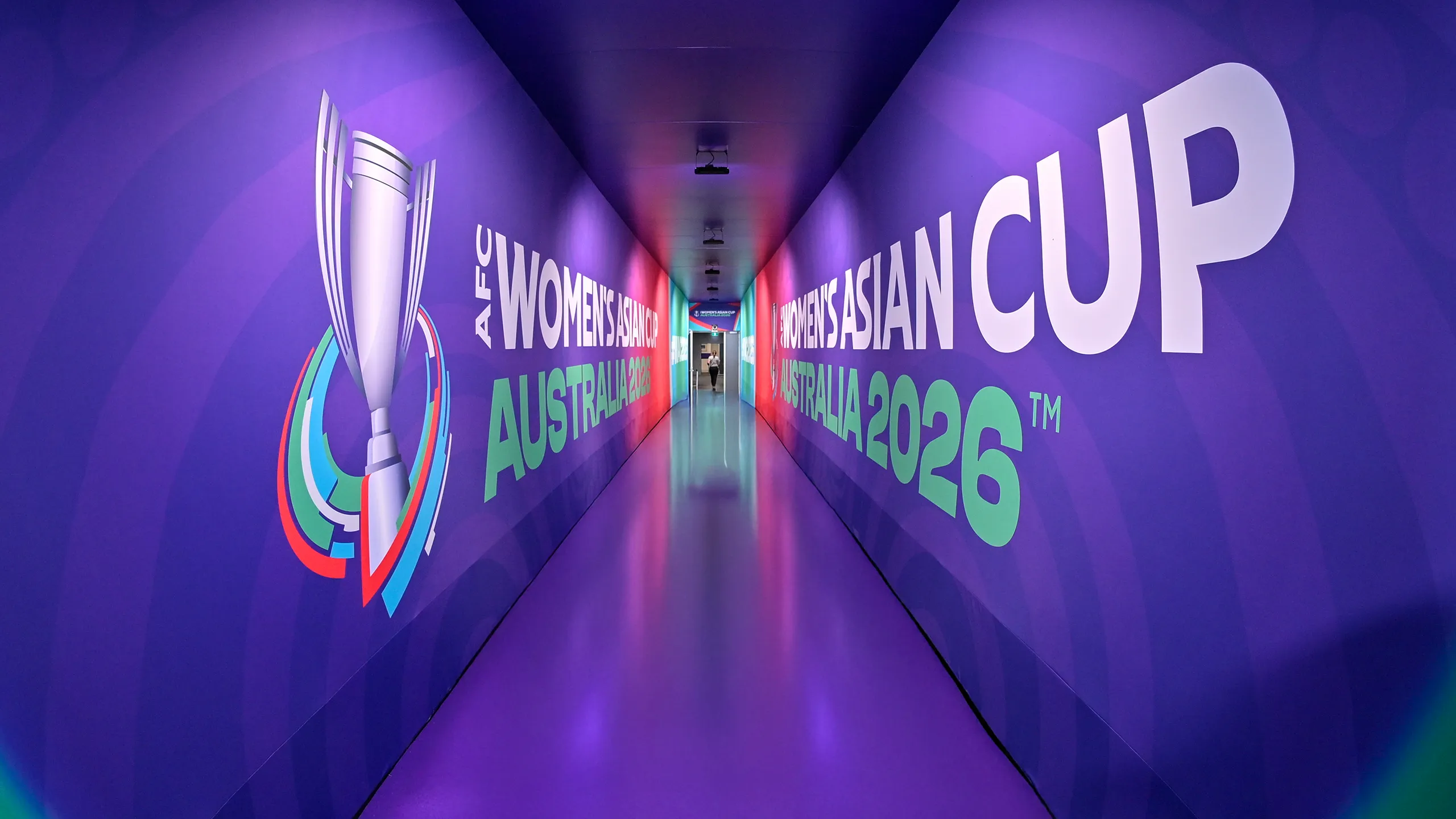
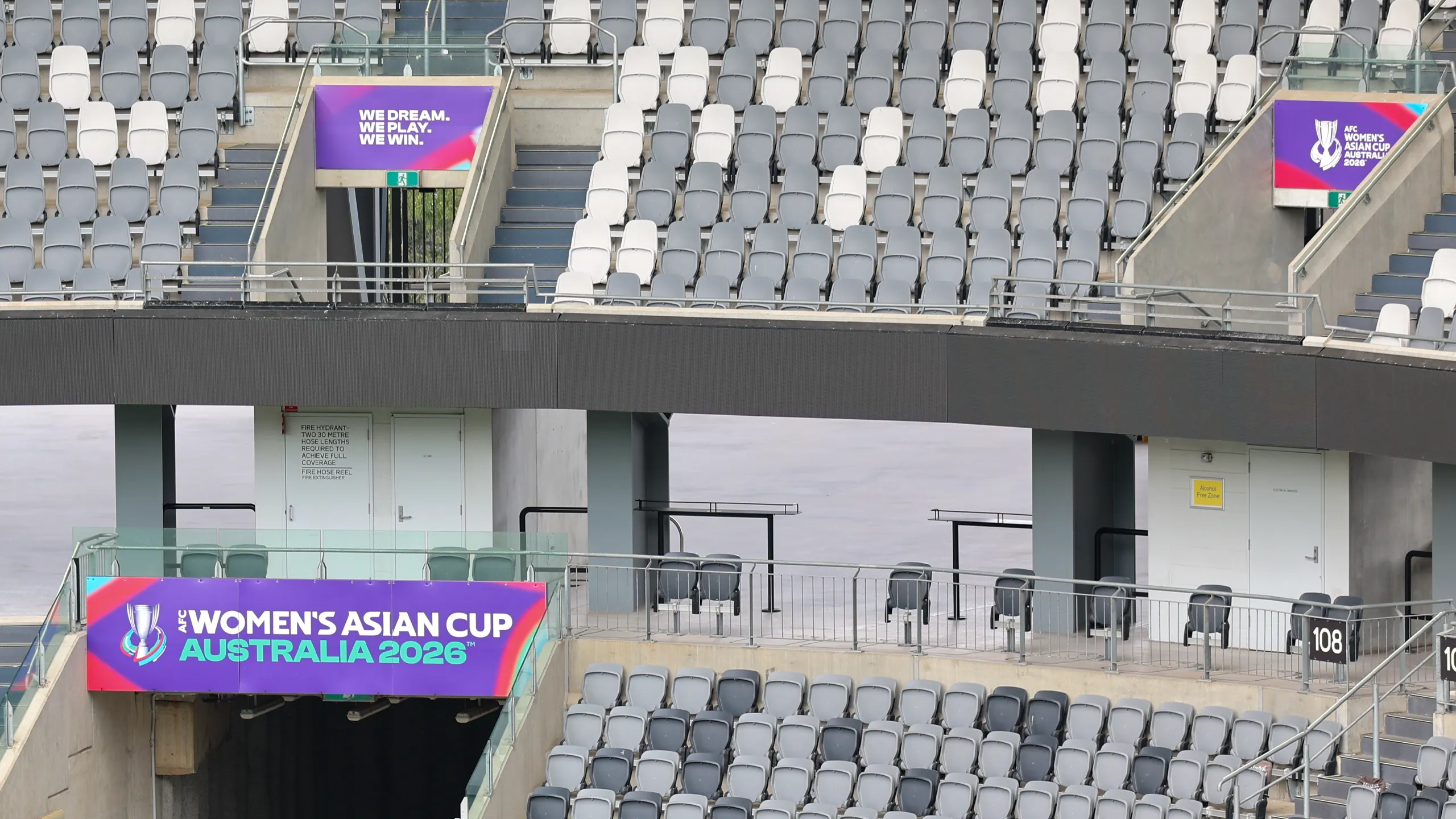
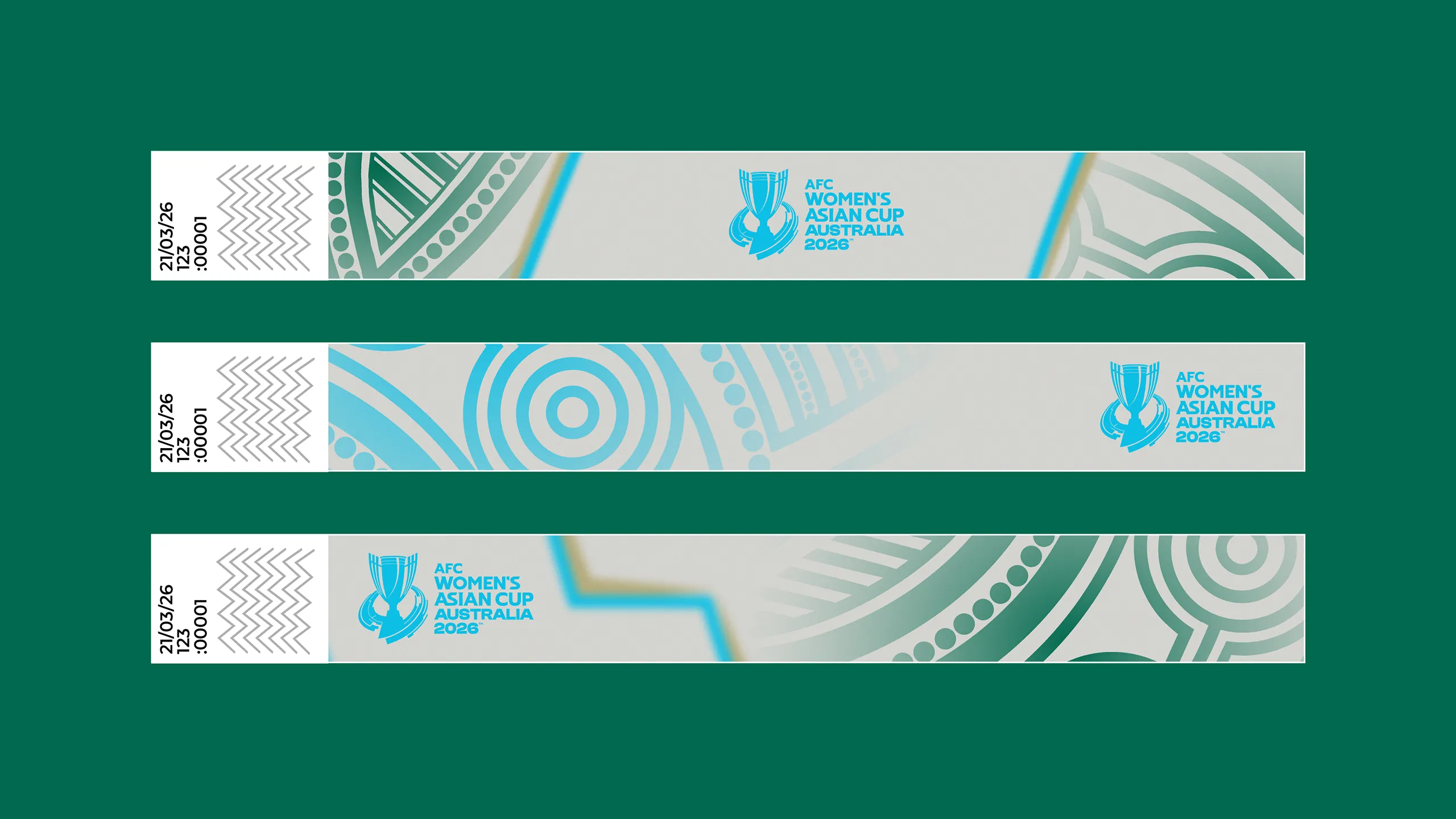
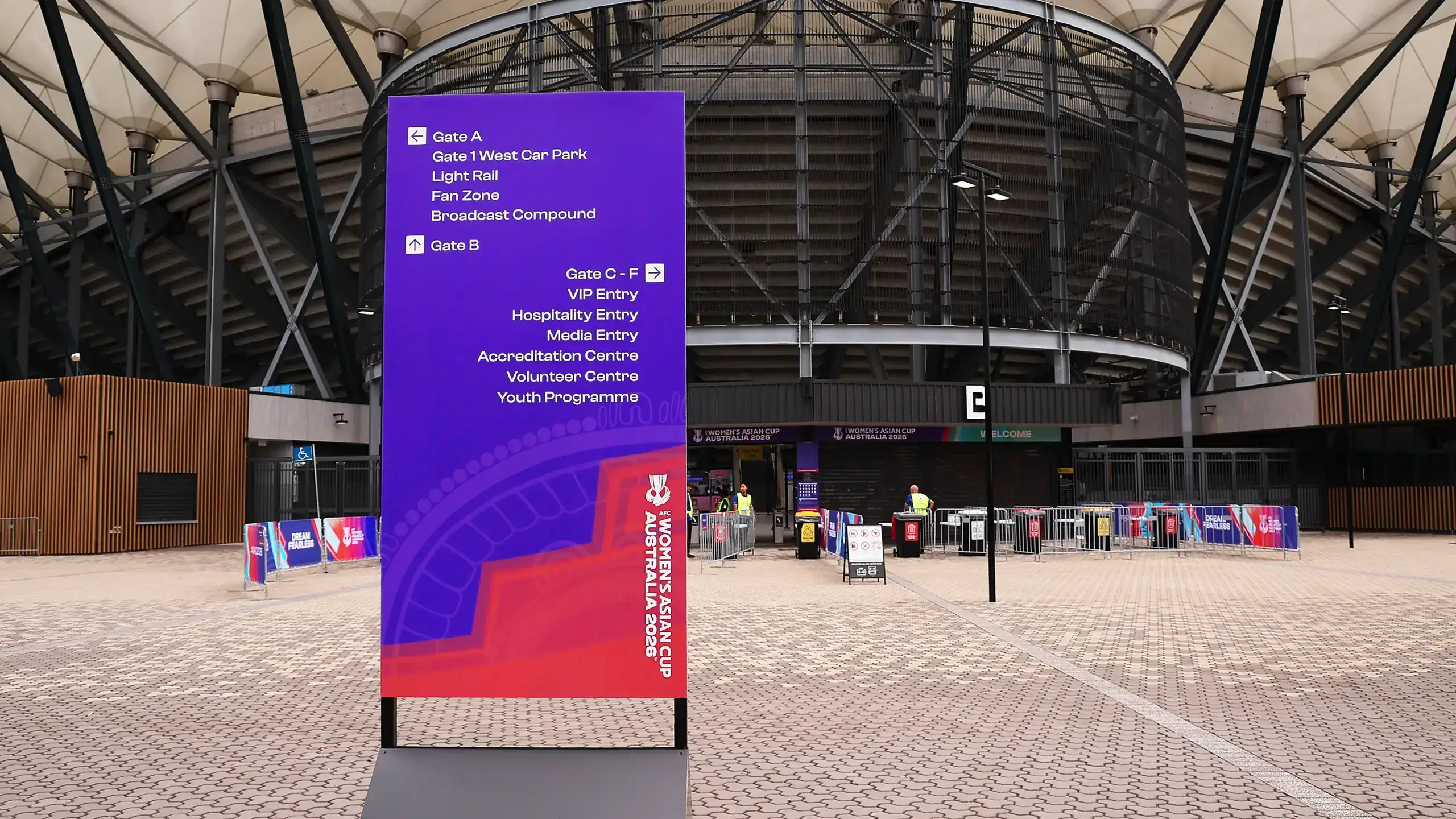
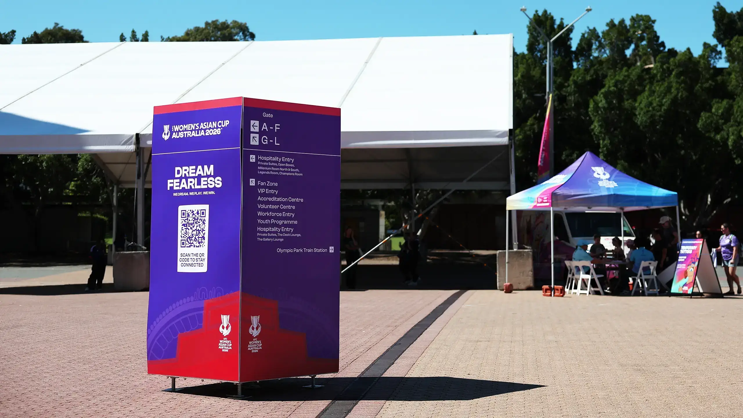
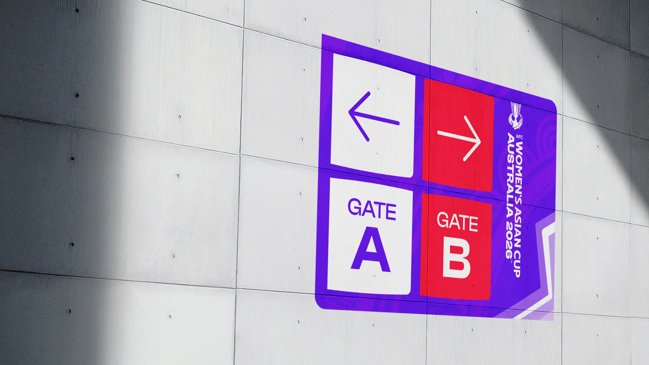
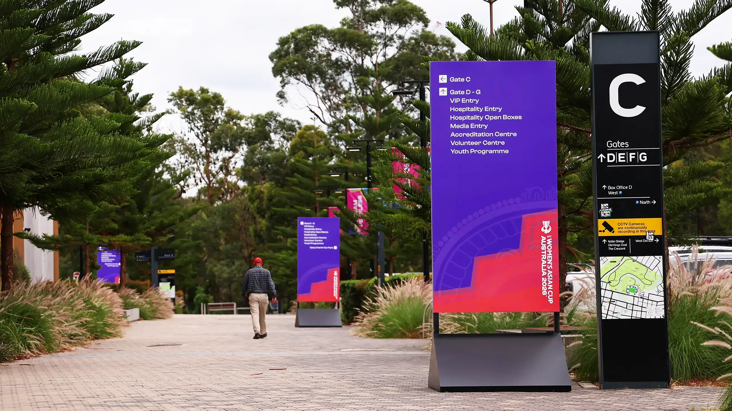
Wayfinding
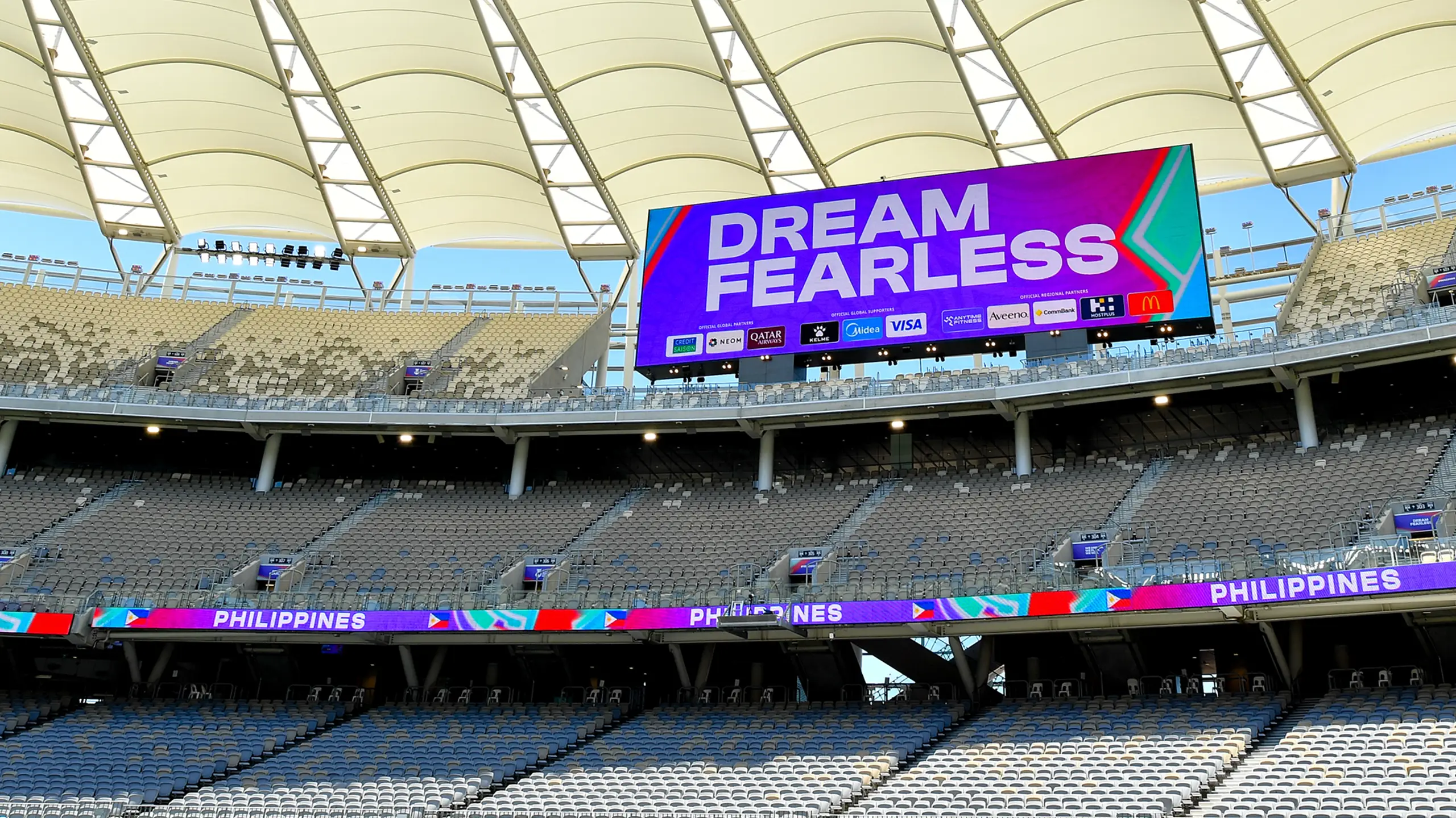
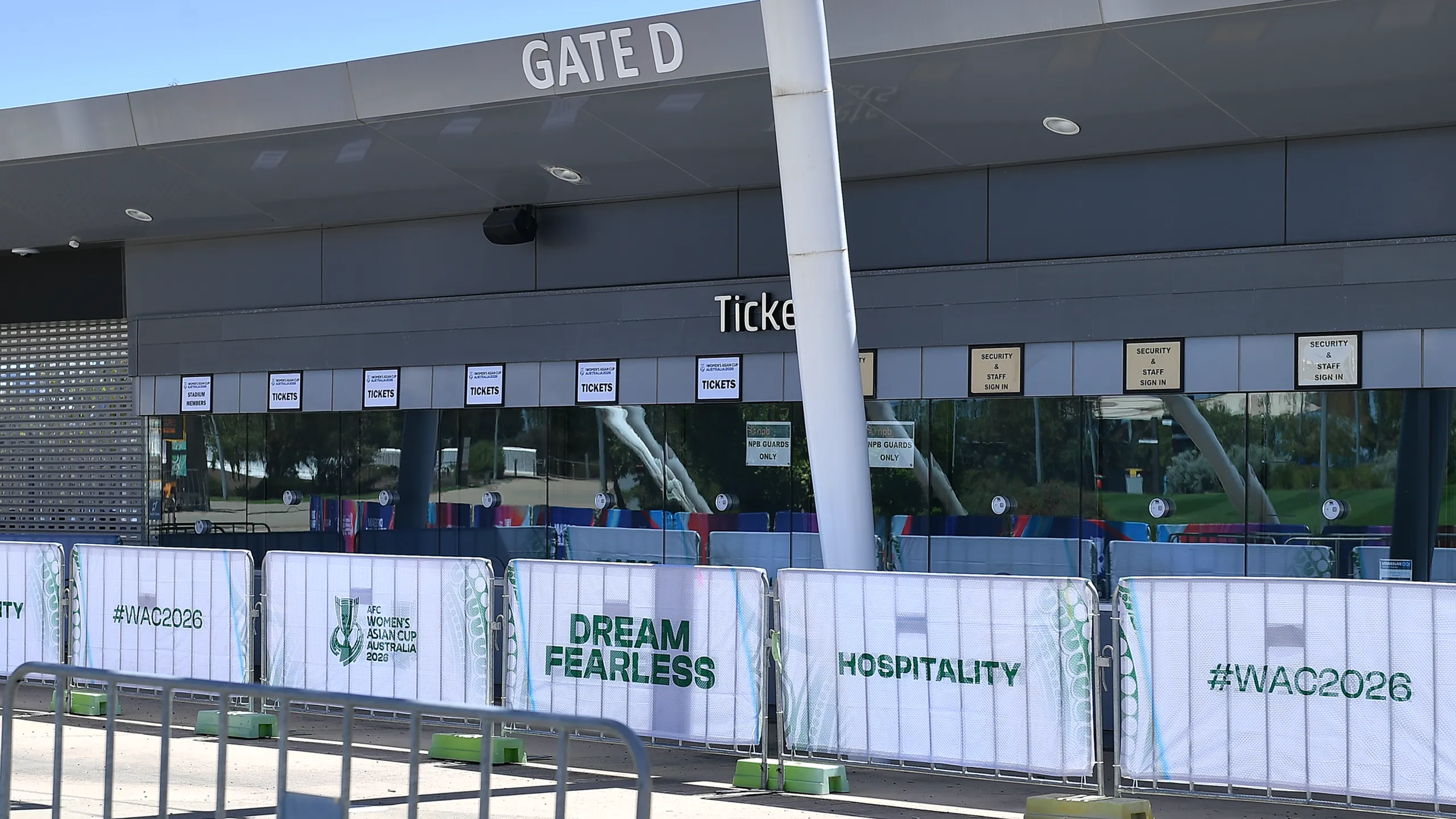
The wayfinding system for the AFC Women's Asian Cup Australia 2026™ was underpinned by a custom, dedicated palette created specifically for physical signage environments, drawing on Pulse Purple, Watermelon and White to ensure clarity and contrast at every scale. Bold and instantly recognisable, the system guided fans and officials through stadiums and host cities while remaining connected the wider tournament identity.
A holding shape inspired by the indigenous patterns within the brand unified iconography across all signage, tying the system directly to the tournament identity.

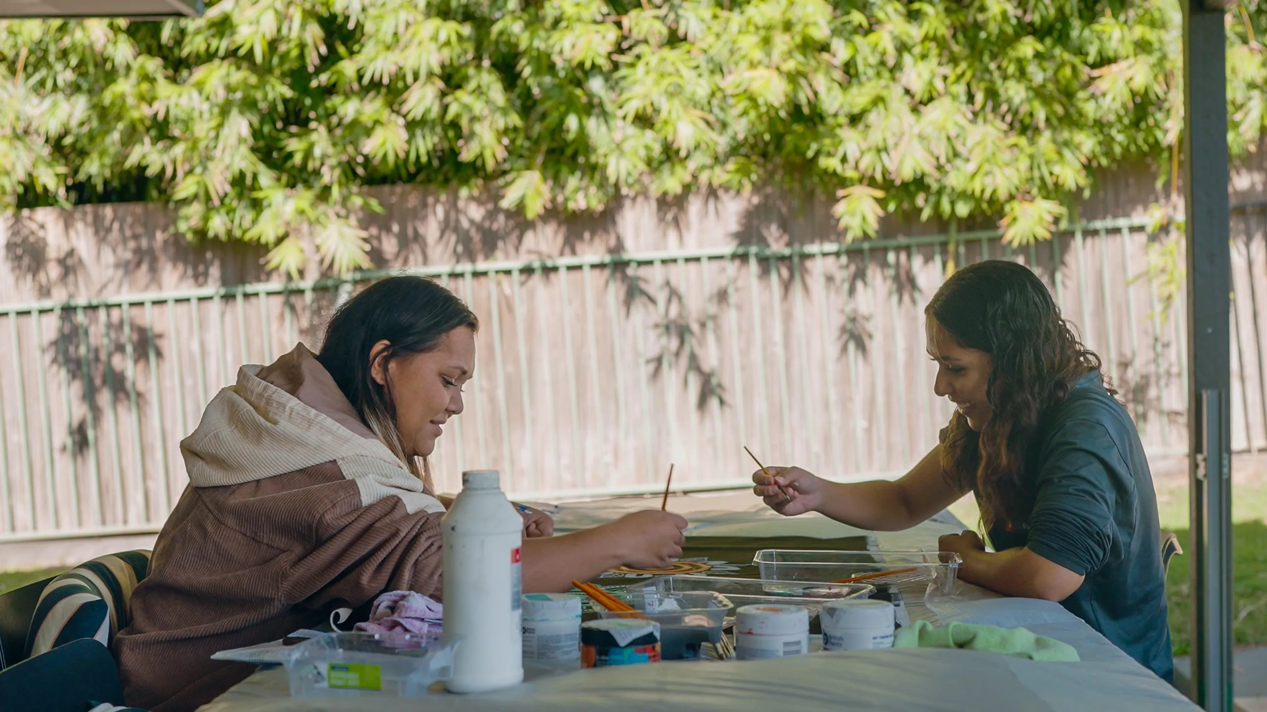
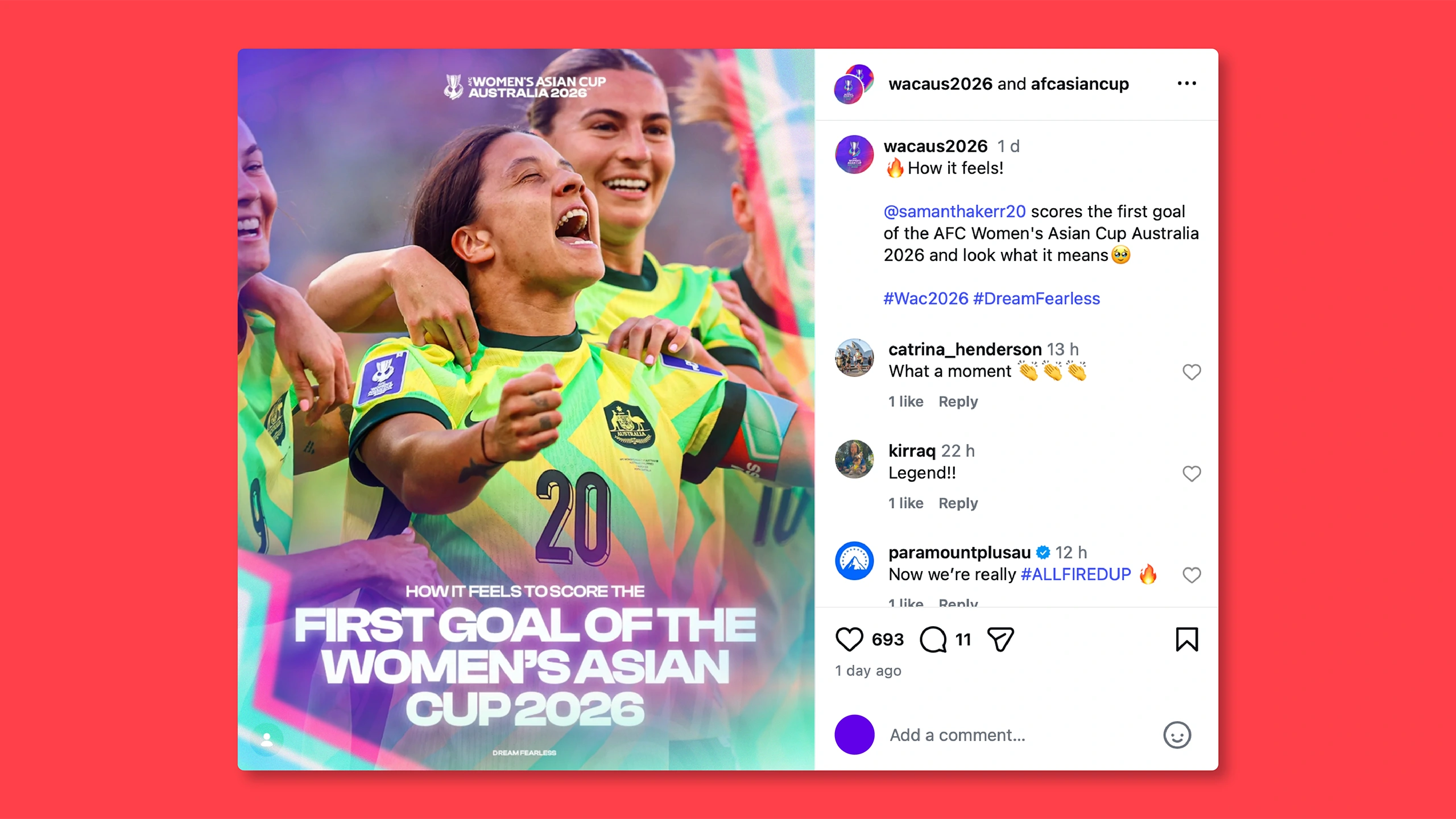
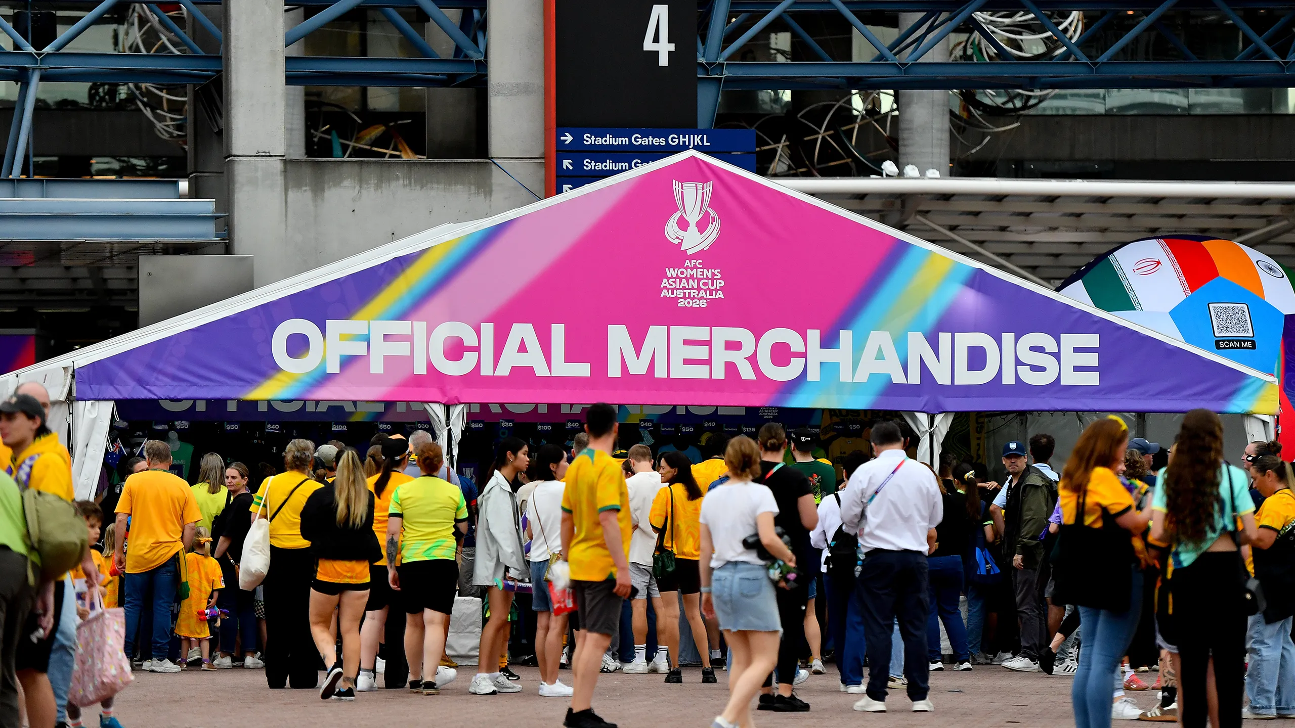
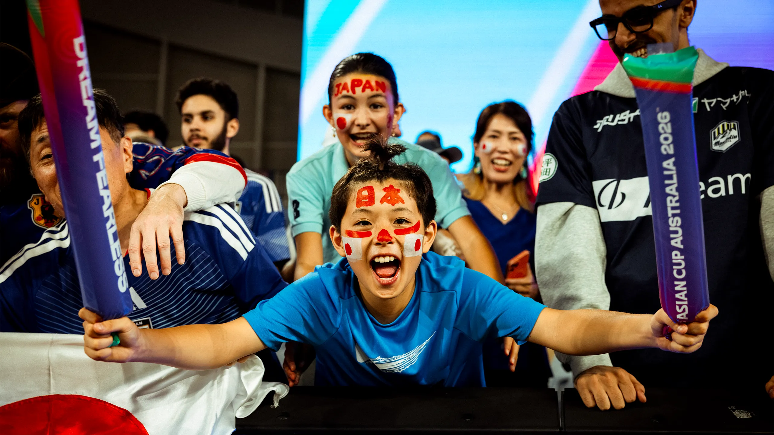
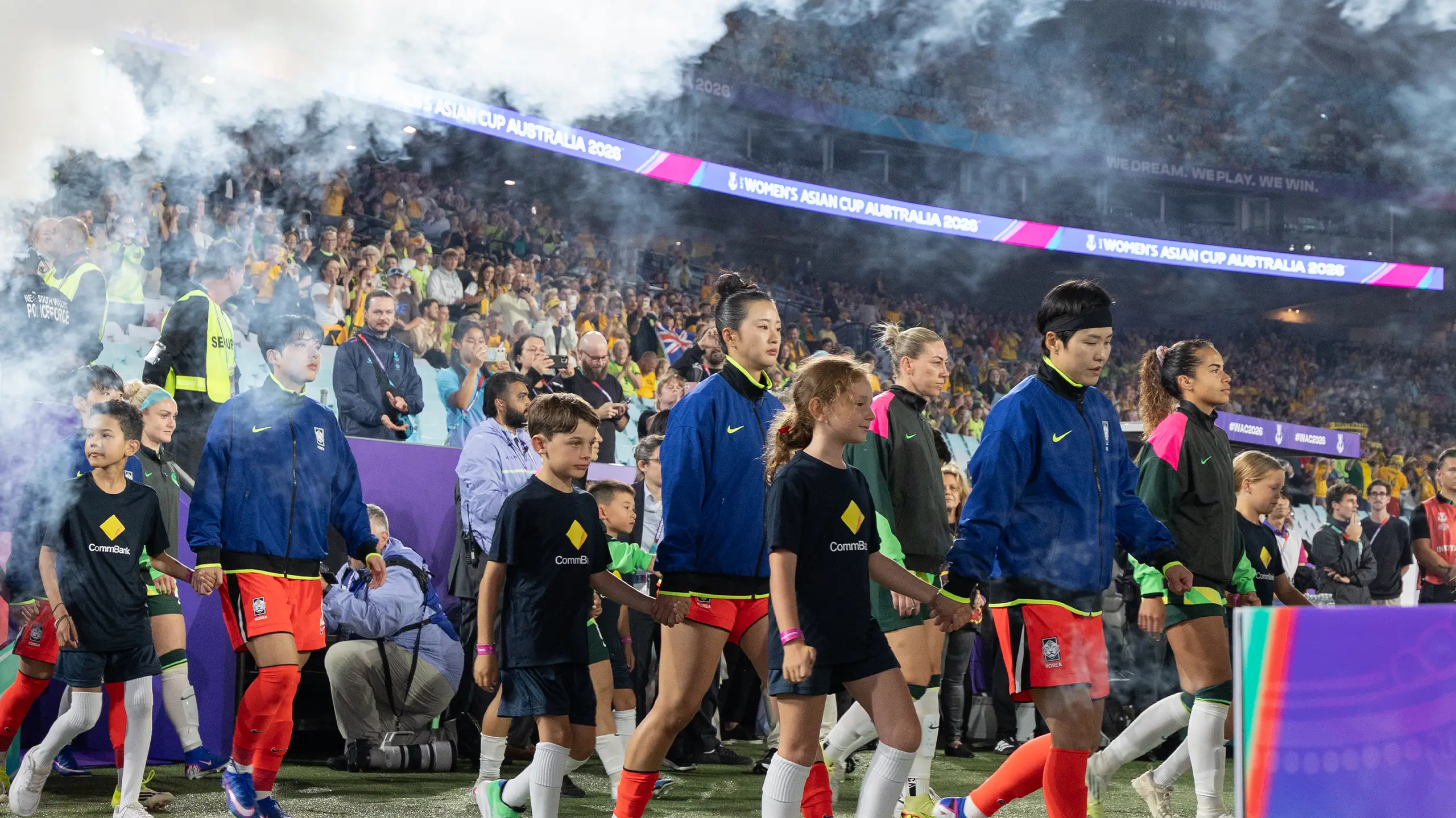
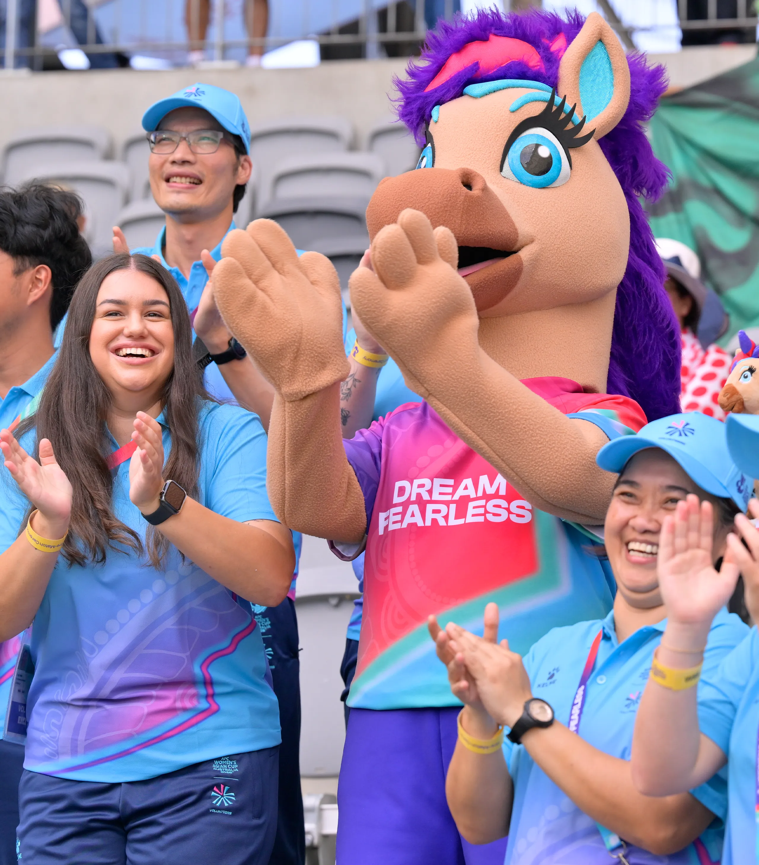
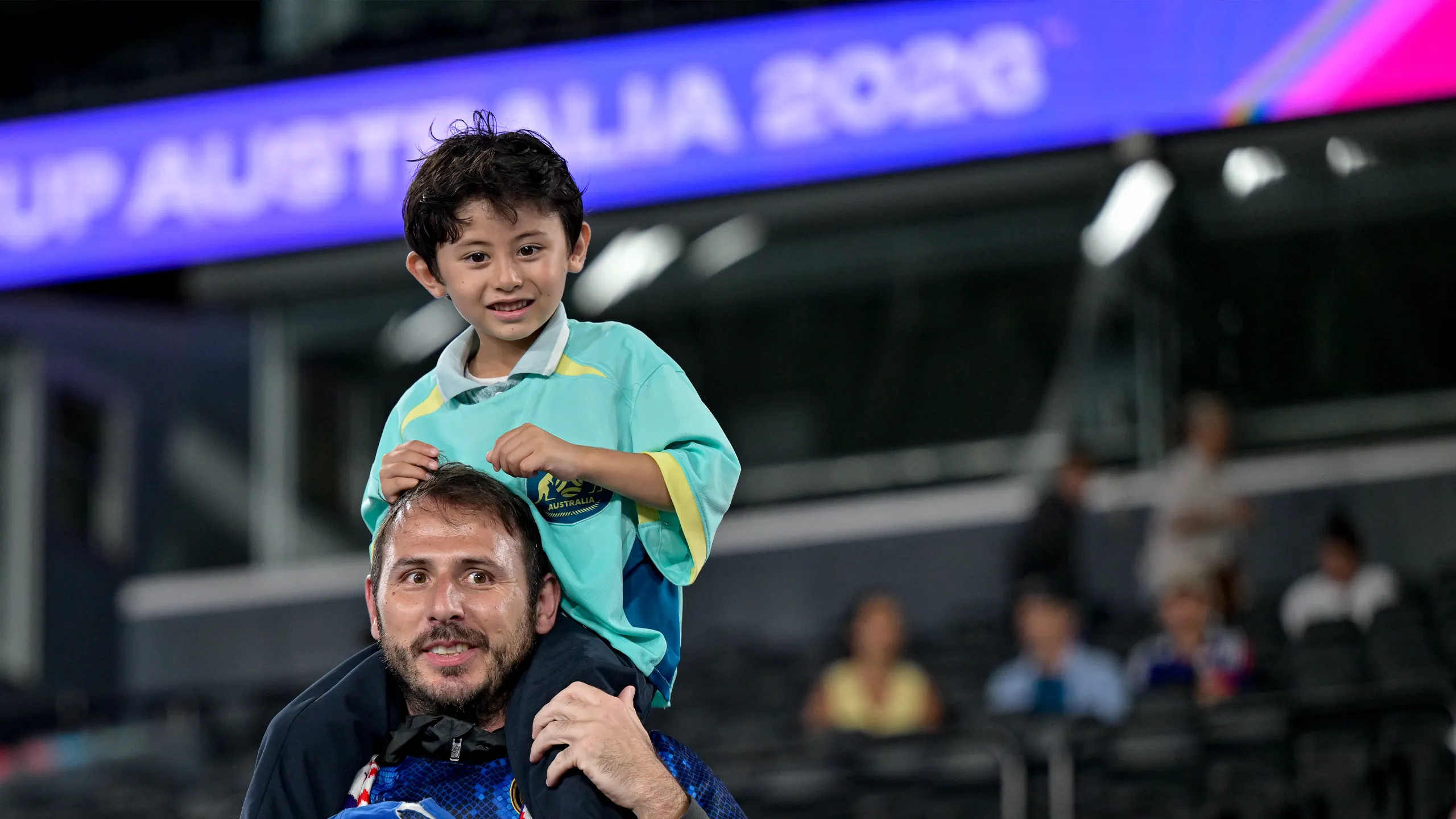
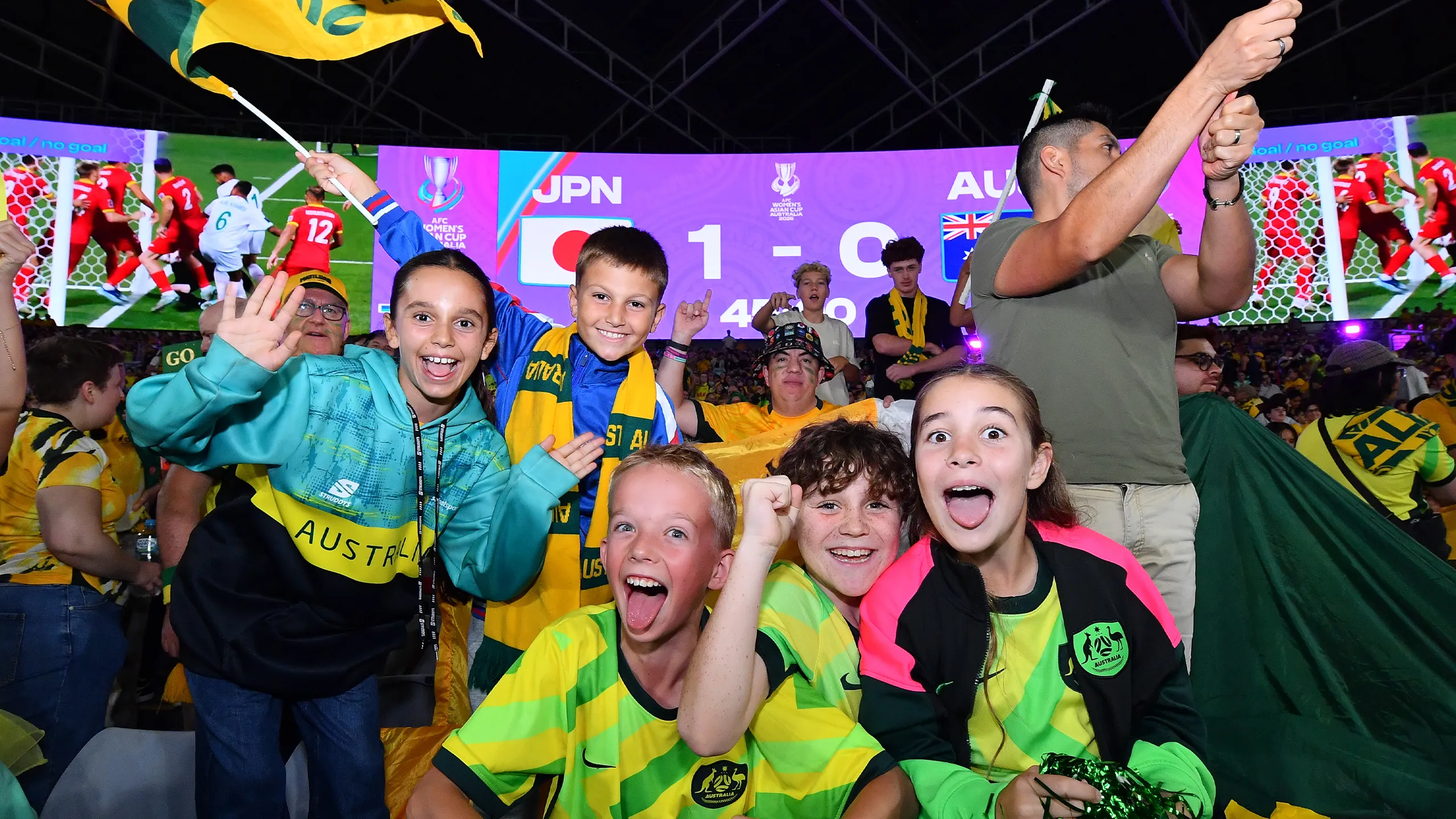
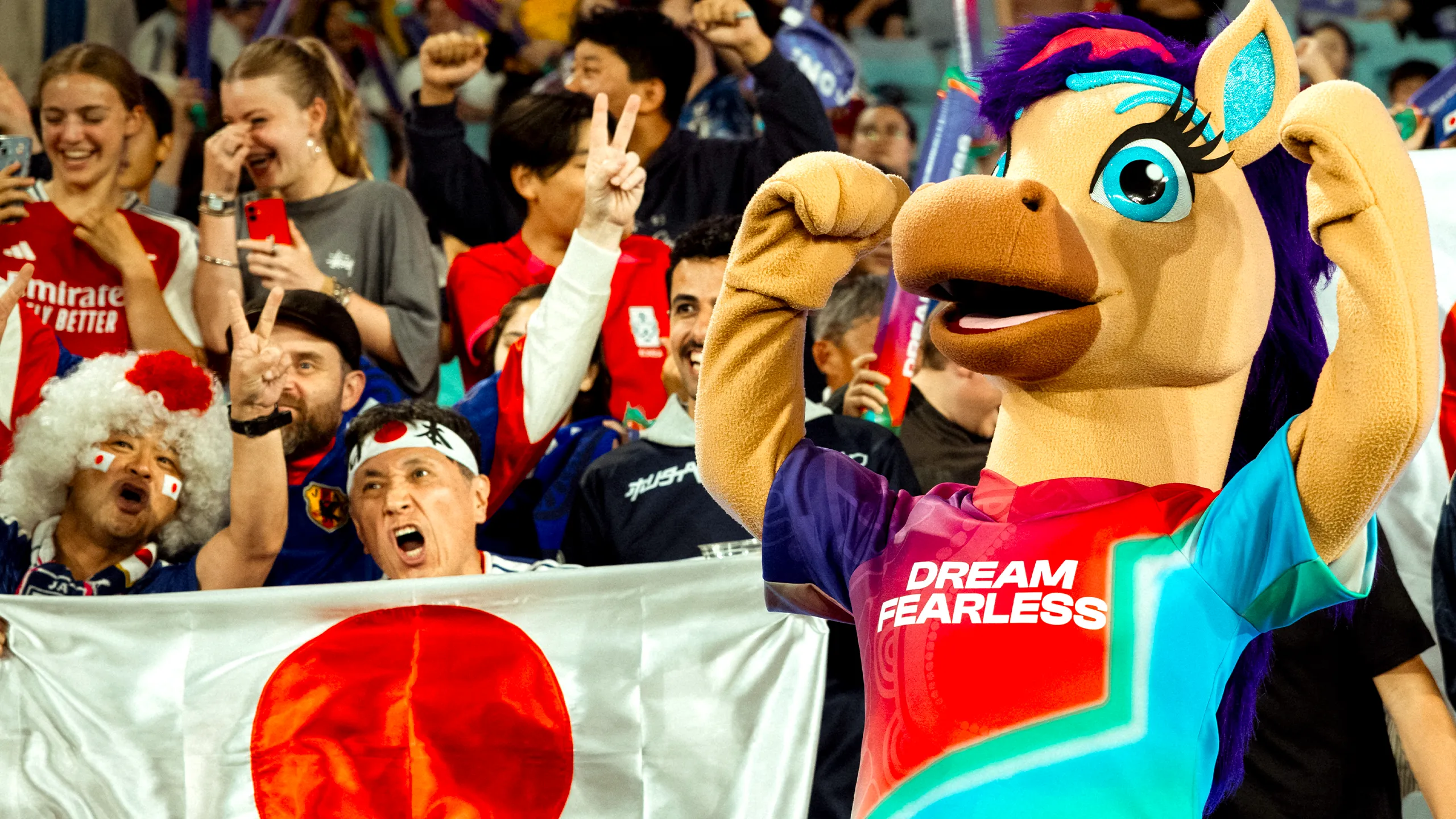
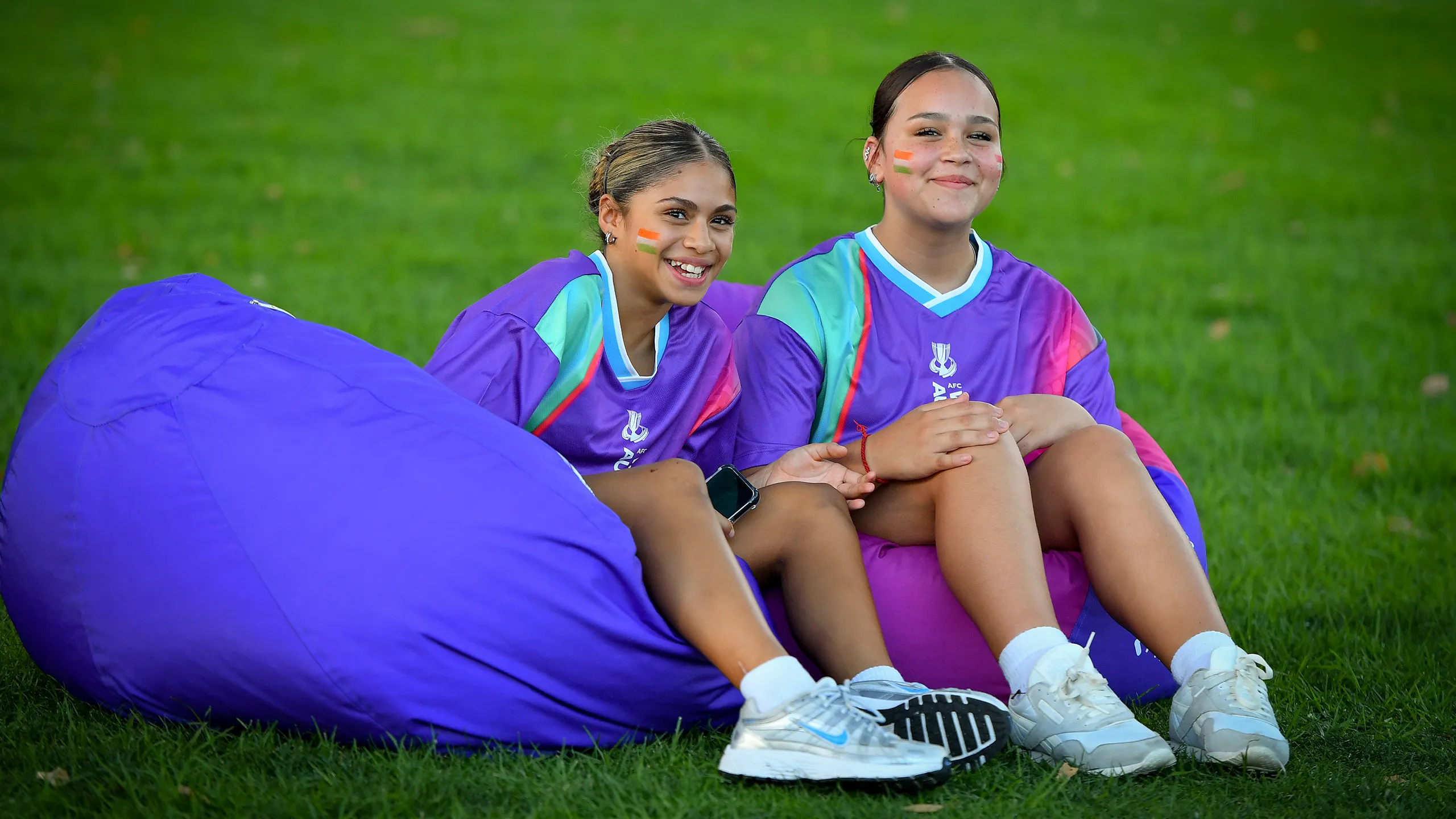
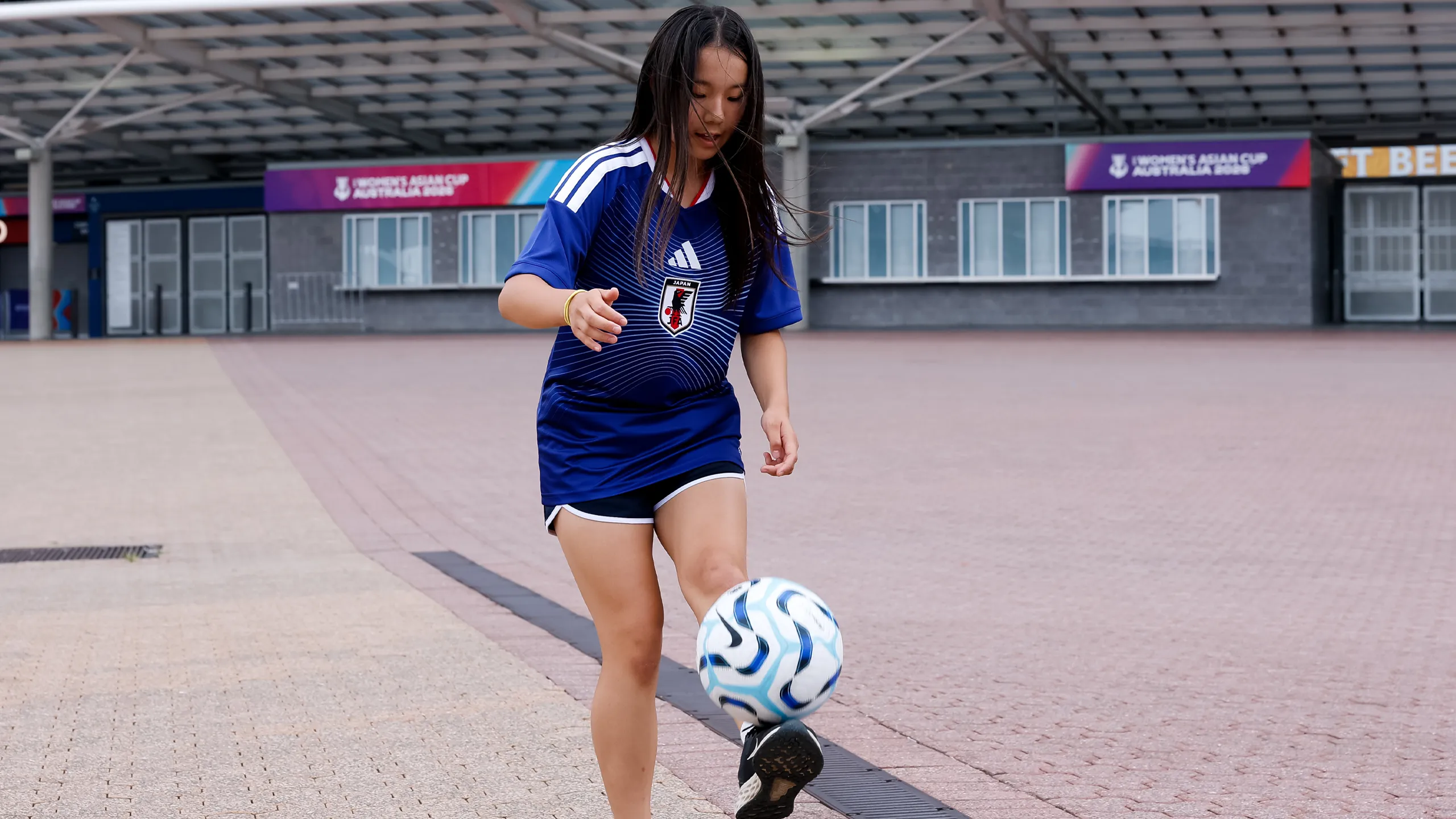
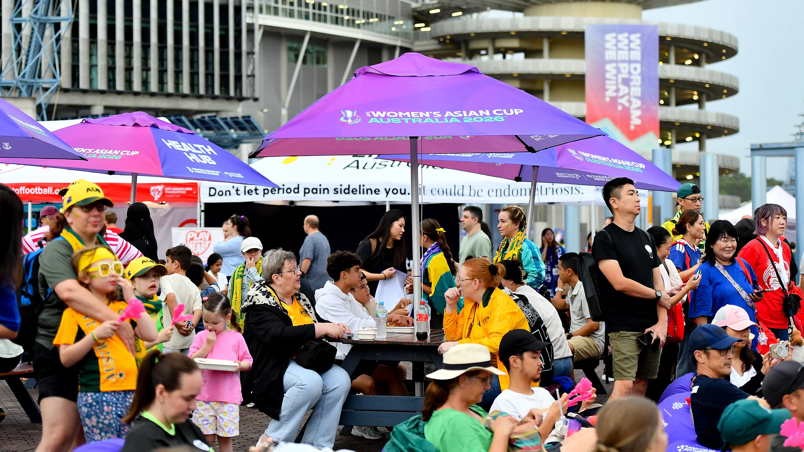
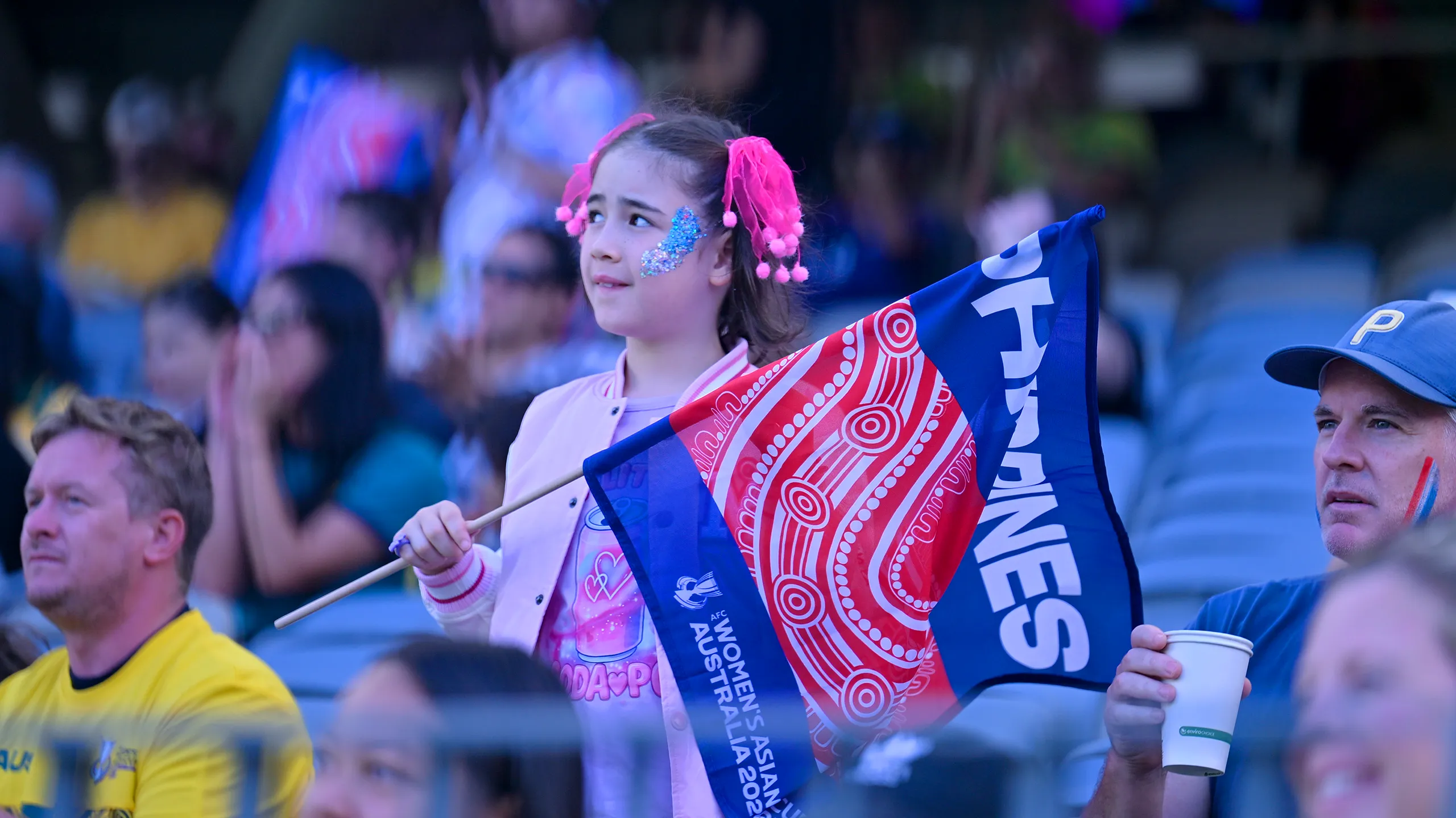
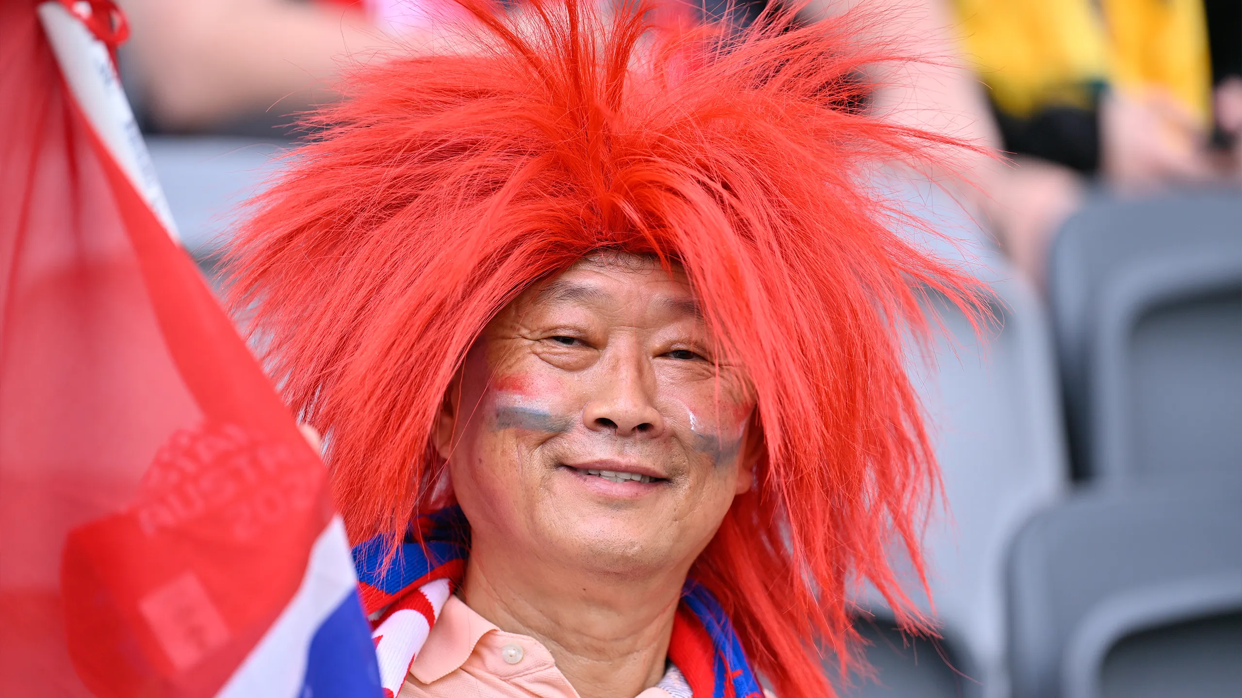
Fan Experience
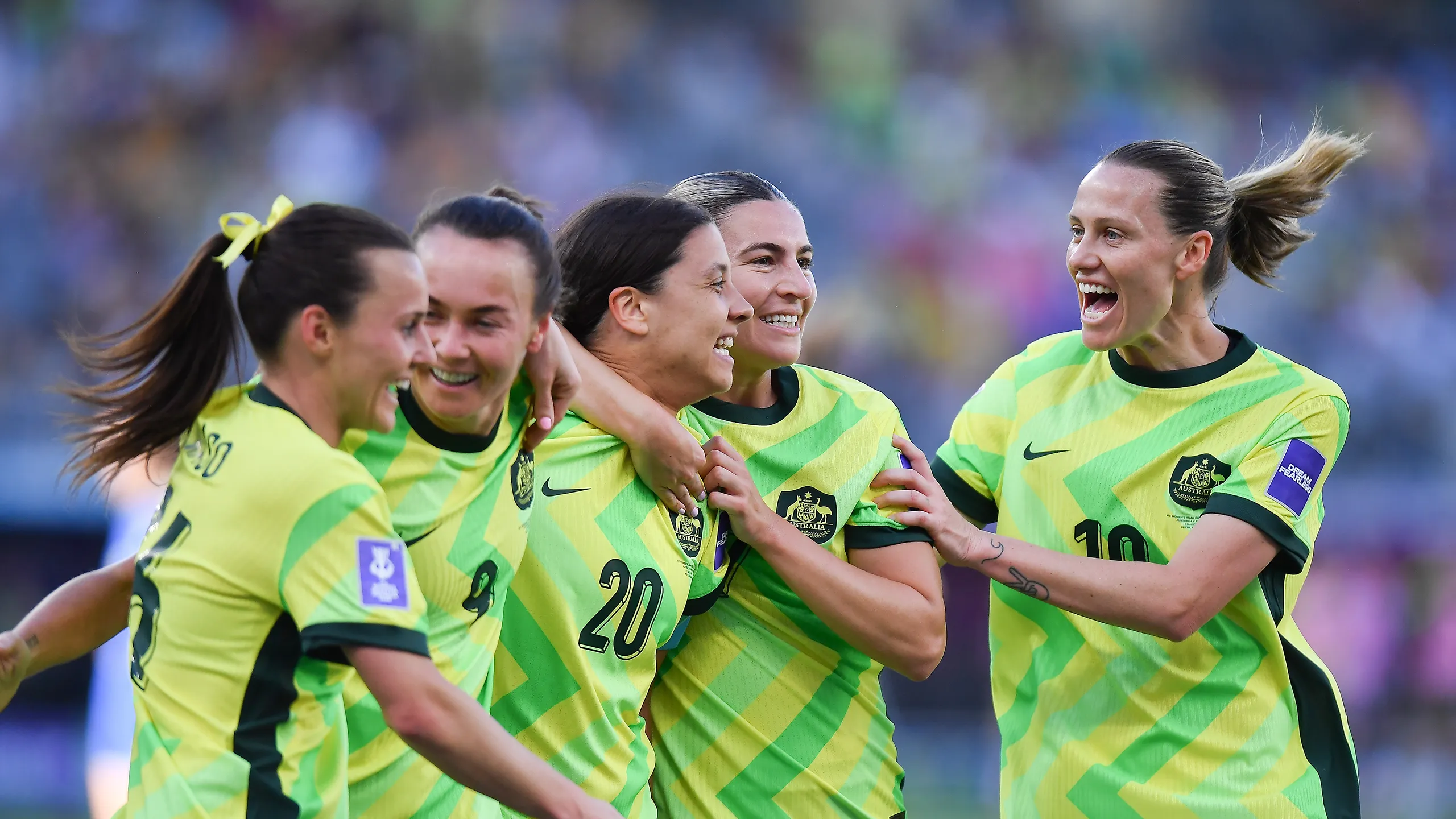
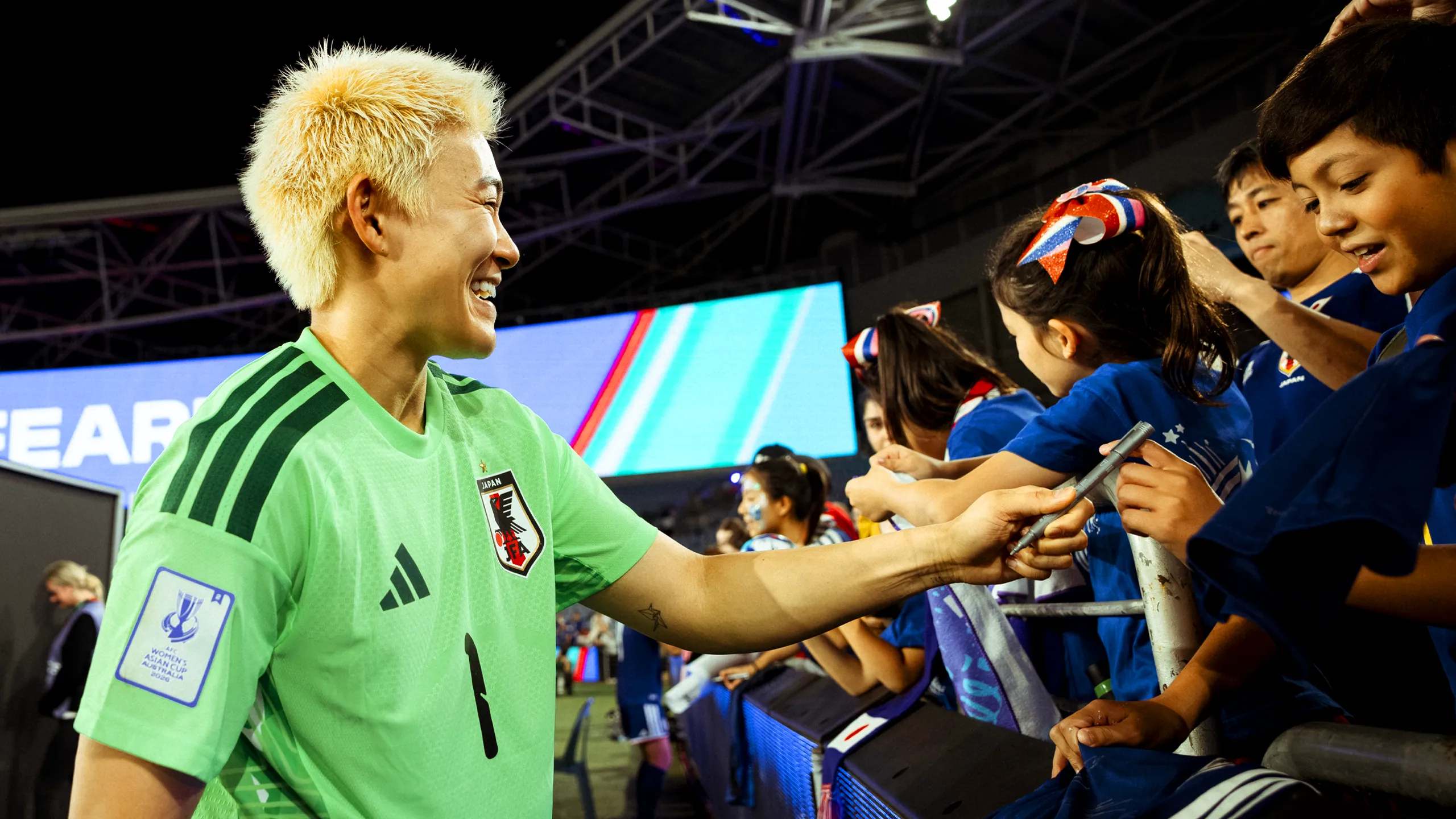
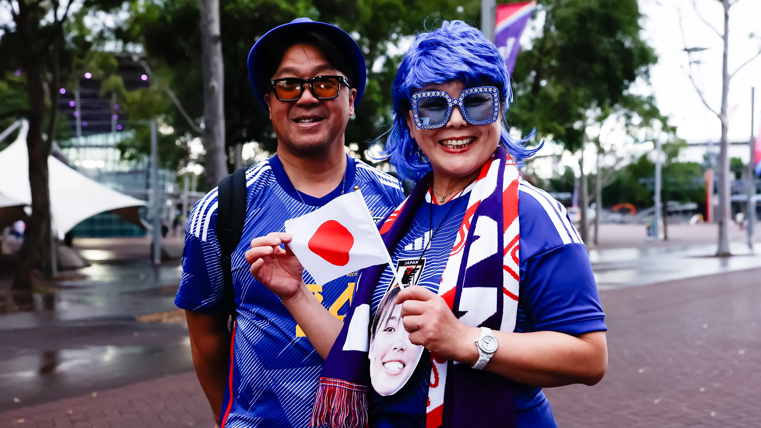
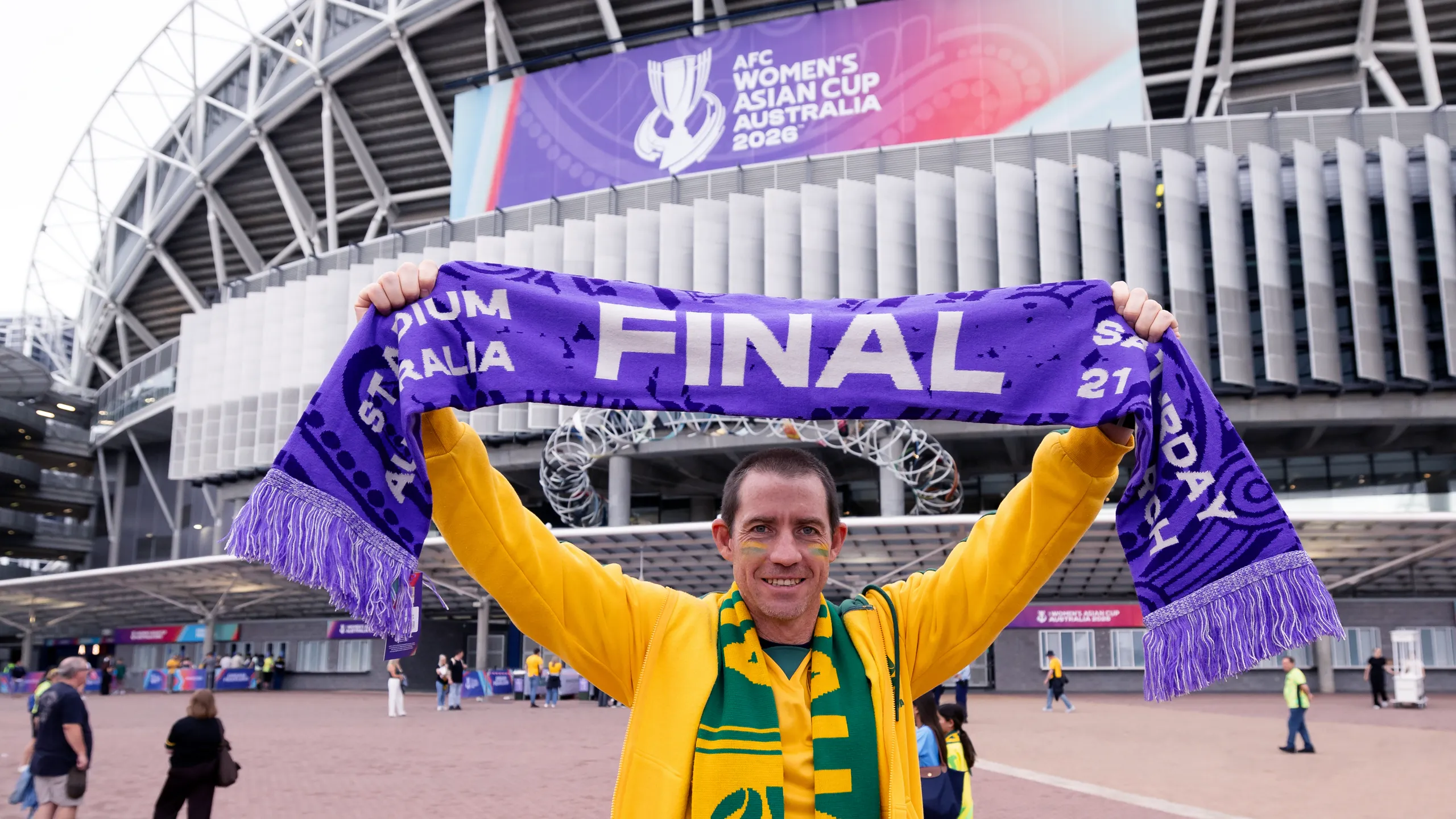
The AFC Women's Asian Cup Australia 2026™ was as much about the fans as it was about the football. The supporters are the heartbeat of any competition, and from the moment they arrived in host cities to the final whistle at Stadium Australia, the brand was designed to create a sense of belonging and celebration at every turn. Fans of all ages and backgrounds came together across Perth, the Gold Coast and Sydney, united by a shared love of the game and the fearless spirit of the tournament.
Whether encountering the brand on a city street, in a fan zone or inside a stadium, every touchpoint was crafted to feel instantly recognisable, welcoming, energising and part of something bigger than a single match. The result was a fan journey that brought the Dream Fearless spirit to life in the most human way possible.
OTHER PROJECTS