AFC Corporate Brand
Year: 2025
Client: Asian Football Confederation (AFC)
Polymath was approached by the AFC to redefine its corporate brand identity, the first time in 21 years and only the second time in the organization’s 70 year history. The brief called for a modern expression of a confederation that connects the most diverse Continent on the planet through football, bringing nations and cultures together under one
shared identity.
shared identity.
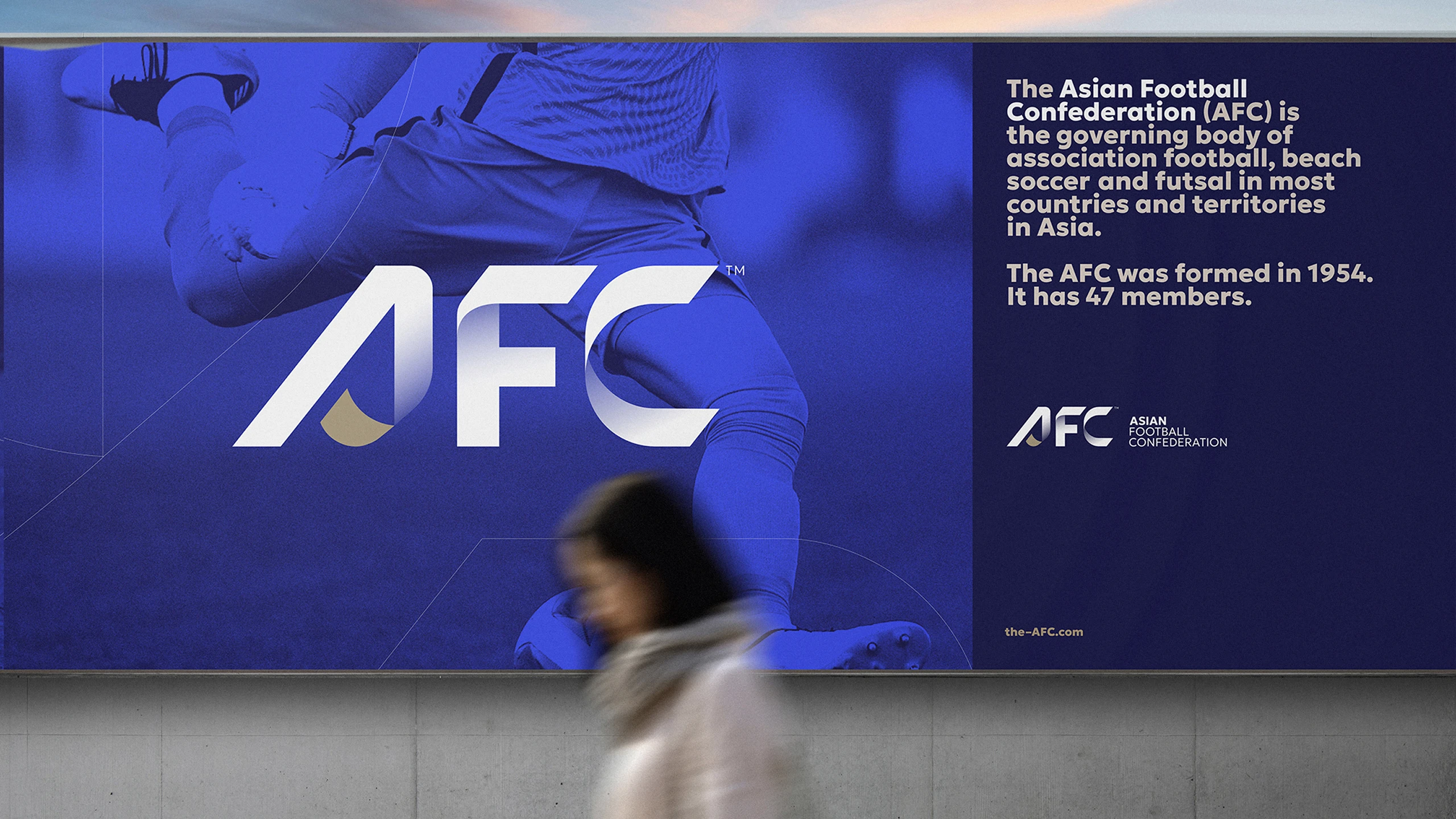
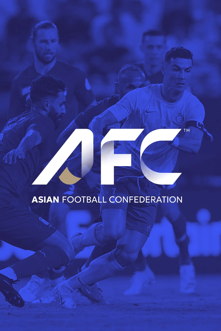
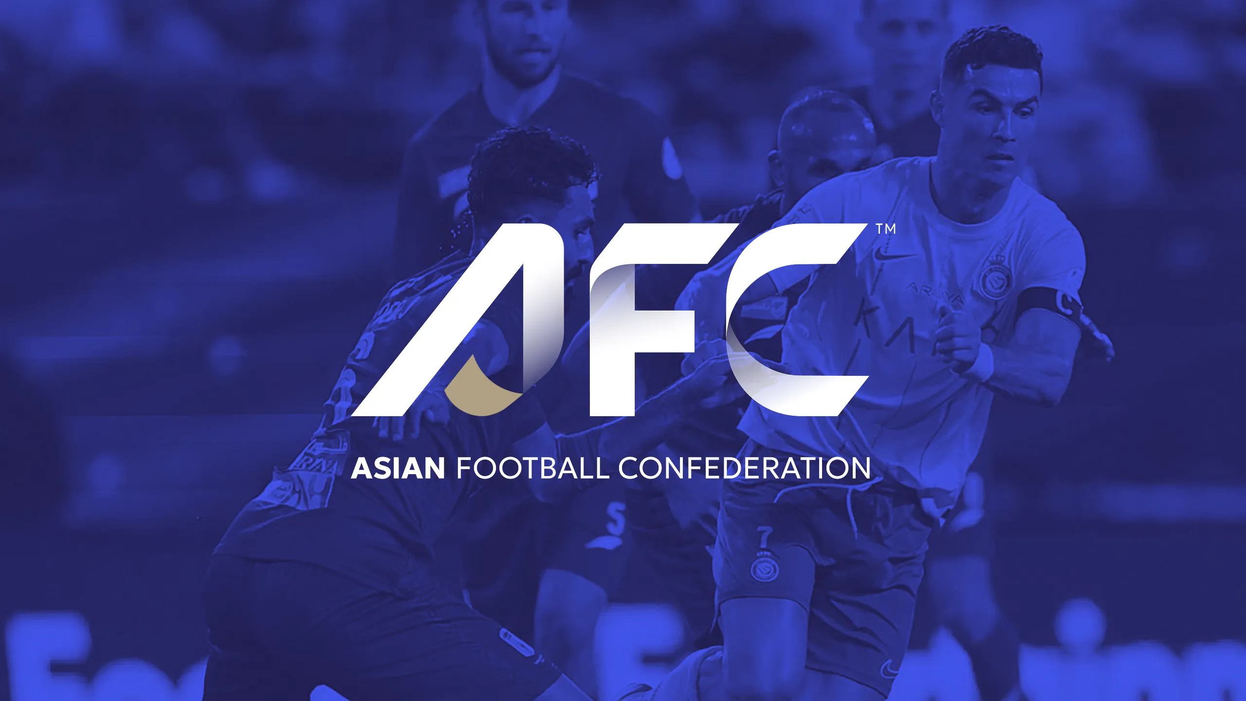
The new logo sits at the centre of the rebrand and is built around the idea of connection. Its form is inspired by a continuous thread or ribbon that reflects the movement of the game, weaving across the Continent before folding into the letters, AFC. This creates a distinctive mark that feels confident and contemporary while capturing the sense of unity that defines Asian football.
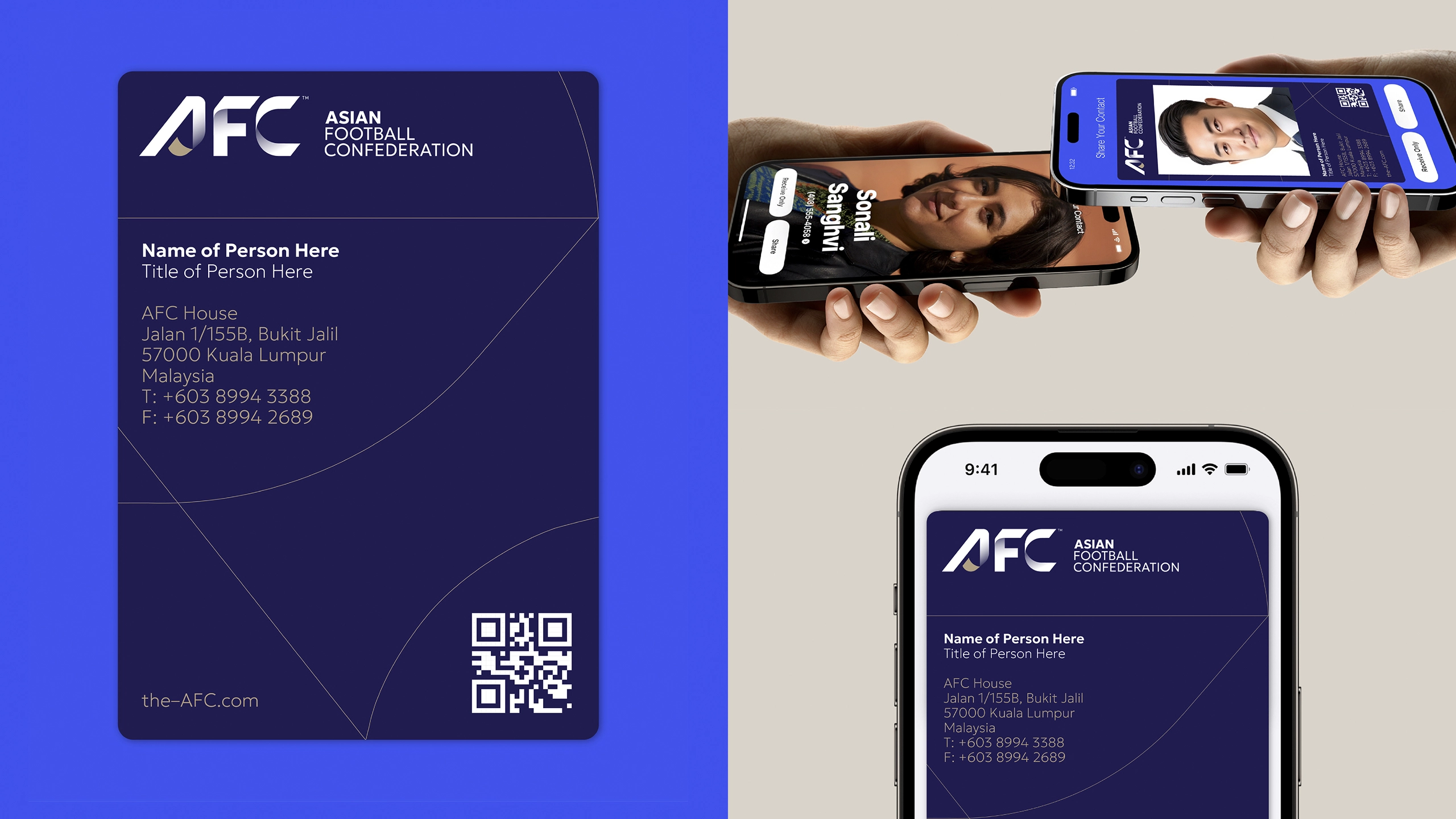
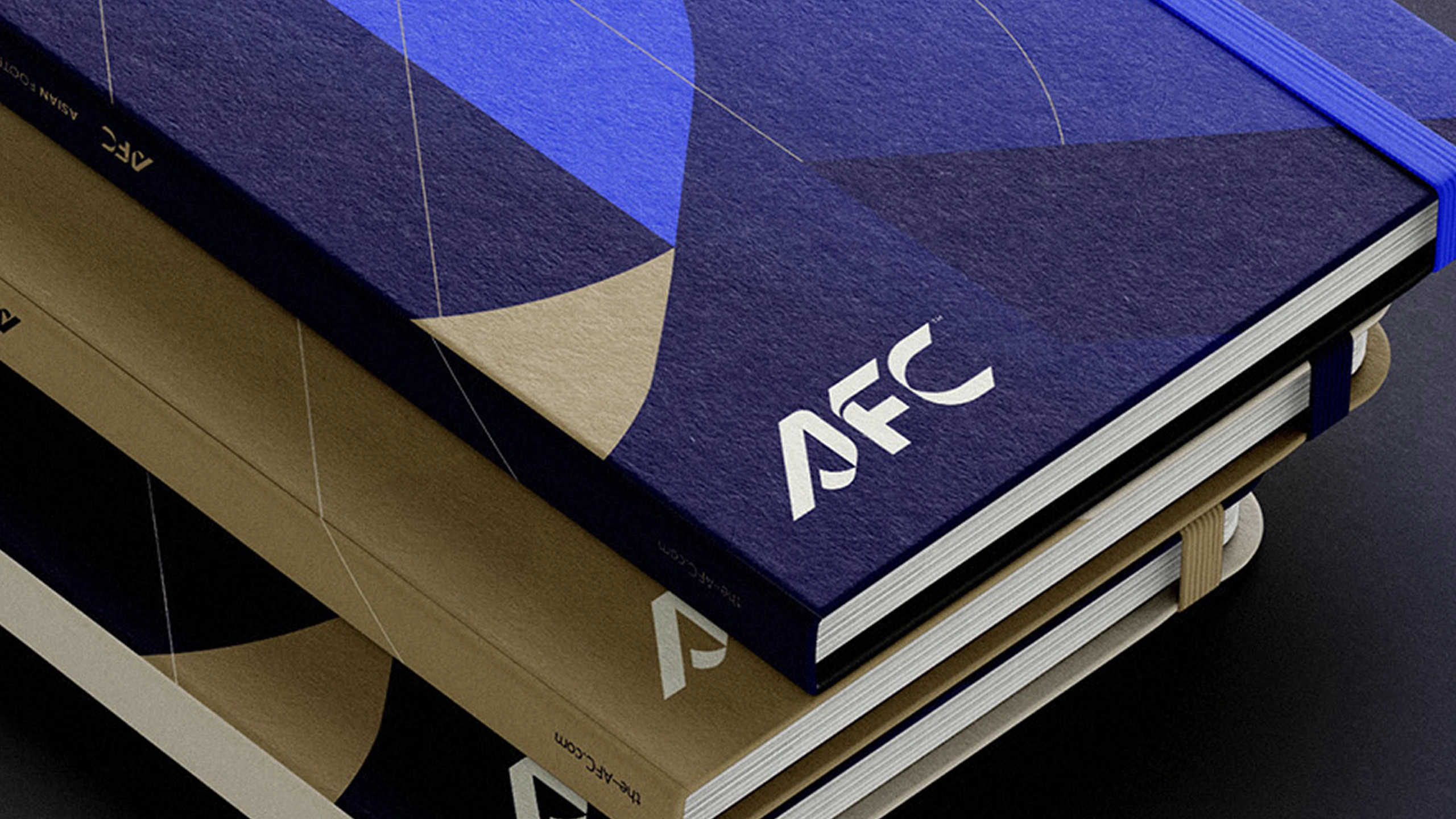
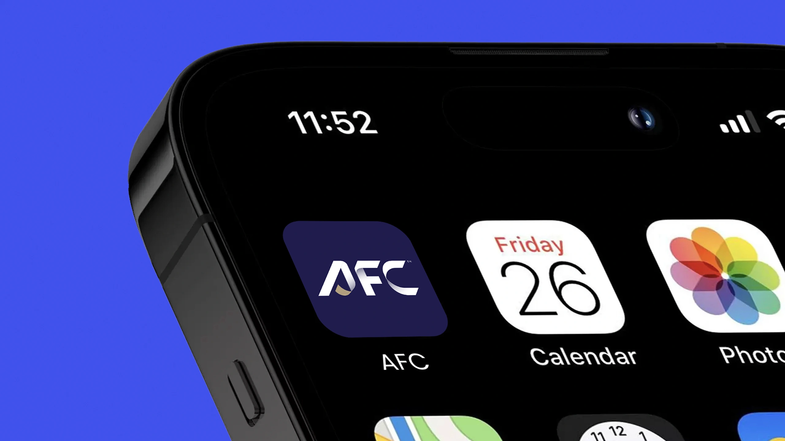
The wider identity builds on this concept through a refreshed colour palette and a flexible visual system designed for use across all AFC applications. The updated colour palette introduces a rich blue with a subtle hint of purple alongside premium tones of gold, linen, fluorescent blue and pure white as the core colours for the AFC’s new identity. Together these elements create a modern and adaptable brand that remains clear and impactful across communications, digital platforms and event environments.To introduce the new identity, Polymath created the official brand reveal video. Launched on the AFC website, the film presented the brand through motion and sound, highlighting the scale of the rebrand and marking the beginning of a new era for the Confederation.
The result is a cohesive and forward looking corporate identity that strengthens recognition, reinforces purpose and positions the AFC as a leading force on the global stage.
Sector
Sports
CATEGORY
Brand Identity | Signage | Merchandise | Motion & Broadcast | Type Design





OTHER PROJECTS


